Introduction: Problem Statement
The problem addressed in this project involves analyzing a large set of historical data for two basketball teams, the Los Angeles Lakers and the Chicago Bulls. The goal is to conduct statistical analyses and derive insights to improve their respective performances using the Python programming language to conduct these analyses. To comprehend their respective skill levels and performance patterns, we will contrast the Lakers’ data from 2013 to 2015 with the Bulls’ data from 1996 to 1998 (FiveThirtyEight, 2019). We will use statistical techniques to glean important information from the dataset, including hypothesis testing, data visualization, and descriptive statistics. The goal is to offer suggestions based on data to improve team performance and serve as a roadmap for strategic choice-making.
Introduction: Your Team and the Assigned Team
This research compares the performances of the Los Angeles Lakers and the Chicago Bulls across various periods. The Bulls competed from 1996 to 1998, but the Lakers played from 2013 to 2015 (FiveThirtyEight, 2019). The main objectives are analyzing their skill sets, game plans, and overall performance. By analyzing these teams’ performances, we may learn more about the elements that contributed to their achievements or setbacks and comprehend how basketball has evolved through time.
Table 1. Information on the Teams.
Data Visualization: Points Scored by Your Team
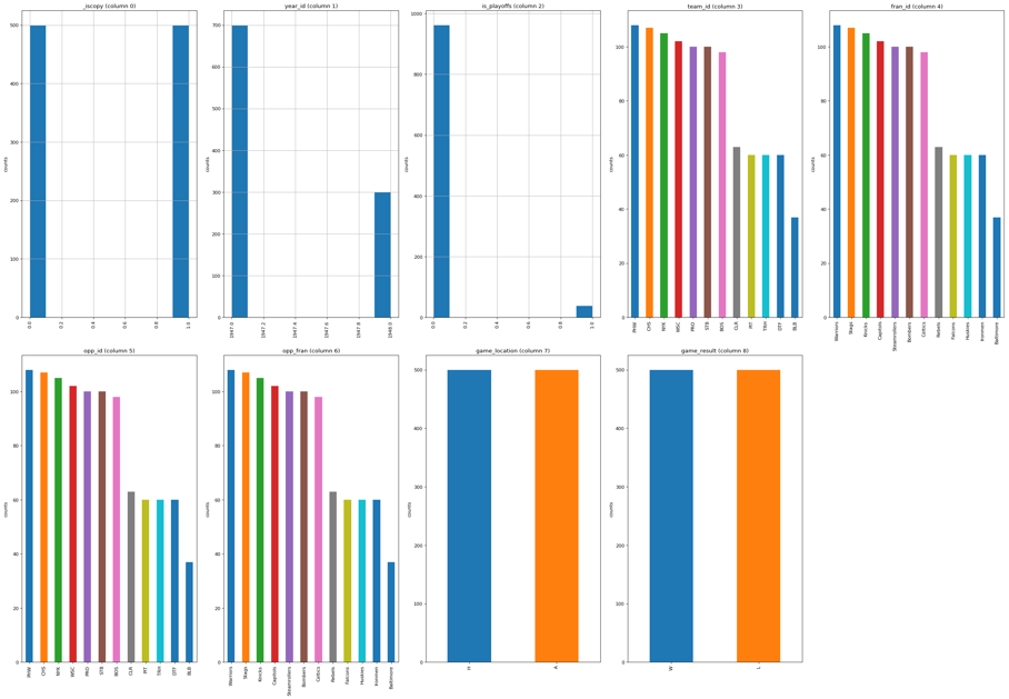
Data visualization is a useful tool for analyzing data distributions and trends. It enables us to depict data graphically, which makes it simpler to grasp and comprehend patterns, connections, and trends in the data. Understanding the shape, central tendency, and variability of data distributions allows us to gain insights into the fundamental properties of the variable under study. As seen in Figure 1, I created a histogram graphic to illustrate the data distribution of the points my team earned in this exercise.

I chose the histogram plot because it effectively shows the frequency of values falling into each bin while segmenting the range of values to represent the distribution of a continuous variable, such as points scored. Using this plot, we can see the distribution’s form and properties, such as whether it is multimodal, bell-shaped, or skewed. The distribution of points scored may be inferred from the histogram plot by visually viewing it. For instance, the distribution focuses on the mean score and seems nearly symmetrical (FiveThirtyEight, 2019). Furthermore, neither of the distribution’s extreme outliers at either end is present. Hence, the team’s scoring performance in home games is relatively consistent, with most scores clustering around the mean value.
Data Visualization: Points Scored by the Assigned Team
In this activity, I chose a box plot to describe the data distribution of points scored by the assigned team. I picked this plot because it visually represents the quartiles, median, and outliers, allowing for a comprehensive understanding of the distribution’s characteristics. By visually inspecting the box plot, I can observe the range, skewness, and presence of extreme values in the distribution. Thus, it signifies the variability and distributional characteristics of the assigned team’s points scored, providing insights into their scoring patterns and performance tendencies.
Data Visualization: Comparing the Two Teams
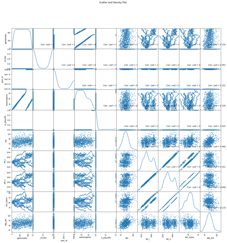
By graphically depicting the variables of interest and their connections, data visualization is used to compare two different data distributions. Data visualization enables us to see patterns, contrasts, and similarities in the distributions of the two datasets through plots like scatter plots, histograms, or density plots. In this exercise, the data distributions for the Bulls and Lakers were compared using a scatter and density plot, as seen in Figure 2.

The scatter and density plot was chosen because it enables a thorough evaluation of the distributions and correlations of the variables. The diagonal plots indicate the density estimation of each variable, while the scatter plots illustrate the connection between pairs of variables. This graph makes it easier to see how the Bulls’ and Lakers’ point-scoring distributions differ or overlap and any clear trends or patterns in their interactions. The similarities and contrasts between the Bulls and Lakers in terms of points scored may be seen by contrasting the two distributions in the scatter and density diagram (FiveThirtyEight, 2019). One may use it to spot data point grouping, score distribution or concentration, and any relationships between variables. This comparison sheds light on the scoring performances of the two teams and how they could have different scoring trends.
Descriptive Statistics: Points Scored by Your Team in Home Games
Table 2. Descriptive Statistics for Points Scored by Your Team in Home Games.
Table 2 presents descriptive statistics for points scored by our team in home games and provides insights into average scoring, variability, and the distribution of scores. The mean and median serve as measures of central tendency, indicating the typical value of the data. The mean, at 104.42, represents the average points scored, while the median, at 105, represents the middle value. We compare the mean and median to determine the skewness of the score distribution (FiveThirtyEight, 2019). When the mean exceeds the median, the distribution is right-skewed, with higher values having a longer tail.
Conversely, a left-skewed distribution favoring lower values is indicated if the mean is lower than the median (FiveThirtyEight, 2019). If the mean and median are roughly equal, the distribution resembles a bell-shaped curve. The distribution of points scored in home games is left-skewed, with a mean of 104.42 and a median of 105. As a result, the median is a better indicator of central tendency since it is less susceptible to the high values in the left tail.
Descriptive Statistics: Points Scored by Your Team in Away Games
Table 3. Descriptive Statistics for Points Scored by Your Team in Away Games.
Table 3 presents statistics regarding points scored by our team in away games, offering insights into central tendency and variability. The mean points scored is 97.93, representing the average score in away games. The median is 97.0, signifying the middle value of the distribution. The similarity in values between the mean and median suggests an approximately symmetric or bell-shaped distribution with no significant skewness. The mean and median can be used as measures of central tendency, as they indicate a similar location within the data (FiveThirtyEight, 2019). We can compare the mean points scored to evaluate the team’s performance in home versus away games. If the mean points scored in home games exceed 97.93, it indicates better performance at home. Furthermore, the standard deviation of points scored in away games is 14.59, representing the variability or dispersion of scores. Comparing the standard deviation of away games with home games allows an assessment of the team’s consistency across different venues.
Confidence Intervals for the Average Relative Skill of All Teams in Your Team’s Years
Table 4. Confidence Interval for Average Relative Skill of Teams in Your Team’s Years.
Confidence intervals estimate population parameters based on a sample and provide a likely range of values. A higher confidence level, like 95%, indicates greater confidence that the true parameter falls within the interval. In Table 4, the 95% confidence interval estimates the average relative skill of teams in a specific range of years for your team. The interval (1548.81 to 1607.99) suggests, with 95% confidence, that the average skill level of all teams during those years lies within that range. It represents a plausible range, accounting for sample variability (FiveThirtyEight, 2019). Different confidence levels, such as 90% or 99%, would change the interval width. Higher confidence levels widen the interval, offering more certainty but a broader range, while lower levels yield narrower intervals with higher precision but reduced certainty.
The probability that a given team in the league has a relative skill level less than your team can be derived from the confidence interval. Since the confidence interval is specific to your team’s years, the probability cannot be directly inferred from the provided information. However, the likelihood of a team having a lower skill level is quite low if your team’s skill level is within the predicted range, considering the confidence level and the supposition that the interval depicts the actual average skill level (FiveThirtyEight, 2019). As a result, it would be uncommon for a team to have a skill level much lower than your team’s. However, the precise chance would rely on the exact values inside the confidence interval and the league’s underlying distribution of skill levels.
Confidence Intervals for the Average Relative Skill of All Teams in the Assigned Team’s Years
Table 5. Confidence Interval for Average Relative Skill of Teams in Assigned Team’s Years.
The confidence interval in Table 5 (95% confidence level) estimates the average relative skill of teams in the assigned team’s years to be between 1732.43 and 1803.82. This interval provides a plausible range for the average skill level, considering sampling variability. If a different confidence level were used, the interval width would change. Comparing this confidence interval with the previous one, we can assess the differences in average relative skill between our team’s years and the assigned team’s years (FiveThirtyEight, 2019). The intervals do not overlap, indicating a significant difference in skill levels between the two teams during their respective periods. The assigned team’s range of years has a higher average relative skill than ours.
Conclusion
The statistical analyses conducted in this project are crucial for understanding and enhancing team performance. By examining data distributions, we gained insights into scoring patterns and tendencies for our team and the assigned team. Descriptive statistics summarized central tendency and variability of points scored, highlighting strengths and areas for improvement. Confidence intervals provided estimates of average skill levels, aiding performance evaluation and strategic decision-making. These findings inform management decisions, identify areas for improvement, and drive data-based strategies for future seasons.
Reference
FiveThirtyEight. (2019). FiveThirtyEight NBA Elo Dataset. Kaggle. Web.