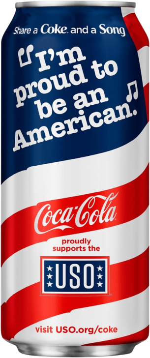
Companies continuously seek new paths to attract new customers and retain their customer base. It is critical to select proper imagery to convey the message that will have the most significant impact on the intended audience. Firms may strive to evoke certain feelings and associate them with their products to ensure a lasting impact on their sales from the portion of their consumers they are trying to influence. Coca-Cola is already known throughout the history of the United States to be a devoted supporter of its military force, yet the selected marketing campaign uses all the vital elements to remind Americans of this fact (Quigley, 2019). This essay will analyze the Coca-Cola advertisement released during its 2016 celebration of its 75-year-long partnership with the United Service Organizations (USO). The limited anniversary can that was used for the promotion targets American patriots and service members and highlights the connection between the organizations and the core values of U.S. citizens.

First of all, the background theme for this package adds the proper sentiment to the advertisement, as the traditional color is replaced with red and white stripes symbolizing the American flag. While the background image alone easily associates the company’s beverage with the United States, Coca-Cola went further and added an additional appeal in its ad. As seen on Figure 1, the quote that replaces the stars on the background of the U.S. flag conducts the direct message of the advertisement. The words of a patriotic song, “Proud to be an American” by Lee Greenwood, guarantee that people who see this can will associate the product with their national pride (Wojcik, 2016). Such a design choice puts this beverage among the prime choices of the target audience during the advertisement campaign. This apparent representation of the American regalia is bound to evoke the right feelings from patriots and servicemen and women.
It is critical to acknowledge that the image bears the logo of both companies on its front side, as seen on Figure 1. The position of the organization’s logo serves as a representation of the cooperation between Coca-Cola and the USO. It is apparent that Coca-Cola places significant pride in its cooperation with the USO. Their connection symbolizes the victory of the United States in World War II. Coca-Cola played a role in uplifting soldiers’ spirits at that time by teaming up with the USO, which serves as an entertaining company specifically for the U.S. Army (Quigley, 2019). People who serve in the U.S. Army can easily recognize the USO logo, as this organization often provides them with social facilities anywhere in the world. The continuous support of the country by this firm is eloquently shown through only three lines of text. The message on the package states that Coca-Cola “proudly supports the USO,” further emphasizing that the company’s interests align with the national ones (Wojcik, 2016). By adding a link to the website that explains in detail the history of this partnership, Coca-Cola ensures that its message will not be received as idle talk.
Another vital part of the can’s design is its traditional line at the top side, which uses an easily recognizable font and message style. While this position is often reserved for informative texts, it is used to create an additional impact on consumers that ties the brand with the comradery that is intrinsic for military organizations. The message invites people to share the beverage alongside the song with their friends. While this part may seem less significant than the rest of the design, it bears significance for service members and patriots alike through its demonstration of companionship. Such an appeal has the potential to revive the memories of past military experiences among Americans who likely had such moments during their service. At the same time, the Waverly font used for emphasizing the keywords in this phrase is one of the famous symbols of Coca-Cola. Therefore, the firm solidifies its message regarding its support of the U.S. Army and the United States in general by including such a seemingly small hint.
In conclusion, the selected advertisement focuses on evoking patriotic feelings among Coca-Cola consumers and promotes both the company’s brand and the USO. The firm successfully combines several interconnected elements in its limited edition coke can that highlight its apparent close relationship with the U.S. Army. Patriots are bound to find this product to be attractive to their eyes, as all of its aspects represent American pride. By combining the red, white, and blue on its can for the background and using the words of a famous patriotic song, Coca-Cola clearly associates itself with the United States. At the same time, it can also remain true to the traditional Coca-Cola design by leaving the message near its rim with easily recognizable font and a warm sentiment to its consumers. Furthermore, the link to the history that Coca-Cola and the USO have satisfied the curiosity of people who may still doubt the good intentions of the firm.
References
Quigley, S. L. (2019). The USO & Coca-Cola: A refreshing 80+ year partnership. United Service Organizations.
Wojcik, L. (2016). Coca-Cola celebrates 75-Year USO partnership with patriotic packaging. Winsight Grocery Business.