Introduction
Although Katsuhiro Otomo primarily is famous for his first large-scale creation Akira, in forms of both manga and anime, this work is not the only possibility to become acquainted with his manner. He actually devoted most of his life to illustrating and produced several thousands of pieces, among which is the below portrait of Stanley Kubrick. Otomo drew it in 1992, two years after Akira had ended (Blagdon, 2012; “Stanley Kubrick portait,” n.d.). Therefore, it can serve as an example of how a passionate creator grows professionally with practice.
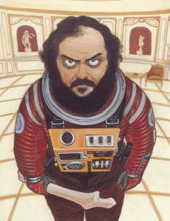
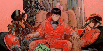
The features that make Otomo’s artwork outstanding, in fact, had crystallized throughout the iconic manga series. The artist himself states that style transforms with the time, the reason for which is slight but constant self-correction (Blagdon, 2021). This is quite apparent from the given portrait; notably, it looks more harmonious and lifelike in comparison with the last topic of Akira that is in the following picture, notwithstanding the offbeat setting.
Elements of Art
Similarities
Thick lines and strong colors that form distinct silhouettes apparently are typical of Otomo’s artistic manner. This can separate not only the characters from the landscape, but also the elements of the latter from each other, showing that all of them are important for creating the necessary atmosphere. The depiction of textures contributes to it as well; thus, both drawings imitate the materials from which the suits presumably are made quite successfully, hence a fuller immersion.
Differences
In one respect, a boy sitting in an armchair with stuff around is closer to everyday life than an astronaut in a museum is. The portait of Kubrick, nevertheless, looks less fantastic and more rational due to the smoother shades. In other words, the still from Akira resembles a somewhat surrealistic dream with its excessive sharpness while the portrait integrates quieter and consequently more trustworthy color schemes.
Principles of Art
Similarities
Both drawings have repetitive patterns, the use of which actually is an effective way to lay emphasis on certain points. The Akira scene, specifically, is in red; in addition to the elements that are of this color, it is observable in all of the other, forming unique shades. The entire image looks as if through red glass, which apparently embodies the character’s aggressive and decisive mood that is guessable from his posture and mimics. Regarding the portrait, its landscape consists of repeating shapes, on whose background the figure of Kubrick gains additional visibility.
Differences
As said above, the silhouette of the person in the portrait stands out from the landscape due to the repetitiveness of the latter. In the anime topic, on the contrary, all shapes are different, which, along with the color composition, makes the character dissolve in the background. It may be problematic, therefore, to perceive his personality separately from the environment and subsequently associate him with a real individual.
Conclusion
The portrait of Stanley Kubrick is the piece of Katsuhiro Otomo’s artwork that shows how the illustrator added to his proficiency in terms of realism with the time. Although the style is recognizable in earlier drawings, mostly in the lines and contours, the colors in the portait are more natural, due to which it looks more lifelike. A strict separation of the central human figure from the background also contributes to realism by emphasizing the fact that the person actually exists.
References
Blagdon, J. (2012). ‘Akira’ creator Katsuhiro Otomo exhibits his life’s work. The Verge. Web.
Stanley Kubrick portrait by Akira director Katsuhiro Otomo (1992). (n.d.). Web.