Introduction
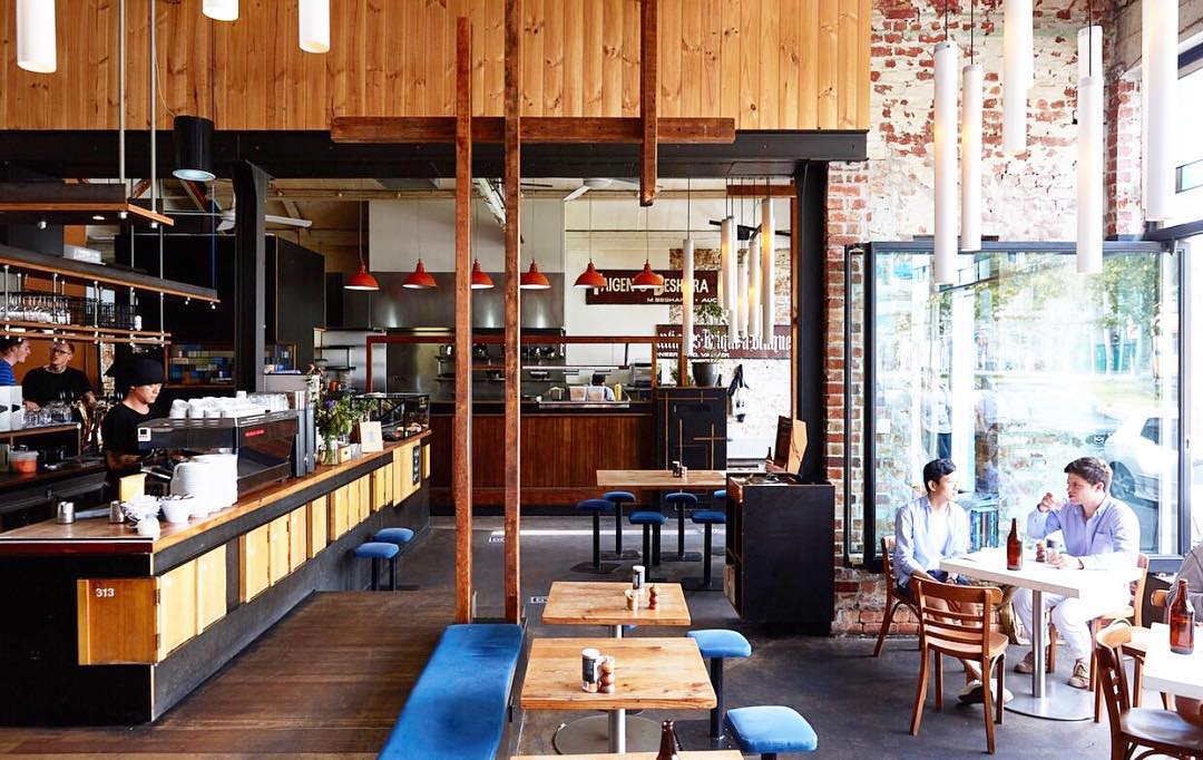
An interior design that captures a particular atmosphere is a challenging task for those who do not understand the intricate aspects of a beautifully furnished room. Modern establishments often strive to achieve a genuinely unique look that will serve as a selling point for their potential customers, yet not all companies achieve this goal. For this assignment, I have selected two cafes that I believe did reach this objective. The first one is called the Auction Rooms Cafe and is located in North Melbourne. This cafe stands out in a row of contemporary two-story buildings with an extremely rustic outside look, making it an easy eye-catcher. Although there is no sign of the building being of any historical significance, its structure and appearance indicate its old age. This feature is further complemented by the design of the restaurant’s interior, which makes it appear as a location from the past centuries. Its interior combines modern design solutions, such as tube-shaped lamps and story-high glass windows, with wooden decorations and unpainted brick walls.
The second cafe, called Terror Twilight, is located in Collingwood, Melbourne. It occupies a visibly smaller space, although it shares some features, such as high ceilings, with the first location. This restaurant has an overarching theme — music, specifically vinyl records. Terror Twilight is more modern in its design yet also points toward the past century through its usage of vinyl records and table placement. A distinct lack of bright artificial lighting complements the cafe’s name and creates warm dusk in the evenings.
These locations are organized entirely differently, yet they share similarities that make it possible for both sites to share the customer base. Being less than three miles apart, both cafes present a slightly different appeal to the same local population as well as tourists of Melbourne. Their unique approach to interior design creates a welcoming space that makes one’s experience of a small restaurant close to a community meeting rather than a visit to a typical eatery. In this essay, I would like to compare these cafes, including their interior spaces, special qualities, target audience, and how these locations appeal to their customers from a designer’s point of view.
Interior Space
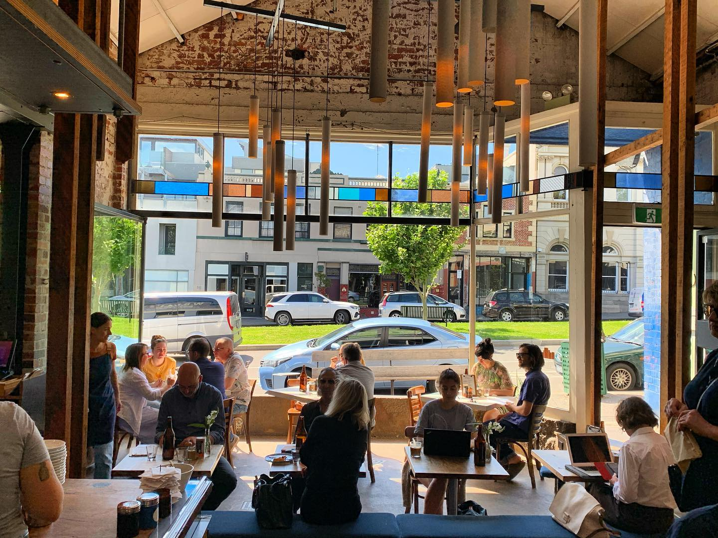
The Auction Rooms Cafe, being located among modern buildings, comes in shocking contrast with its neighboring buildings, including its internal architecture. This restaurant presents an unobstructed view throughout the entire main room and the kitchen, focusing on connecting people more than cluttering decor (“Auction Rooms Cafe | Coffee, Breakfast, Brunch, Lunch in North Melbourne,” n.d.). Wooden furniture adds to the rustic look of this place. With no tablecloths, a sense of hardwood surface adds to the feeling of being connected with nature. The Auction Rooms Cafe is genuinely set on utilizing the full potential of its bright and sunny location. The main room has large glass walls unobstructed by any decor, allowing sunlight to shine on the restaurant’s front tables and providing enough light to operate entirely without bright lamps, as shown in Figure 1. The entrance to the restaurant is outside of the frame, as it is separated from the table zone by a section of a brick wall, making the room look less like a public spot. With little division, the cafe appears as a single hall inviting people to connect.
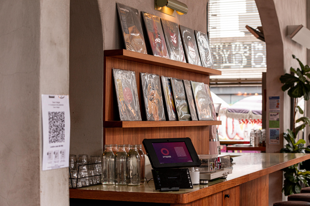
Terror Twilight’s interior takes roots in contemporary music, and this theme permeates every aspect of the design. Despite being relatively small, this eatery focuses on excellent acoustics by leaving its ceiling as unobstructed as possible. This cafe is decorated with vinyl albums of various music artists from the past fifty years (Figure 2). A vinyl record player is the centerpiece of the shelf in the middle of the restaurant, further complimenting the music-oriented style, as seen in Figure 2.
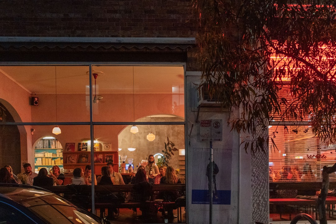
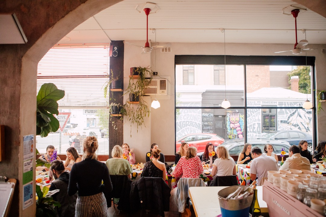
It is possible to immediately recognize the atmosphere within the cafe through its large, open windows. Terror Twilight is decorated primarily with warm colors, filled with greenery, and has a lot of empty vertical space, which can be seen in Figure 3, while not as much walkable perimeter. The restaurant uses numerous plants to dilute its otherwise monotonous look. A combination of urban and natural elements when neither struggles for dominance within an interior design allows one’s gaze to remain occupied (Abercrombie, 2018). As seen in Figure 4, the cafe has numerous plants that do not clutter the view but freshen the otherwise simplistic wall decor.
Materials utilized by the cafes create a clear case for comparison of their interior spaces. The Auction Rooms Cafe is located in an old house made of wooden planks and brick walls with natural colors, giving it a look of a nineteenth-century building. Its internal design matches the pattern, with little to no paint being applied to the materials. Wooden elements enhance the natural light and the appearance of plants within an interior design (Alapieti et al., 2020). At the same time, Terror Twilight has plain gray concrete walls that are decorated with plants and music paraphernalia. What is more important in the material selection of this cafe is its sound-dampening capabilities. A room with walls made of solid materials, in comparison with a room filled with obstructive objects, “reflects sound while the latter’s solid volumes and soft materials absorb it” (Pallasmaa, 1994, p. 40). Being a music-themed cafe, Terror Twilight negates the dampening qualities of its furnishing through the smart placement of speakers. Moreover, it uses concrete instead of wood or brick as the main wall texture, allowing sound to reflect better.
Special Qualities
At first glance, the Auction Rooms Cafe almost reaches the size of a two-story house, yet, with its large open table area, it has more than enough space for all customers who visit it. Due to the small number of tables, this cafe has a lot of empty space inside the building, as seen in Figure 5. The bar desk located in the middle of the main room contributes to the feeling of an open design, as it has no barriers that prevent customers from seeing the other side of the primary lounge. This approach to furnishing gives this cafe an atmosphere of a community space. People who visit this eatery sense a breath of freedom from modern tendencies to put privacy above the community. By placing its kitchen and bar stand in the open, the Auction Rooms Cafe follows the same idea it promotes among its customers.
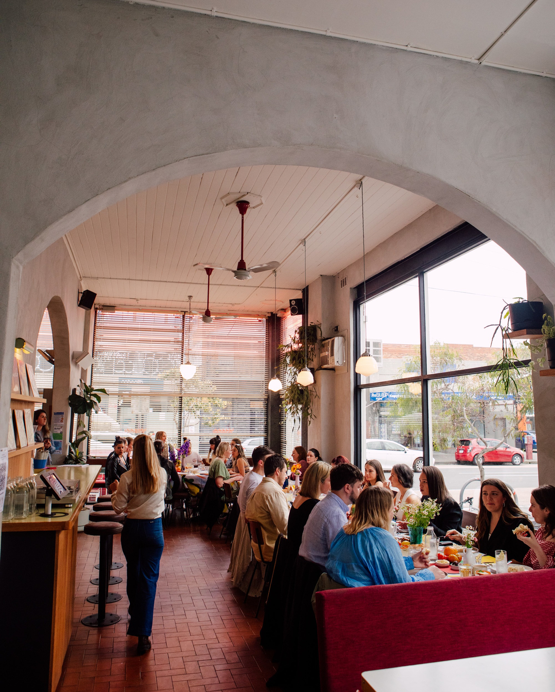
Terror Twilight appears to be less spacious than the Auction Rooms Cafe, which is crucial for the goal of the restaurant’s designers. It has large tables for groups of up to ten customers, which are set not far apart from each other, as shown in Figure 6. The interior gives an impression of a living room due to its decor and lighting that enhance the cafe’s intention to be “more like visiting a friend’s house” (“About 2,” n.d.). I believe that Terror Twilight succeeded at its goal of an atmosphere of a tightly-knit community. I agree with the cafe’s designers’ decision to put decor as a centerpiece of the main room, as I can get behind their idea of a home-like atmosphere after seeing the photos from the location. I assume that this restaurant is always filled with pleasant music contributing to its relaxed ambiance.
Social and Political Qualities
Both cafes were aiming to become not only eateries but also community centers. People who use these locations do not merely seek to satisfy their hunger. Setting up the furniture is not a sufficient condition for creating the desired atmosphere, as it has to be lived by the people for whom it was made. The concept must be brought to life by interactions that support the mood of the interior (Sloane, 2014). For example, while the Auction Rooms Cafe might not fit that many customers, it appears to be spacious enough for at least two dozen people to be served simultaneously. The restaurant has a clear focus on community, that is, the closely-set tables and shared benches at the table row, as seen in Figure 6. Customers are encouraged to interact with each other, and the cafe serves as a catalyst for new friendships. The atmosphere in this eatery promotes interaction and can easily serve as a place for meetings over a cup of coffee.
The second restaurant has a similar approach to creating a sense of community. Although its name may be unappealing to those who do not share the owners’ passion for music, Terror Twilight focuses on creating a friendly, inviting atmosphere and poses as a place to hang out with friends (“About 2,” n.d.). The interior design is created with this thought in mind, as the tables are placed closely together. There are also little to no barriers between tables, allowing customers to group up as they, please. The furniture placement might not be as orderly as in some cafes, giving this place a look of a large dining room or a canteen. The restaurant supports its atmosphere by complimenting it with music from an extensive, ever-changing collection of vinyl records (“About 2,” n.d.). Depending on daily playlists, customers who visit Terror Twilight will have an entirely different experience. I think visitors are more likely to begin a discussion on a topic they are curious about, and Terror Twilight gives musicians and their fans a chance to meet each other under favorable conditions.
These two cafes may share the same audience, as their locations are mere 2.3 miles apart from each other. The restaurants invite these reoccurring visitors by creating specific conditions for interactions between customers, putting people together in conditions favorable for making new friendships. Clients need to be “seduced” by the interior design to behave in a particular manner intended for the location through an overarching concept that is visible in all objects that must complement it (Sloane, 2014). I think that both restaurants succeeded in creating a feeling of fellowship between their visitors, although they used different means to achieve that goal. The Auction Rooms Cafe places its customers together physically in an atmosphere that promotes communication, while Terror Twilight does so through visitors’ shared interests. Their design solutions fit perfectly into a limited space that provides a much-needed resort from the bustling city life of Melbourne. The cafes are limiting their customer bases by focusing on a specific theme in their designs, yet they ensure that they capture a particular audience with great success.
Conclusion
In conclusion, these two locations might share a similar audience and goals, yet they have prominent differences in their approach to interior design. The Auction Rooms Cafe has a more rustic look due to the extensive use of wooden beams and unpainted brick walls. However, it also has visibly more space due to the designer’s approach to lighting, table, and counters placement, making the interior look more open than it is. There is a distinct lack of cluttering decorations, which also adds to the idea of free space. In turn, Terror Twilight occupies a smaller room and has more decorations that further reduce the visible space. This cafe is furnished with more suitable items for a living room that adds to the core idea of a home-like ambiance. In either case, the cafes’ interior design is created to make customers feel at home. This goal is achieved by a friendly atmosphere created by a combination of lighting, decorations, and furniture placement. These two locations present a valuable lesson for designers who aim to capture a specific feeling without having to lean on stereotypical solutions.
References
Abercrombie, S. (2018). A philosophy of interior design. Routledge.
About 2. (n.d.). Terror Twilight Collingwood.
Alapieti, T., Mikkola, R., Pasanen, P., & Salonen, H. (2020). The influence of wooden interior materials on the indoor environment: A review. European Journal of Wood and Wood Products, 78(4), 617-634.
Auction Rooms Cafe | Coffee, Breakfast, Brunch, Lunch in North Melbourne. (n.d.).
Auction Rooms Cafe. (2018). Weekends are for sleeping in, drinking coffee and hanging out at Auction Rooms [Photo]. Facebook.
Auction Rooms Cafe. (2019). When the sun shines, the walls of our cafe disappear [Photo]. Facebook.
Pallasmaa, J. (1994). An architecture of seven senses. In S. Holl, J. Pallasmaa, & A. Pérez-Gómez (Eds.), Questions of perception: Phenomenology of architecture (pp. 40-49). a+u Publishing Co., Ltd.
Sloane, M. (2014). Tuning the space: Investigating the making of atmospheres through interior design practices. Interiors, 5(3), 297-314.
Terror Twilight. (2021). Those couple days between Chrissy + NY all blur into one [Photo]. Facebook.
Terror Twilight. (2022). Who’s still “working from home”? [Photo]. Facebook.
Terror Twilight. (2022). Don’t mind us; just reminiscing about good times and pasta [Photo]. Facebook.
Terror Twilight. (2022). Come inject some soul back into your bones to kick off your weekend [Photo]. Facebook.