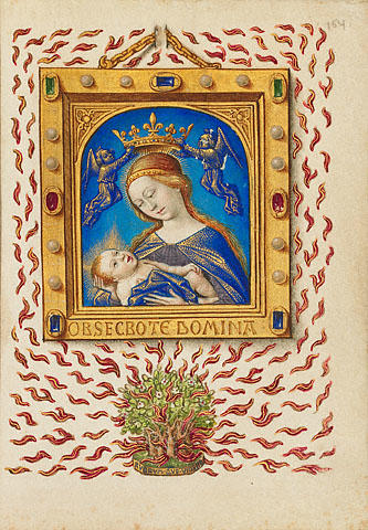
The painting titled “Madonna of the Burning Bush” is one of the illustrations in The Book of Hours. It was made in XV century by Georges Trubert, who was a famous painter and had few apprentices who followed his style. We can see a number, 154, in the right upper corner of the painting, which indicates the number of the page. The words that can be read on the frame, “Obsecro te domina”, can be translated as “I beseech you, lady” (Langston, 47), and points to the prayer, which the painting illustrates. Nowadays the painting is kept in the J. Paul Getty Museum in Los Angeles with the other pages from the Book of Hours. It should be mentioned, that every version of this book is unique, because each of them was made by different artists in different centuries. However, all the books are united by one theme and direction.
The picture is made on parchment, which means that a special carefulness and precision had to be applied to the painting. The technique used is tempera. Besides tempera colors, the golden and silver paints are also used for the picture. The combination of different materials makes the work look rich and complex. The small mild strokes make the picture smooth and accurate.
The picture was aimed at depicting the content of the prayer, which praised the virginity of Mary. Thus, the most important matter in the picture is its symbolism. The bush as a root of life, and the flame as a means of purification, is the basic elements conveying this sense. In addition, the angels carrying a crown above Mary’s head symbolize her spiritual superiority.
Concerning the technique of painting, attention should be paid to the line quality. Trubert uses soft thin lines in the picture, which adds precision and clearness of forms. Another vivid quality of the picture is the rhythm. It is shown by numerous crests of flame of similar shape and color. As for the color value, the author uses both dark and light tones, but the great value difference is avoided.
It should be also noted, that the traditional religious paintings depicted flat surfaces, making the objects look more plain. However, in the analyzed painting we can see three-dimensional figures. Such effect is achieved through using shades and different tones of one color for the objects. In addition, not only the alive figures are three-dimensional, but the painted frame too. The author used numerous shades to show the perspective to the viewers. However, the tongues of the flame remained flat, typically of the pictures of that time.
It can be stated that such tools used by the artist made a great contribution to the paintings of the period.
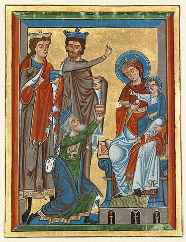
Another analyzed piece of art is called “The Adoration of the Magi”. It is an illustration in a book, which describes the life of Jesus.Such books were typical of that period, and even though they discussed one and the same topics and depicted the same scenes, they all were unique in some ways. The author of the painting is unknown, but it is a well-known fact that it was created in Germany; the presumable date of its painting is 1240. The image depicts men paying homage to the newborn Jesus (The J. Paul Getty Trust, 1). Today the picture is kept in J. Paul Getty Museum.
There are three men depicted I the image. Interestingly, the oldest one stands on his knee, while the youngest is the tallest among all of them. One of the men is carrying the Bible, a traditional attribute of Christian gospels. His finger is pointed up, showing the obedience to God’s laws. The other man carries a gift for Jesus and points to the star that led them to the newborn. Jesus is welcoming the men with a traditional gesture. Mary is carrying a ball, a shape that symbolizes infinity and beginning of life.
The materials used for the picture are tempera colors combined with gold leaf and ink. The picture is rather detailed; however, the proportions of human bodies are not preserved, which is an attribute of religious paintings. For instance, the newborn Jesus has the proportions of an adult man, with ling legs and developed fingers. At the same time, all the three men have extremely thin feet, which would barely carry their bodies. In addition, all the bodies are prolonged. The forms and shapes are simplified, but a great attention is paid to symbolism. An interesting detail in the picture is the setting in which Mary and Jesus are shown. Unlike the poor conditions described in all the gospels, the surrounding is well-decorated and rich (The J. Paul Getty Trust, 1).
The significance of the picture is hard to overestimate in the religious world, as it contains the traditional attributes of Christianity and depicts a classical scene from life of Jesus.
Concerning the technical aspects, the distinctive attribute of the image is the shapes used in it. The artist uses mostly geometrical shapes, which include strict lines, angles and sharp forms. This quality is typical of religious paintings in Christianity. Another important feature is movement: every depicted figure is rather dynamic, which makes the composition lively. Concerning the colors, the author uses complementary colors, such as blue and orange, which creates a visual contrast in the image.
What is more, attention should be paid to the frames. The artist made a double frame. One of the frames embraces the whole picture; the other serves as an element of interior decor. We can see the men’s feet on the inner frame; in addition, the throne where Mary and Jesus sit is also beyond the second frame. Thus, the artist made attempts to show the perspective by depicting the surfaces of different levels. In addition, the frames have different colors for the vertical and horizontal lines.
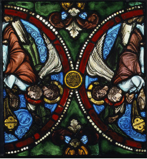
The next artistic work to b discussed is a magnificent stained glass. The author of the Panel with Censing Angels is unknown, as far as it was not a private, but a public property. Most possibly, a group of artists worked on it. Due to one of the sources, the panel is known to be designed for a French church of Saint-Étienne located in Troyes (West, 1). In fact, the panel was not planned as a separate work, but belonged to a series of stained glass produced for the church decoration. However, after the church was annihilated in the flow of French Revolution, the panels that remained were owned either by private collectors or museums. The Panel with Censing Angels is now kept in the Metropolitan Museum of Art. Even though it cannot be viewed as a part of the greater project, it can be said with no exaggeration that the Panel with Censing Angels is a stylistically complete piece of art, which can be analyzed as a separate creation.
It is a well-known fact that the technique of creating the panel was rather complicated and time-consuming. Every object of the picture had to be first drawn, and then cut out of the glass of a certain color. The drawings were made on a wooden panel, which allowed working with glass easily and safely. The colorful glass had to be of smoth texture and equal thickness; otherwise, the stained glass would be inaccurate. The smallest details, such as eyes, were drawn by the artist with special enamel and then fixed by heating. It can also be seen on the panel that all the lines are black and thick; this is the effect caused by the strips of lead used to join the pieces of colorful glass (Kleiner, 195). Obviously, using glass as a media for such panel demands accuracy and experience. In addition, every stage of working with it demanded certain skills, which points to the high possibility for a large group of people to be involved in the process of creating one panel.
This stained glass of the late XII century represents a paramount example of an element of Gothic architecture, where the small Romanesque windows were replaced by big stained glass windows. It is a typical stained glass of the period, where the classical themes and techniques are used, which determines the merit of the panel as of a cultural heritage of Gothic period. It can be stated that the panel is made on high level by a qualified master.
One of the most important advantages of the panel is its unity. The artist managed to situate the objects in such a way, that they joined in a harmonic composition. The unity is partially achieved by the symmetry, highlighted by the two semicircles with similar pictures. Interestingly, the work is based on numerous contrasts: the exquisite details are contrasted with their thick black contours, and the warm colors are contrasted with purely cool ones. Thus, placing vermillion red next to light blue the author makes the work look more mosaic. In addition, apart from pure hues, traditionally used in stained glass, the artist mixes different colors in order to get olive green for the background and ginger for angels’ clothing.
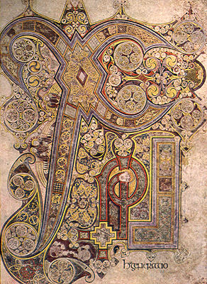
One more piece of art that is to be examined in this paper is the Chi-rho-iota page, folio 34 recto of the Book of Kells. It is a striking masterpiece of an unknown Scottish author, which belongs to late IIX century. Presumably, the author of the page was a monk, as far as the Book of Kells was designed and produced by the only literal people of the time, monks. Today the page as a part of the book is kept in the Library of Trinity College in Dublin, where it appeared in 1661 (West, 1).
The image depicts the three letters of Greek alphabet, which are needed to start writing the word “Christ” (Lubbock, 1). The letters are painted on vellum with tempera. It should be noted that the painting is extremely accurate, and each detail was carefully planned and represented. Only thin brushes and slow mild strokes could lead to such a result.
The forms and shapes used in the painting are those that were later typical of Gothic art. Such predispositions are obvious in the curves and complex patterns.
The peculiarity of the piece of art is that on one hand the letters are decorated, but on the other hand the decoration includes letters. The numerous curves and organic shapes make it difficult to distinguish the dominant, either it is the pattern or the letters. The colors used are mostly warm, and the color value is light. This creates an impression of a sole picture with no distinct lines. However, such effect can be a result of the page’s age, as far as any paint becomes pale with time. What is more, while all the used colors are warm, the biggest letter has a very thin contour, which is of a light blue color. This makes the letter more distinct and noticeable in the general image.
Thus, it can be noted that the eye of the viewer is another instrument needed to see the picture and its content. Viewed from distance, the work seems to be just a pale stain; however, with further examination one may find a number of fascinating details, which constitute a great composition. Depending on how attentive the viewer is, he or she can catch more or less details. The important feature is that the harmonically composed curves flow one from another, change from floristic into geometrical, and seem to have no ending and no beginning. This also points to the work’s unity.
It has to be said that the Chi-rho-iota page is a unique painting, which is impossible to reproduce due to the complexity of its patterns. In addition, the page shows that even in conditions of absence of numerous tools and materials for painting, which are available now, people managed to create masterpieces. This makes the page extremely significant from both the cultural and artistic perspective.
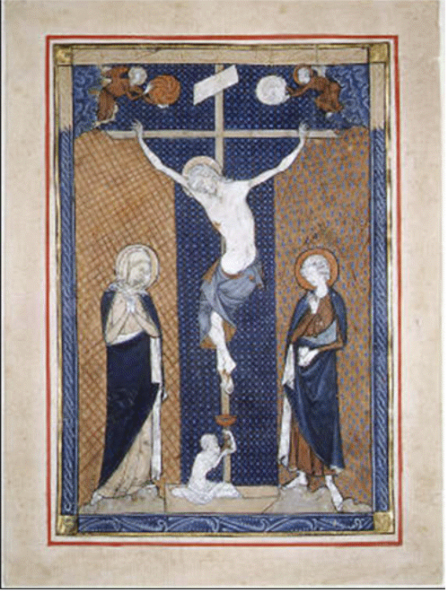
One more work to be analyzed is the painting “Leaf from a Missal”. Missals were and still remain an important element of Christian culture, as they are taken to the piligrimage by the believing peope. However, the analyzed page was not designed as a part of a book for daily usage; it was a special edition, wand a lot of effort and money were put in its creation. The page is dated by nearly 1270-1290 in different sources. Its author is unknown, but the page belongs to a French missal and represents the Gothic style of painting.
The religious character determines the page’s content and manner of painting. There is Jesus depicted hanging on the cross and bleeding. Next to him, Mary and St. John are standing from both sides. There is one more figure, which is the body of Adam, who gathers the blood flowing from the Jesus at the bottom of the cross. Interestingly, the figure of Adam is much smaller than those of the other characters. Such violation of proportions points to the mortality of people and their spiritual misery in comparison with the other depicted figures.
The basic material for the painting was parchment, and the tempera colors were used. It should be noted, that the color scheme is rather limited, which makes this painting different from the similar works of the time. The author uses only three colors: while, brown, and blue. This may serve as a symbolic device, where brown denotes the ground, blue denotes heaven and white stands for the air. However, the palette with few basic colors is a distinctive feature of icon painting. The color intensity is not very high, which makes the viewer involve associative thinking more than the visual receptors.
There is also a vivid pattern in the image. For instance, the shape of the cross is repeated by the background lines, and the body of Christ also resembles the shape of cross. The pattern is also achieved by the background, which is covered with small little spots. They also serve as a tool for achieving contrast: the texture of the front figures is plain, while the texture of the background is complex because of the patterns. That is why, “The figures are dramatically isolated against alternating panels of diapered and tessellated backgrounds” (Frazer, 1).
One more important detail to focus on is the pair of angels, who are placed in the upper corners of the page. One of them carries the sun, another carries the moon. Traditionally, the sun is on the right from Jesus’ perspective. The angels symbolize the eternity and the cyclic nature of life, where the day changes the night, just like the joy changes the sorrow. This means that Jesus’ suffering will be sooner or later changed into relief.
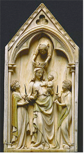
The last piece of art to be discussed in this paper is the plaque called “The Virgin and Child with Angels”. It is a great example of Gothic ivory. It belongs to the period of 1320-1330, but its author is unknown. The plaque is known to have constituted a part of a triptych, but the other two parts of it were lost (Rumsey, 1). It should be added that plaques were a very popular element of interior decoration at that time. They did not demand much space like big sculptures, and were much more interesting and dimensional than usual paintings.
Concerning the material, the artist used ivory for the sculpture. This material is hard to work with, but it belongs to the luxurious materials. It looks very rich and gorgeous, and therefore is used in decorating the most demanding interiors. In addition, the ivory was also gilded in certain areas, such as on the surface of clothing of the angels (Rumsey, 1).
It has to be said that the artist demonstrated a skillful and accurate approach to sculpture. The mild shapes and natural look of all the details is a result of hard labor. In addition, the actual texture of the work is very smooth, which also points to a number of operations made with every detail. This makes the plaque a significant object in the world of Gothic sculpture.
The most important aspect about the sculpture is its unity. All the figures have postures that point to their interaction; none of the characters is left aside. The complex frame puts all the figures in one limited space, which also contributes to the work’s unity. Another significant property is movement. The only purely dynamic figure in the sculpture is the angel, who carries a crown above Mary’s head, which attracts the viewer’s attention. However, this detail also has a reverse effect: the angel above Mary is depicted from an untraditional perspective, where only his back and hands are viewed. Thus, he looses the image of the angel; his clothing looks like the clothing of an ordinary man, which makes the figure rather confusing.
Works Cited
Frazer, Margaret “Leaf from a Missal [French] (1981.322).” Heilbrunn Timeline of Art History. New York: The Metropolitan Museum of Art. 2006. Web.
Kleiner, Fred. Gardner’s Art Through the Ages: A Concise History of Western Art, 2nd Edition. New York: Wadsworth Publishing, 2010.
Langston, Scott. Exodus through the centuries. London: Wiley-Blackwell, 2006.
Lubbock, Tom. “Anonymous: The ‘Chi-Rho’ from ‘The Book of Kells’ (c.800)”. The Independent. 2008.
Rumsey, David. “France, Paris, 14th century.” The Amica Library. 2000.
The Adoration of the Magi. The J. Paul Getty Trust. 2001.
The Gospels in Medieval Manuscript Illumination. The J. Paul Getty Trust. 2006.
West, John. “Irish Treasure at Austin College.” Austin College. 2000. Web.