Introduction
The given formal analysis will primarily focus on Byzantine Art, where the emphasis is put on more abstract elements rather than a naturalistic one. The image is a mosaic, where it brings distinctive features to the imagery, such as depth. The depiction, as a part of Byzantine Art, consists of mostly golden yellow coloration with white and black elements, proportions are greatly focused on centering everything around the key figures, and lines are smooth and distinctive in order to separate the figures from the background. Therefore, the given form of art mainly accentuates an observer’s attention on the depicted people or holy entities, such as Christ, and strongly exhibits their superiority through their wealth and higher state of being.
Color and Background
One of the most critical aspects of the coloration of Byzantine art is its excessive use of yellow color, which equated to gold and a sign of wealth. Since the Church was an institution with vast amounts of resources during the Byzantine period, it expressed its wealth through the imagery by depicting key figures covered in gold on a golden background. In the case of proportions, the central figures are Christ and Mary, who are put in the middle of the image. The kings or rulers are put on two sides of the image in order to show their inferiority towards the former figures, but the image still is able to draw attention towards them. The background is a golden color to signify the wealth and power of the religion and the corresponding Church. The heads of all figures are distinctively circled to represent their holiness, and even Christ is not submerged in the black mantle of Mary. In addition, the majority of attention is drawn towards the upper half of the image since the faces are located in the given section.
Lining and Mosaics
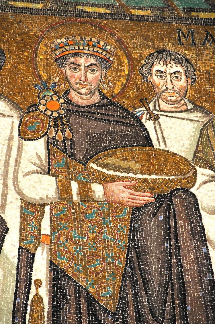
In the case of a lining, the figures are prominently outlined through bold and smooth lines in order to signify their overall importance. However, objects lack distinctive lines because the present held by Constantine blends with the golden background. It is possible that it was done in order to convey that these gifts are part of the Christian and the Church’s wealth. The facial expression of the figures exhibits seriousness and grimness, which are key elements of Byzantine Art. The latter tends to avoid adding emotional elements to the images in order to preserve neutrality, where holy figures’ personalities are not ruined by a depicter. Since the image is a mosaic, it lacks the smoothness of a surface, which provides the depiction with depth. The mosaic structure also limits the continuity of coloring, which is the most prominent in the black mantle of Mary, which contains white or yellow stripes. A similar image can be seen in Figure 1, where the mosaic structure is more prominent, and lines are distinct for figures since it is also Byzantine Art.
Conclusion
In conclusion, the given image is a part of Byzantine art, which utilizes mosaic format and predominantly uses golden background as a demonstration of the wealth and power of the Church. The key figures have a neutral look lacking emotions, whereas lines and proportion are indicative of the identified art form. These elements work towards making sure that figures draw the highest amount of attention by making their outlining prominent and faces distinct.
