While an infographic is the visual representation of data, ideas, or knowledge to convey information fast and effectively, chartjunk is the visual representation in graphs and charts that adds no significant value to the presented information. In order to enable effective data presentation, it is important to make them stand out by having a clear relationship between different variables and avoiding data distortion. Irrelevant information does not only increase the complexity of data but may also affect the intended impression. The visual representation must be simple but with detailed and relevant information regarding the subject of interest.
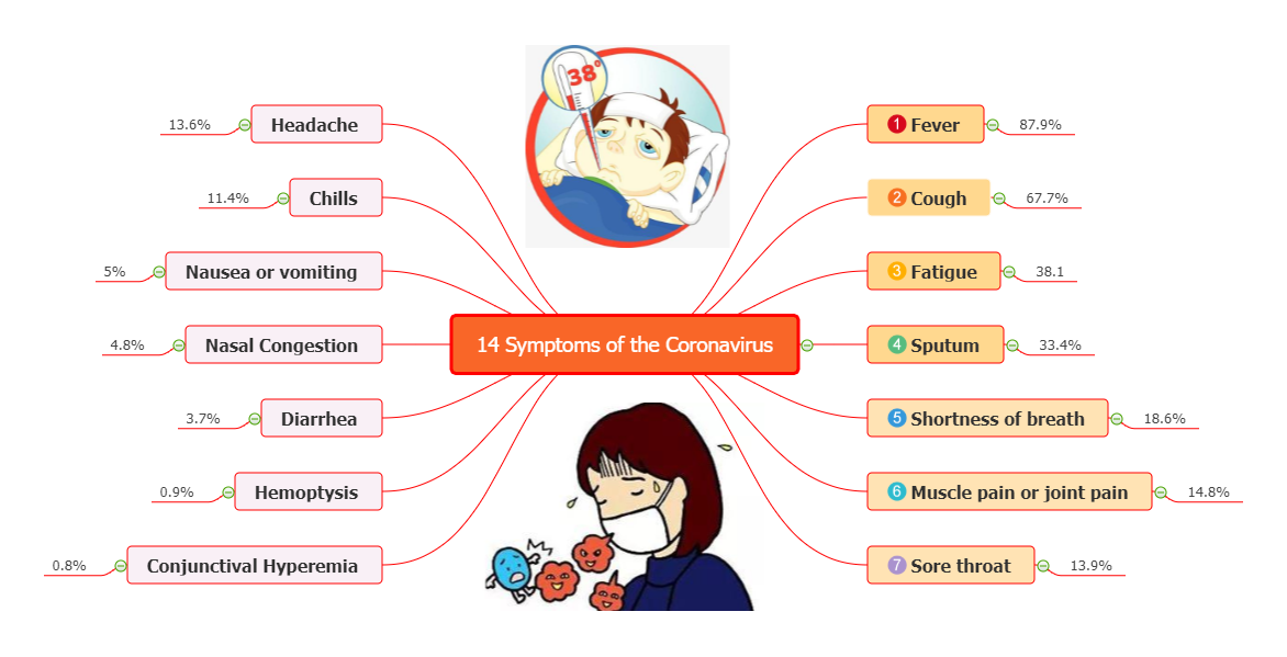
Infographics serve the same purpose as silhouetting, they do not present irrelevant information. Infographics are crucial in making communication easy to understand, as shown in Fig. 1. People prefer it for presentation since it is easier to comprehend than reading texts. It consumes little space since it uses images worth a significant number of words (Lynch, 2022). Silhouetting, on the other hand, removes unnecessary features on the image background, thus making it neat and simple to understand.
Chartjunk is one of the visual representation tools but very contentious. It is over “decorated” with information or colors that add no value and might bring confusion instead, as shown in Fig. 2. In order to avoid creating chartjunk, it is important to understand the Data-Ink ratio. It is equally critical to understand the kind of message to convey in figures and use relevant captions to provide more information; this will help avoid unnecessary information (Ćurčić, 2019)). Cropping operates the same way as chartjunk; both aim to ease visual representation but still end up with unnecessary information. Cropping an image does not eliminate non-important features appearing from the background completely.
References
Ćurčić, M. (2019). Chartjunk and why to avoid them. Qualia BusinessQ Software. Web.
Lynch, A. (2022). Benefits of infographics. Edraw. Web.