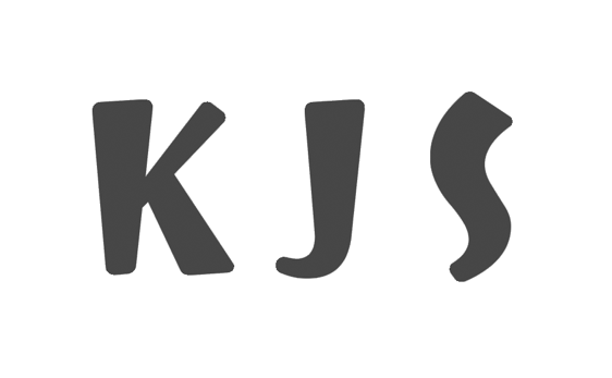
The logo design procedure is characterized by the need for precise forethought, critical evaluation, and validity of each decision made. To make a brand logo, whether personal or company, ordinary, similar to the others, means to lose the competitive battle in advance because customers remember only the ones that stand out. In this paper, I decided to follow the path of the most famous brands that follow the concept of minimalism: Nike, Adidas, Google, Facebook. These companies are an example that even ordinary graphics can become a logo, which means that no additional meanings need to be sought (Spyre Studios, 2017). Also, I wanted to show that my personal brand exudes positivity, trust, and friendliness, and round shapes are the best solution for that. If the logo is too serious, clients might be intimidated by such a specialist with a pretense of elitism. Finally, when it comes to color choices, it was critical to address their symbolic meanings. Tranquility, deep trust, healing, and confidence are perfectly conveyed by the color blue, which is precisely what should describe me as a brand (Tailor Brands, 2021). Using all of the above rationales, I produced this logo:


These are my initials that can be used on printed products, as shown in the examples below. It is an easy, uncomplicated and memorable logo that does not require serious thought on the part of the consumer. In addition, the font used creates some wordplay when KJS can be read as KIS, a distortion of the word KISS. Consequently, variation will be created around the logo, which will serve as a positive advertisement for the brand.


References
Spyre Studios. (2017). The company name on a logo: How to make it work. Spyre Studios. Web.
Tailor Brands. (2021). The meaning behind logo colors. Tailor Brands.