Introduction
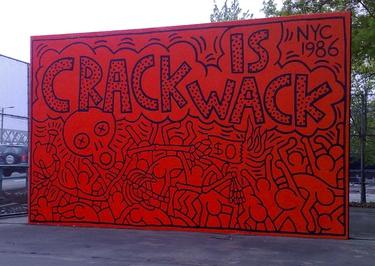
The paper will consider the painting “Crack is Wack” which Keith Haring created. The artist used catchy slogans to make a quick and effective statement. One of the most prominent examples is “Crack is Wack”, a mural about the crack cocaine epidemic and its consequences in New York City (Sheff 4). Haring uses bold lines, bright colors and quirky creatures in “Crack is Wack” to grab the public’s attention. Thus, the artist attempted to increase awareness of the mental and physical harms and the financial hardships that crack can impose on people.
Analysis of Elements and Principles
The artist used deceptively simple imagery and text to convey the main point of the painting to the general public. To spread the message to the masses, the author used a personal style, “performing in public… to distribute his art to a wider public” (Buchhart 2). Haring chose to portray the drug addiction problem through bright colors and clean and simple lines. Thus, to emphasize and simultaneously capture viewers’ attention, the author created a picture in orange colors with distinctive black lines. This appealed to the eye of all who viewed it. It is essential to mention that the choice of color allows for visually simplifying the perception of the social phenomenon (Haring). This is because the artwork is easier for the human grave compared to the palette, where the red color is on a black background. In addition, the color scheme contributes to a sense of chaos at the bottom of the artwork because of the intertwining of different forms of lines.
Haring applied the principles of pattern and repetition to the painting. The pattern of the skull is a symbol of death, which is inevitable if people do not stop consuming drugs. The repetition of the symbols emphasizes the urgency of the problem: the last money will expire soon, and the person will be left unprotected. The artwork has a textual inscription in the foreground to clearly explain the main emphasis on the problem of drug addiction. Crack means a cheap form of drugs that leads to death, and wack in slang means the substance’s harmfulness. Haring uses the principle of repetition to text in a drawing. The text, depicted in the foreground, is smoothly integrated into the image’s background (Haring). This ensures compliance with the principle of unity and the creation of a coherent idea. Harring used the concept of form, which can be observed when the lines close in and form complete figures. The author chose the concept that each line combines to create a form. In turn, the shapes together demonstrate an outline that conveys the idea of the painting.
The author also applied the principle of movement, forcing one to examine the picture gradually. In this way, viewers can establish the causes and consequences of drug consumption. For example, from the skull, the person’s gaze moves down the skeletal body to the outstretched arm. After viewers have seen a dollar, their gaze focuses on the bottom of the picture (Haring). Next, viewers can see interwoven human images that cannot be separated from each other. They are in constant motion, which creates an effect of chaos. Addicted people are no longer in control of themselves and are chaotically searching for drugs, as staged “instead of opening your mind, it shuts it and makes you dependent on whoever’s providing you with the drug” (Sheff 4). Thus, the principle of movement creates a sense of instability in drug use.
Conclusion
Therefore, bright colors and intertwined lines capture the viewers’ attention and force them to reflect on the proliferation of drugs in society. At the same time, the moving shapes enable the demonstration of the negative consequences of drug use. The emphasis on the opioid crisis in the community is shown through the foreground and background of the painting. Hence, the drugs is portrayed as a negative social phenomenon contributing to addiction and death.
Works Cited
Buchhart, Dieter. Keith Haring: The Political Line. Prestel, 2014.
Haring, Keith. “Crack is Wack.”
Sheff, David. “Keith Haring, An Intimate Conversation.” Rolling Stone, vol. 1989, pp. 1-6.