Introduction

Last year, the Louvre was visited by many millions of people, firmly entrenching its status as the most visited art museum in the world. The Louvre’s collections include the finest works of art through the mid-nineteenth century and exhibits of ancient civilizations. Naturally, the new generation is not burning with a desire to unravel the mysteries of the past and get involved with art. Therefore, the more progressive museums of the world have created an interactive version of their halls. Currently, people have the opportunity to visit museums and enjoy the best masterpieces of art in real-time online. Accordingly, visiting virtual museums will help one appreciate art from a distance and have a new experience. Thus, it is essential to discuss the visual elements and design principles of the Mona Lisa painting, which can be observed in the virtual museum of the Louvre.
The Visual Elements
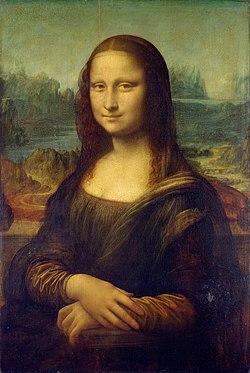
That the painting was created by Leonardo Da Vinci, almost no one doubts. This portrait uses the sfumato method invented by the master. This can manifest itself in the extremely subtle transition from light to shadows (Da Vinci). A subtle haze shading the lines makes the Mona Lisa almost alive. One part of the work that affects all viewers is Mona Lisa’s smile. Its presence and shape change depending on the points of observation. It is thought that it, for all its mystery, embodies the impossibility of finding a foothold in human feelings (Marsili et al.). Moreover, Leonardo’s canvas has small dimensions, 53 by 76 centimeters, and generally appears dark (Da Vinci). Although it may appear contradictory, this painting has a sense of movement.
The fog-shrouded background, the bridge across the river, and the colors used by the artist create a sense of naturalness and liveliness. Leonardo declined to use a clean background, as he had previously done (Da Vinci). The positioning of the figure from the waist and also the position of the arms is a new style of the artist. According to experts on texture, Da Vinci used soot and a stencil to transfer the image to canvas.
Principles of Design
It is significant to mention that the artist uses balance to distribute the weight evenly in the painting. Both sides of the Mono Lisa are symmetrical and have the correct proportions, which creates the effect that the woman in the picture is alive (Da Vinci). This significantly influences the harmonious appearance of the picture and conveys the woman’s feeling. The principle of emphasis allows one to focus the attention on the woman’s face and emphasizes it as the focal point of the painting. In Mona Lisa, Da Vinci creates rhythm in the folds of the woman’s sleeves to create a sense of movement (Mandeep and Campbell). It is also expressed in the overall colors and shapes of the painting. It should be considered that the map’s scale is small for that, but despite this, the author managed to convey a mastery of techniques. The artist uses homage to describe the secondary or accentual elements of the artwork (Faktorovich). Accordingly, a woman is depicted in the foreground and nature in the background, harmoniously emphasizing the picture’s focus.
Conclusion
Thus, Leonardo Vinci used basic design principles and visual elements to convey the theme and atmosphere of the painting. At the same time, during the online viewing and tour of the Louvre, visitors can also view the painting from different angles and scales. They can observe the picture and read or listen to explanations about the technique of execution. New techniques enable art lovers to have a new experience from the comfort of their own homes.
Works Cited
Da Vinci, Leonardo. Mona Lisa. 1503. The Louvre Museum, Paris. MoMA Learning.
Faktorovich, Anna. “The Water Behind Mona Lisa.” Pennsylvania Literary Journal, vol.12, no. 3, 2020, pp. 57-201.
Marsili, Luca, et al. “Unraveling the Asymmetry of Mona Lisa Smile.” Cortex, vol. 120, 2019, pp. 607-610.