Judith Beheading Holofernes
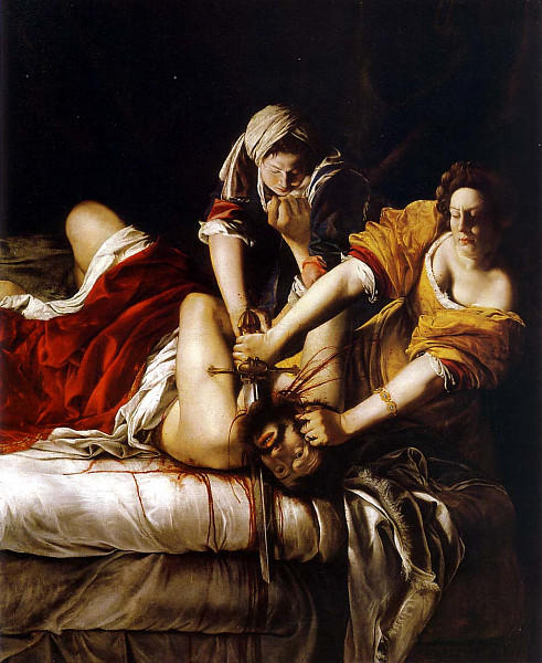
The first work of art to be analyzed in this paper is called “Judith Beheading Holofernes”. It is an oil painting on canvas, which belongs to Artemisia Gentileschi, an Italian artist, who created this painting in 1620. It depicts a scene from the Old Testament when an Israel woman Judith and her maid kill Holofernes, an enemy of their nation (Kleiner, 300). The scene was most possibly preferred by the female painter because it involved the woman as the main positive character.
The date of the painting’s creation, as well as its thematic background, point to the fact that the work belongs to the baroque style. The aim of the painter was not only to present the scene of the murder but to make it as dramatic as possible; all the possible tools were involved to make the viewer feel what is happening on the canvas.
The fact that proves the intention of the author to make her work more dramatic is that the analyzed work is the second version of the same painting. The first “Judith Beheading Holofernes” was painted about 6-8 years earlier, and was almost identical to the particular one (Parker, 1). Then a question occurs: why did the painter need to redo the previous work? Obviously, her aim was to improve the painting and make it more impressive.
The most noticeable details add to the “Judith Beheading Holofernes” of 1620 are the jets of blood that can be seen in the compositional center of the painting. These details seem to make the whole painting appalling and rude. Interestingly, this cold brutality contrasts with the smooth and light manner of painting, typical of the period.
The contrast can also be seen on the level of lighting for different parts of the image. The well-lightened bodies of all the three characters are shown on an almost black background. Such contrast creates an effect of mystery. In addition, it was necessary for expressing the night time, when the events were happening.
It should also be noted that the painter used a warm palette for the painting, with the yellow and red hues dominating. The color intensity is high in the clothes of the main characters; in the rest of the painting, it is lower. This helps the viewers to identify the center of the composition quickly. The painting in general can be referred to as “compositionally intense” (Salva, 1). This is due to the interlaced arms of the characters, which create a number of parallel diagonal lines in the picture and make the whole composition dynamic. The jet of Holofernes blood is another dynamic line, which is much thinner and therefore easy to notice.
One more point about the painting is the solution for the background. The painter made it very dark; however, the detailed analysis shows that it is painted in warm deep brown tones, which supports the general palette of the work. In addition, the space of the room is shown by some purely lightened drapery in the background.
All in all, it can be stated that Artemisia Gentileschi had put a lot of time and effort into the painting. Harmonic in general and perfect in every detail, it serves its main purpose: impressing the viewers. This was the final and the most successful version of the “Judith Beheading Holofernes” by Artemisia Gentileschi.
Glorification of Saint Ignatius
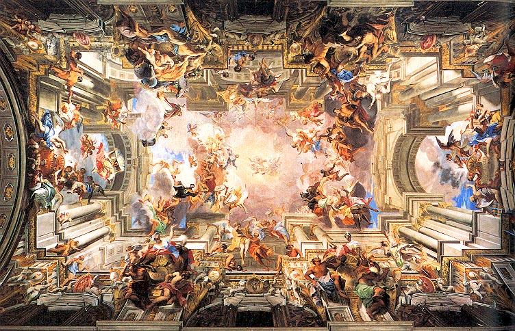
The next painting to be analyzed in the paper is the fresco on a ceiling of the nave of Saint Ignatius in Rome. Its author was Fra Andrea Pozzo, and the fresco is called “Glorification of Saint Ignatius”. The date of its creation is 1691-1694, the years of the bloom of the Italian Baroque style. Obviously, the work belongs to the Baroque style, as far as it is not only beautiful but also represents a number of ideas.
The painting was created for the order of Jesuits, where its author belonged (Kleiner, 301). The central event in this complex work of many levels of composition is the meeting of Christ and Saint Ignatius. However, despite their importance, the characters do not form the compositional center of the fresco.
The idea of the composition was to make an impression that the ceiling has one more dimension and is connected straightly with the heavens. With this purpose, Fra Andrea Pozzo paid a lot of attention to painting the elements of architecture, typical to those present in the nave. The painter uses the same shapes and colors for depicting arches and columns as in real life, which creates an optical illusion. Another trick used here is the knowledge of perspective. The painter made all the figures in the fresco gradually changing their size from big to small, which created an illusion that the smallest figures are the most distanced. One more element that helped Pozzo to deceive the viewers’ eyesight is the precise depiction of lights and shadows. Indeed, the sky on the painting seems to be glowing, and it is used as a source of light for all the depicted figures. Correspondingly, the “lower” parts of the composition are less and less lightened. This is also an effective tool for creating the desired effect. The historical facts say that “Glorification of Saint Ignatius” was a very accurately planned project, studied by Pozzo for several years (Gagliardi, 1). Thus, the result of his hard work is astonishing.
On one hand, it is obvious that analyzing every figure of Pozzo’s fresco is useless, as far as all the depicted characters serve the purpose of forming the composition. Only the central figures belonging to Jesus and Saint Ignatius are logically significant. Jesus seems to pour the light into Ignatius’s heart. This light spreads in four different directions. As Pozzo explained himself, the directions are the four corners of the world, and people standing there symbolize all the nations of the planet (Reid, 1). At the same time, on the other hand, there is no doubt that the sense of the painting is being completed by every figure present in it. The main instrument Pozzo used here is symbolism, which makes it possible to stare for hours at the ceiling and trying to read the signs.
Concerning the artistic value of the fresco, great attention should be paid to the movement. The painter placed all the figures in a way that moves the viewer’s eyes to the center of the painting, or “up” in the sky. It should also be noted that the light warm hues are mostly used for the fresco. However, the deep cold blue appears at every level of the composition in some small details. However, it does not spoil the general view but makes the composition more rhythmical. The rhythm is also supported by the repeated forms of the elements of architecture and forms and postures of the figures.
It can be said that the fresco is being analyzed for four centuries now, and even though all its secrets are studied, it still remains mysterious and attracts the attention of artists and casual viewers. The work of Fra Andrea Pozzo can be called one of the most impressive of the works of the sixteenth and seventeenth centuries.
The Entombment
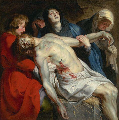
One more painting that represents Baroque style is “The Entombment” by Peter Paul Rubens. Created in 1612, this oil painting was designed for an altarpiece for one of the Catholic chapels (J. Paul Getty Museum, 1).
The painting depicts the traditional scene from the Bible when the body of Jesus is mourned over in his tomb. Besides Jesus, the present characters in the painting are John The Evangelist, Mary Magdalene, Mary, and Jesus’ mother (J. Paul Getty Museum, 1). The aim of the painter was to show grief and pain and to make the viewers feel these feelings too. The proof for this is an unusual approach to composition: Rubens only depicts the figures and leaves very little space for the background and surrounding.
Therefore, the characters look a bit clustered in such a small space. However, this also serves another purpose: due to the absence of the surrounding, the viewer automatically focuses on the depicted figures, and on the body of Christ in particular. This creates an effect of striking truth, which is rather impressive and evokes certain emotions.
A peculiar thing to be discussed about the painting is the choice of colors by the artist. Rubens has an original approach to the combination of hues, and it is hard to say whether the general palette is warm or cool. The reason for this is that even the cool objects have some warm zones. For instance, the dead, blue, and grey body of the Christ has some warm tones of ochre in the lightened areas. The same phenomenon is observed with his mother, Mary, who is wearing a cool black cloak with a white hood expressed with warm colors.
The only totally warm figure in the painting is John The Evangelist, who is wearing a red cloak and has it supported by blushes and a warm blond-brown head of hair. The colors in John The Evangelist’s clothes are the most intense. Such choice of colors for this character serves a double purpose: first, the blushing face of John The Evangelist creates a contrast with the dead body of Jesus, and second, the red cloak serves as a background for the body of Jesus and therefore makes the blood on his body more vivid.
It should also be noted that the posture of every character is even more expressive than their faces. In addition, the chosen posture of Jesus suggests that he “fills in” the painting, which makes him an obvious center of the composition. Another interesting detail of the composition organization is that Rubens managed to find a different direction for the glance of each of the characters. Their heads do not repeat each other’s angles of bending, which points to the fact that the painter avoided the parallel lines in his work. This was made with the purpose to make the composition more dynamic, even though there is no obvious movement in it.
The depiction of the Entombment as a classic scene from the Bible was often represented by painters and sculptors of all the times. The painting of Rubens is special because of its simplicity in performance, and at the same time with the complexity of the design. Rubens involved all the possible tools to make his painting dramatic, and he definitely was successful at it.
Isabella Brant
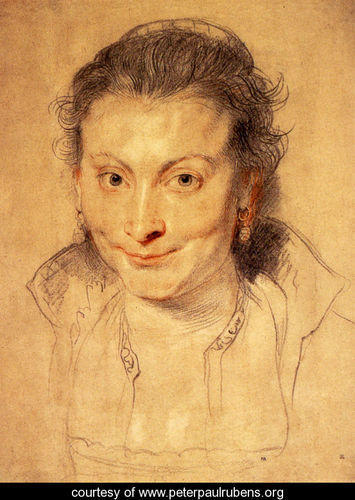
The next painting to be discussed in this paper belongs to the already discussed artist, Peter Paul Rubens. It is the portrait of his first wife, Isabella Brant, which was drawn at about 1620. The period of the work’s creation points to the Baroque style; however, the materials used and the content of the work do not correspond to this style. Rubens made a portrait using colorful chalks, and it depicted a face of a woman with no particular expression. Thus, the work is not dramatic, which is typical of Baroque paintings.
However, while the portrait reminds of a sketch, at first sight, the face of the woman is drawn to perfection. While some elements of clothes and decoration in the hair are just outlined with thick lines of grey chalk, the face is complete both in sense of shapes and colors. In addition, the hair and clothes reveal the strokes of the chalk, while there is no sign of sharp strokes in the face. Thus, the texture of the face is smooth.
The two basic tools used to create the portrait are color and line. The lines are thin and accurate, wavy in the hair section. The colors are warm. To be more precise, the yellow paper and the tones of red chalk make the impression of warm colors used. Rubens mostly plays with light, highlighting some areas with white and making shadows with dark grey. Only some accents are set with the help of red chalk. It makes the smile more lively, eyes more expressive, and ears darker. The only black areas in the portrait are the pupils and nostrils. They were probably additionally painted with ink (Van Camp, 1).
It should be said that the painter paid much attention to the muscles of the face. With the shadowing he represents even the smallest details of the woman’s mimics, making her look alive and appealing. In addition, while there is no background for the figure, the artist added some shadows on the collar and behind the woman’s head. These shadows make the head look three-dimensional and real.
The head of the woman is placed not in the very center of the page, but a little higher. Rubens left more space in the lower part of the painting and less space in the upper part, which means that he wanted the face to catch the viewer’s eyes. In addition, the painter made the eyes of the model very vivid; they are looking straight into the viewer’s eyes. However, despite this fact, eyes are not the main detail of the painting. The face is perceived as a sole figure, which proves the unity of the image.
The analyzed painting is interesting because of the personal investment of the painter in it. While the characters painted by Rubens are not much expressive, this face has a lot of subtle emotions hidden behind the well-presented mimics. In addition, the depicted face expresses the attitude of the artist to its owner, which is obviously warm and caring (Finch, 1). Rubens managed to show the details he was watching for years in one portrait, revealing the character of the woman.
Allegory of the Planets and Continents
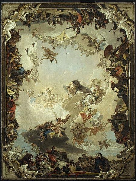
The author of the next painting is a famous Italian painter, Giovanni Battista Tiepolo. The discussed work of the artist is a sketch for his “Allegory of the Planets and Continents”. The year of its design is 1752. In the same year, the artist presented the sketch to a German bishop, Carl Philipp von Greiffenklau. The sketch was a previous version of a ceiling.
Talking about the stylistic orientation, it should be mentioned that the painting belongs to the Rococo style. The scene showed in the work depicts a famous mythological character, Apollo, who is about to travel the sky. There are also numerous other mythological characters and other creatures, such as horses and birds. The composition of the sketch is built on the perspective. It is aimed at creating the visual effect of depth. That is why, the painter used several levels of composition, each corresponding to a certain distance.
Interestingly, with the growth of the distance, the number of characters depicted decreases. Therefore, the last level only contains a clear sky. This creates an impression of an airy composition, despite dozens of figures contained in it. The same is with the colors and lighting: the closer an object is to the viewer, the most intense is its color and vice versa. The more distanced the objects are, the more lightened they are. The most distanced figures seem to dissolve in the sky. This also creates the impression of a frame; all the dark figures in the front seem to be just a frame for the central part of the painting and Apollo in the center of it. The additional frame of the composition is constituted by the pairs of figures in every corner of the painting.
The placing of the numerous figures in a certain order is not chaotic in this painting. Tiepolo used a lot of symbols and allegorical images to create a meaningful picture. For instance, the painter drew planets in the form of deities next to the main character, and the figures in the corners of the image serve to show the sides of the world (Magister, 1).
It should be noted, that the form of the sketch suggests leaving the details unfinished. In addition, the shapes are shown figuratively, which means that only light and shadows are shown, but the semi shadows are omitted. For the same reason, the expressiveness of the faces in the painting is also hard to notice: only some of the figures have sketched eyes or noses.
Concerning the colors used, Tiepolo uses a warm palette based on light ochre. Even the bluish tone of the sky, which is supposed to be cool, is in fact warm. Interestingly, the painter does not use pure hues; all the colors are complex and well designed.
The work of Tiepolo made after this sketch is a precious heritage for the artistic world. The sketch gives us an opportunity to analyze the development of the great project, and predict the results. It should be said that the form of the sketch did not prove an impediment to the work’s complexity and finitude.
The Milkmaid
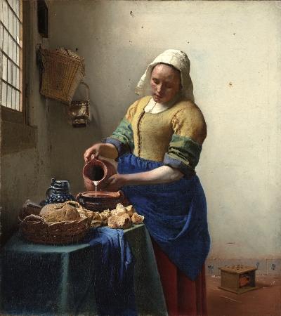
The next, and the last painting analyzed in the paper belongs to a recognized Dutch painter, Jan Vermeer. It is one of the most famous oil paintings of the author, called “The Milkmaid”. The approximate date of its creation is 1658-1661.
The style of the painting is Rococo, although some elements of style could be perceived as Classical or Romantic. The painting depicts a woman pouring milk into a pot in the casual setting of a servant’s room. The depicted subjects, as well as the significance of the work, are strikingly simple. There are theories about the Christian symbolism in the picture, but they are not confirmed so far. There are no imaginary creatures or allegorical figures in the painting, only a girl and milk and bread, meaning nothing more than what they are. However, the techniques used to represent these subjects are complex and rather impressive. The painting is told to witness the technical evolution of the painter (Gowing, 1).
The first thing that catches the viewer’s eyes is the competent depiction of lightning. The source of light is situated outside the window, and all the depicted objects are subordinated to this light. The painter paid much attention to the semi shadows and transitions from light to dark. This makes the painting mild. The corner situated behind the milkmaid is dark, and the shadows of the objects hanging there are extremely accurate.
The second striking detail about the painting is the choice of colors. Vermeer chose a warm palette for this painting. Even though some colors seem to be neutral, as for example the white wall, they still have some warm tones. It seems that the bred in the front dictates the colors of the whole painting. The tones of ochre, beige, and light brown look very harmonic together. The painter used a limited number of colors for this work (Vergara), which contributed to the unity of colors. The elements of cool blue are also added to the front. They attract the viewer’s attention and divide the composition into the front ground and background.
One more tool used by the artist is involving many types of textures in his painting. He masterly shows the rough surface of the bred next to the glossy jug, matt clothes of the milkmaid next to her oily skin, and a wicker basket next to the hardware. This points to the skillfulness of the painter and his knowledge of the subject of painting.
It is worth pointing out that the analyzed work is elaborated to the smallest details. The best proof for this is the wall behind the milkmaid. As a rule, homogeneous surfaces in the background are showed figuratively. However, Vermeer did not make the wall simple; in contrast, he showed every possible distinctive detail of the wall. Stains of plaster, unevenness of the shape, rust in the bottom, and even a nail sticking out of the wall – all the details are realistic and lively.
The painting all in all is very unified. This is achieved by a number of mentioned techniques, and by a successful organization of objects in the format. The merit of the work for the world art is hard to overestimate. It does not only show the great mastery of performance but also depicts the mode of life of the period.
Works Cited
Bagliardi, David. “Glorification of Saint Ignatius.” How to tour Italy. 2004. Web.
Finch, George. “Isabella Brant, a portrait drawing.” British Museum. 2009.
Gowing, Lawrence. “The Milkmaid.” Essential Vermeer. 2009. Web.
J. Paul Getty Museum. “The Entombment, Peter Paul Rubens.” Who’s Afraid of contemporary art? 2008. Web.
Kleiner, Fred. Gardner’s Art Through the Ages: A Concise History of Western Art, 2nd Edition. New York: Wadsworth Publishing, 2010.
Magister, Senex. “Allegory of the Planets and Continents.” Hoocher. 2008. Web.
Parker, Christine. “Judith Slaying Holofernes”. Life and Art of Artemisia Gentileschi. 2009.
Reid, Daniel. “Il Gesu, Sant. Ignatius and the Church Triumphant.” Dan Reid’s Rome Blog. 2008. Web.
Salva, Maria. “Artemisia Gentileschi and Elisabetta Sirani-two women of the Italian Baroque.” New Expressionists. 2009. Web.
Van Camp, An. “Curator in the spotlight.” Cod Art. 2003. Web.
Vergara, Daniel. “Johannes Vermeer’s “The Milkmaid”.” WordPress. 2008. Web.