
The ability to provide simple explanations for complicated matters is a sign of mastery. But sometimes, words are not enough. Infographics are a great way to simplify and visualize even the most complex subjects.

🔤 Infographics for Students: The Basics
An infographic is an image formed by data visualizations (graphs and charts) and brief text explanations. It aims to provide a quick and general understanding of an issue.
Infographics are most widely used in presentations, educational posters, business reports, marketing campaigns, and newspaper articles.
Infographics in research and education are usually the most effective. They explain complex phenomena and processes so that even a person who has limited knowledge of the subject matter can understand. Infographics are also great because studies have shown that it is easier to memorize visualized data. Here is a list of good reasons to use infographics in research.
7 Reasons to Use an Infographic in Your Research Project
There are many reasons why you might want to use an infographic in your project. Some of them are listed below.

- To overview the topic. Web marketing researchers report that we process and understand images 60,000 faster than text that conveys the same information. If you want to introduce a topic to your audience, a well-structured infographic is your best choice.
- To simplify complex concepts. Our world is inundated with information, and few people are ready to digest a wordy text, especially if it covers a complicated subject. Mix writing with infographics to make it reader-friendly.
- To summarize background information. This will demonstrate to your audience that your review of the available literature is more than just a collection of facts and quotes. Present a whole chapter in a single infographic to help the readers retain more information from your paper.
- To compare and contrast data. Comparisons are often too wordy when presented as a narrative, especially in qualitative research. An infographic will save space for other information and highlight the differences and similarities between the categories.
- To display your results. The results are the most valuable part of your research. Draw your readers’ attention to them with an infographic that stands out from the plain text.
- To add beauty to your project. When you were a child, you probably preferred books with pictures. Surprise, nothing has changed since then, at least for your brain. People love structure and organization in bright colors and images. Use this common characteristic to your benefit.
- To make it likable and sharable. Many researchers would like to raise public awareness about the problem they study. Infographics are visually appealing and easily understandable, which makes them easy to share on social media or thematic websites. As a result, thousands of interested users can share it worldwide.
✅ 9 Signs of a Good Graph with Examples
Why are high-quality visual materials so crucial to your research? Academia is a small, tightly knit world. One mistake or suspicion about data manipulation can destroy your reputation. For this reason, your infographics should be as impeccable as your text (or even more so, since they draw more attention). This section illustrates the criteria of a good and bad infographic in research.
1. Correct Data Representation
| ✔️ A good graph reflects the data accurately. A correct and coherent visual representation of the data. | 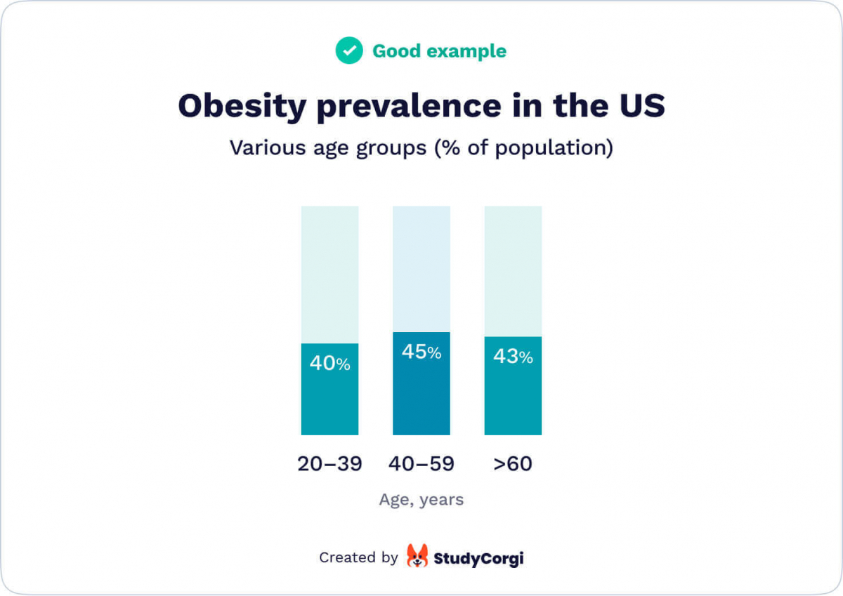 |
| ❌ A bad graph misleads the reader. Data can be unintentionally misrepresented due to narrow sampling (if you have surveyed two people, for instance, adding one more will change the picture dramatically). Incidentally, some people prefer to misinform their readers in order to support their message, starting the graph from a point different than zero. | 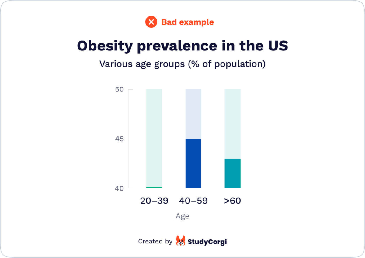 |
2. Choosing the Right Type of Chart
| ✔️ A good graph uses the appropriate type of chart for: Representing value distribution (scatter plot, line chart, bar chart) Comparing values (bar chart, line chart) Illustrating parts of a whole (pie chart, stacked bar) Describing the relationship between sets of data (bubble chart, line chart, scatter plot) | 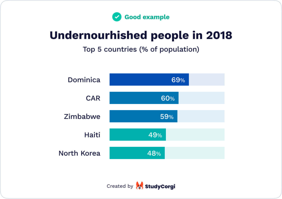 |
| ❌ A bad graph uses the wrong type of chart. In most instances, such a mistake is made because of a misunderstanding of chart types. Use the lists on the left to make the right choice. | 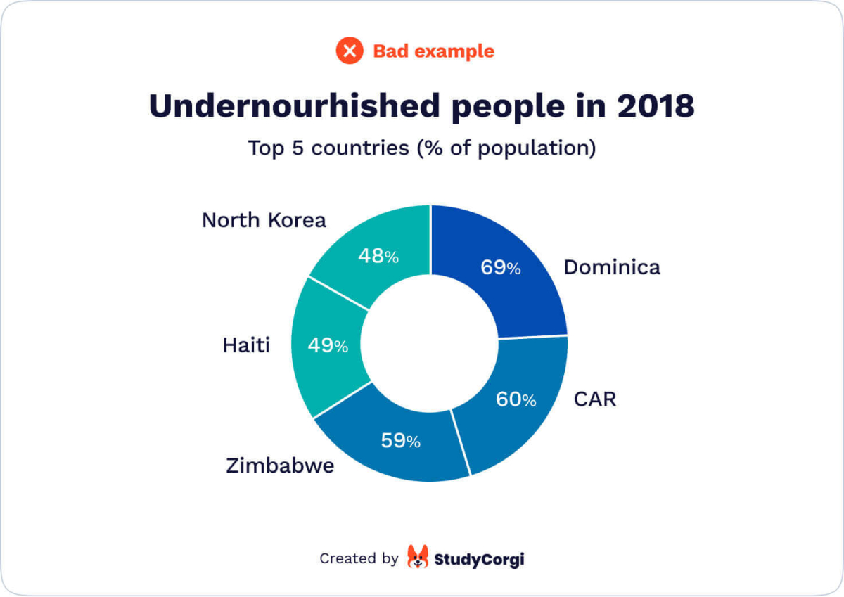 |
3. Correlation ≠ Causation
| ✔️ A good graph implies that correlation is not causation. Some trends can change similarly over time, but it might not mean they affect each other. If you have the slightest doubt that one phenomenon caused another, mention it. Alternatively, you may add a third phenomenon that could cause both trends. | 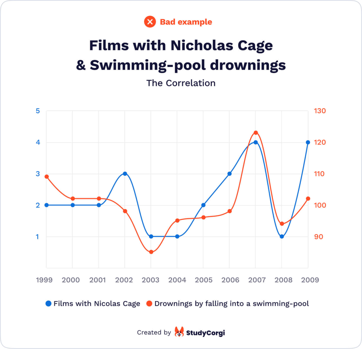 |
| ❌ A bad graph looks for cause-and-effect relationships everywhere. This is the most common mistake in quantitative research. A scientist establishes causal links between two different trends that have no relation |
4. Just Enough Data
| ✔️ A good graph is not overloaded with data. Infographics facilitate the readers’ understanding of complex data. They provide a superficial but complete picture of the described issue. | 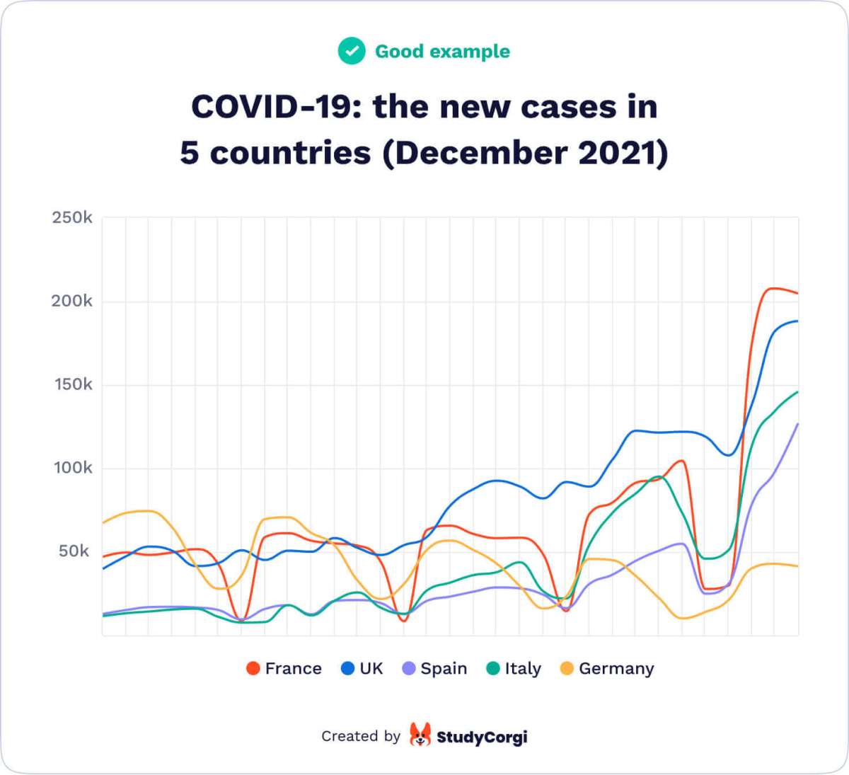 |
| ❌ A bad graph contains too much information. Overwhelming your reader with details in your infographics is considered bad manners. If you can delete something without distorting the general picture, do so. | 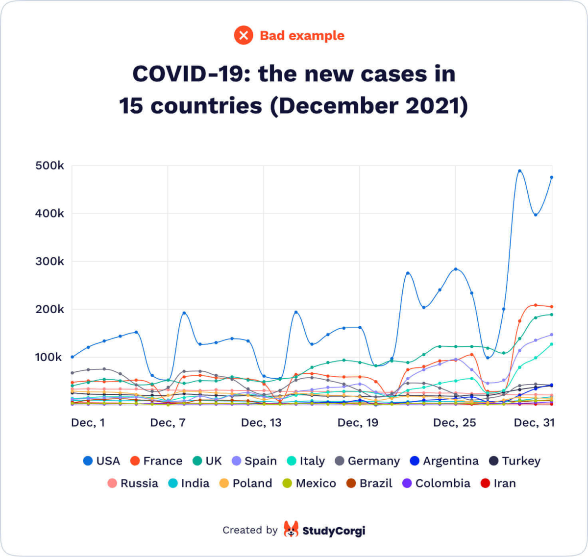 |
5. No Extra Explanation Required
| ✔️ A good graph is clear without any additional explanation. Anyone who looks through the graphs in your research project for the first time should understand your findings. They should only need to read the text to get more details about what they have already learned. | 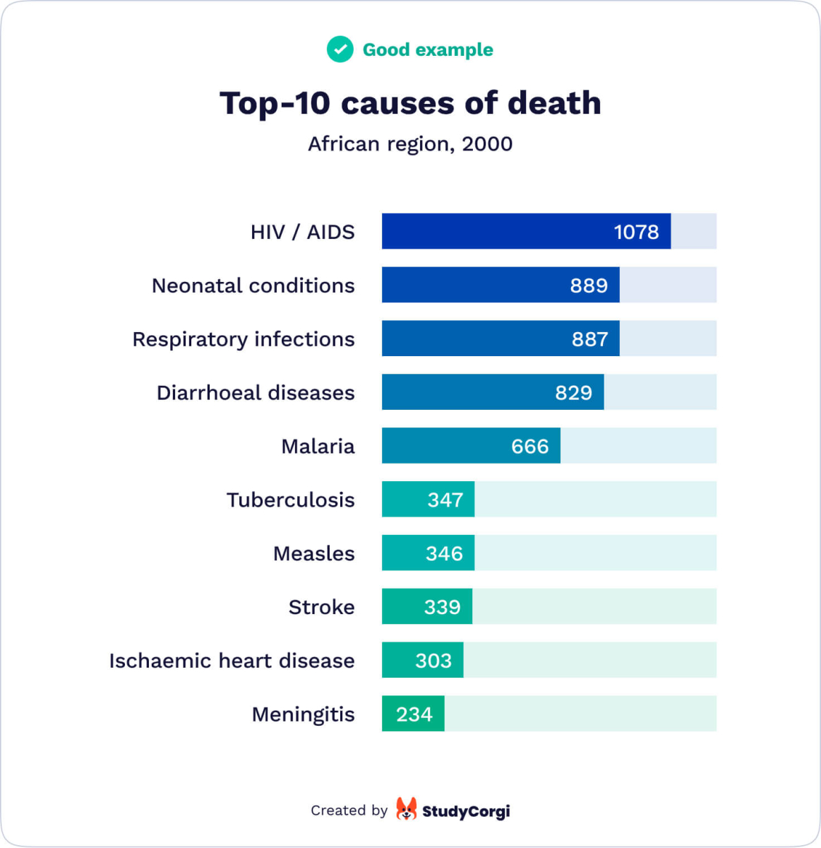 |
| ❌ A bad graph requires additional explanation. Everything that entails extended attentive reading is not part of a good graph. This point refers to excessive data and wordy text inside the infographic. Choose another type of graph if you cannot remove any data to make it simpler | 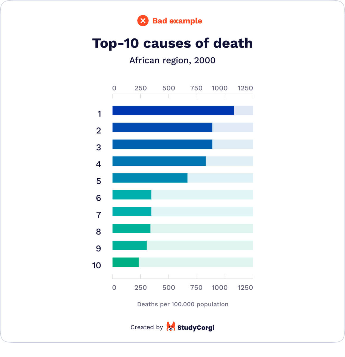 |
6. Simple & Beautiful Appearance
| ✔️ A good graph looks simple & beautiful. Infographics should be clear, correct, and pleasant for the reader’s eye. A good graph follows one of the traditional graph types or combines them. You can experiment with colors as long as they are contrasting and easily distinguishable. | 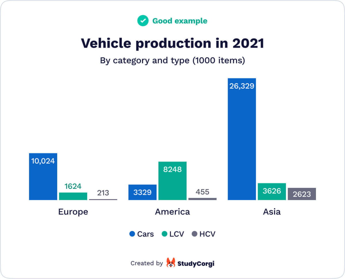 |
| ❌ A bad graph ignores standard conventions to look original. Attempts at originality often end with failure. Also, 3D graphs make it harder to understand the general message and data correlation. | 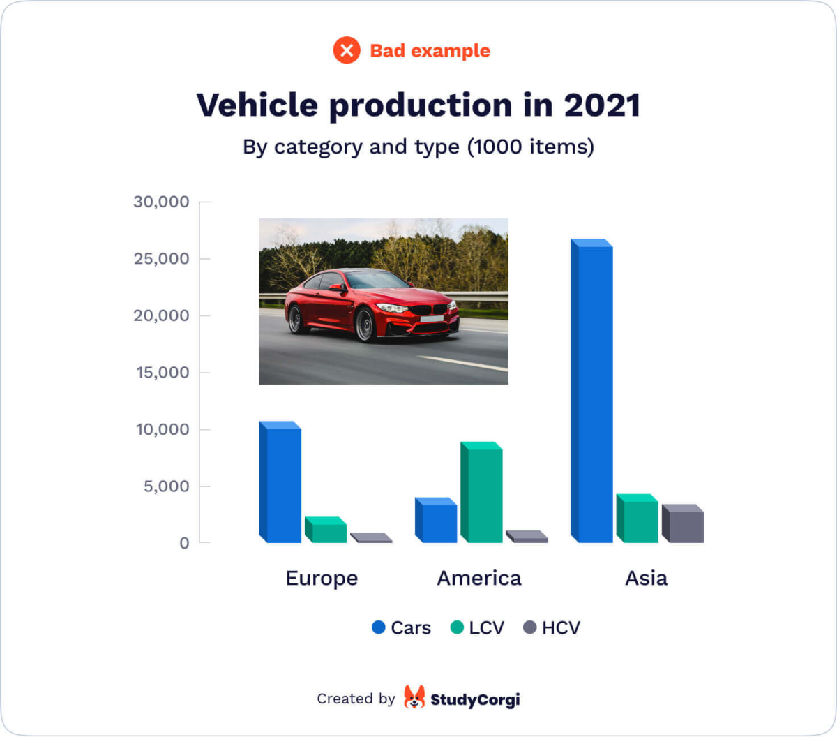 |
7. Clarity
| ✔️ A good graph contains intuitively arranged data. Distribute the parts of a pie chart in a clockwise direction, from the largest to the smallest part. If it is a stacked bar chart, there can be various ways to arrange data, for example, from the longest to the shortest, or chronological (if applicable). | 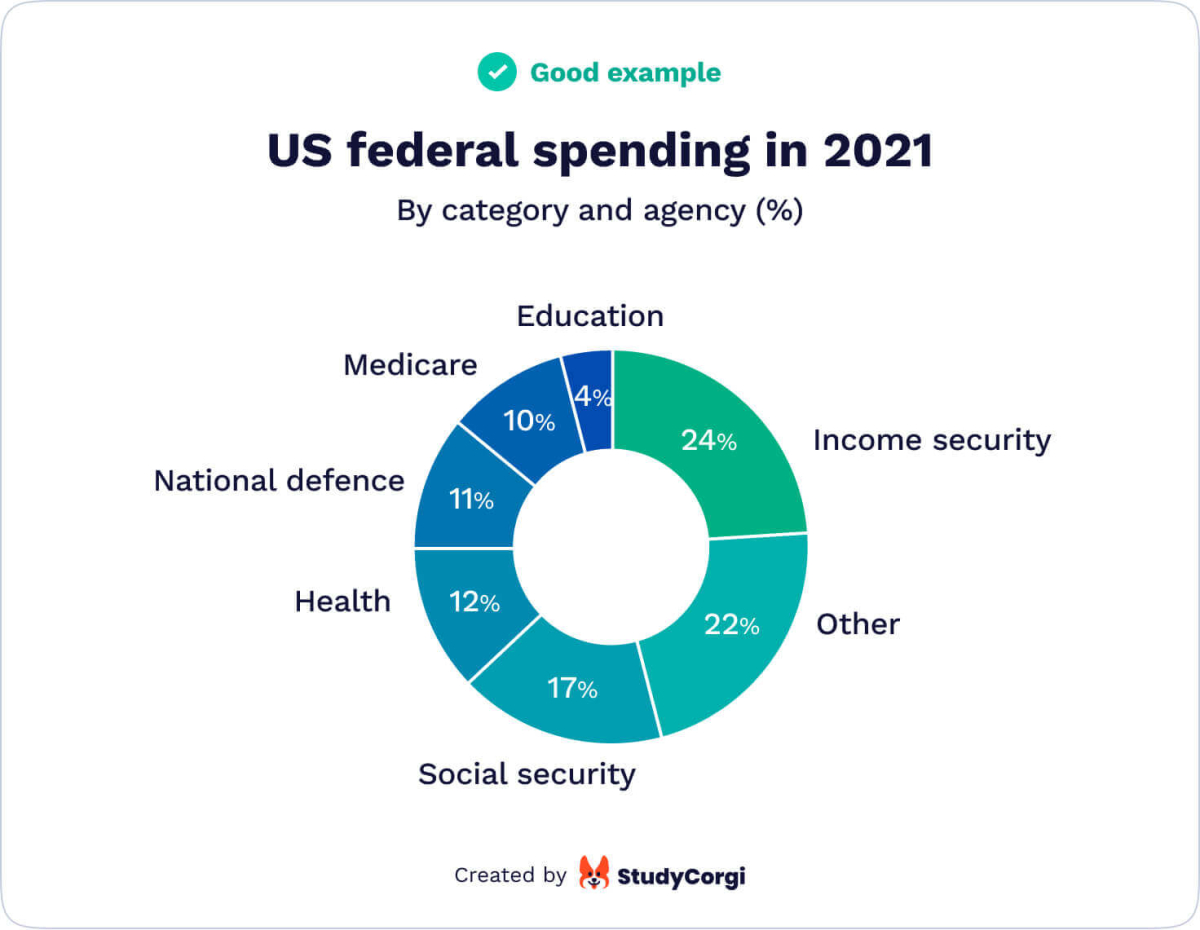 |
| ❌ A bad graph looks messy It takes the human brain more time to process unarranged data. Don’t make your reader waste their time trying to understand your graph’s meaning or find the necessary section. | 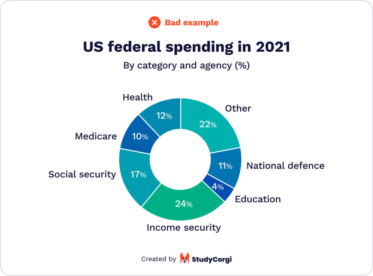 |
8. Good Title
9. Usefulness
👣 Make an Infographic in 8 Steps
Good news: anyone can create a good infographic. Not so good news: you have to learn how to do it correctly. Good news again: here’s how!
Step 1. Define Your Audience
Imagine your intended readers. What is their level of knowledge of the subject matter? What are their interests? How long do you think they will spend looking at your infographic?
These are the most common places to publish your graph:
- Dissertation or research project;
- Scientific or professional journal;
- Popular scientific publication on social media.
Depending on which of the above applies to your case, your audience will be:
- Deeply knowledgeable – requiring little to no explanation but having little time to dedicate to your infographic;
- Relatively informed but interested and ready to spend a lot of time studying your illustration;
- Diverse and unpredictable, scrolling through your publication and reading it only if something strikes their eye.
So how should you approach each audience?
- Include only the data that illustrates your message.
- Make the infographic detailed enough and include an appropriate legend and references.
- Give a striking title (a rhetorical question or a hot-button issue will do) and select bright colors.
Step 2. Think of the Story You Want to Tell
An infographic is a graphic narrative, not a picture. It tells a story. For example, the extension of working hours raises the national suicide rate by X%. This story has a moral: there is a length of a workday that should not be exceeded.
To know if your infographic has a story, use the “So What?” test. For example, there are more stray cats than dogs in Cyprus. So what? Develop your answer until the question becomes inapplicable.
Step 3. Highlight the Important Parts
You don’t have to make up an infographic for each piece of quantitative information in your project description. Which data supports your thesis statement and your message? Use it to create an illustration.
To highlight specific points inside the infographic, add more text to the most critical sections and make their colors more striking.
Step 4. Choose a Catchy Title
The results of Step 1 and Step 2 will help you select a compelling title. It should be shorter than your entire research’s general title, even if that fits. Treat this task as if you had to create a “breaking news title.” The best length is less than 60 characters.
Stay away from overused topics. If that’s impossible, it is better to select a different survey or study to represent in the infographic. However, there’s no need to stress about brainstorming something innovative. Taking a different look at an old problem is enough.
Step 5. Select the Infographic Type
What do you want to explain to your reader? Depending on your answer, here is a short list of infographic types. The option you choose will affect the layout of your illustration.
- Process description
- Comparison
- Timeline
- Informational
- Listing
Step 6. Choose the Software
This step has two limitations: your skills and budget. You can show your creativity in Adobe Illustrator or Photoshop, but if you are more of a beginner, you could try Canva or Piktochart. These tools have free but limited functions, extendable at a certain price. In the next section, you will find an overview of the top 6 infographic makers.
We recommend that you don’t spend too much time on this step. Use the first platform you find fit for your purposes, and we will advise you how to do this below.
Step 7. Organize Your Data
Once you’ve selected the software and template, you’ll have to arrange the available information: title, graphs, explanations, legend, etc. Note that a template accelerates your work but limits your creativity and possible design variants.
In any case, follow the advice below. Your infographic should not be over-saturated with data. Key graphs should remain in focus, and the text should be balanced with pictures.
Step 8. Make It Look Beautiful
The color palette sets the tone for the image. Many topics have a traditional set of colors, and it is always better to use them. For example, war and death are usually black and red. Business is associated with green or blue. And in general, subdued and pastel colors produce a different effect than bright and intense hues. Five colors should be your maximum.
It is better to select traditional fonts. For instance, sans-serif looks excellent in small font sizes as they are more readable. Serif fonts make your infographic look more formal. Display fonts look good in headings.
Finally, adjust the infographic size and weight, especially if you plan to publish it online.
📊 Top-6 Infographic Makers for Beginners
Of course, there are more than six infographic makers, both free and paid. But we believe that this selection is the most diverse and that anyone can find something appropriate here.
Canva
This free app has some premium purchases, but the basic version is enough to create almost any graph you need. Besides, education workers and students get a special price!
You can create an infographic here in just 30 minutes, even if you’ve never done it before. The number of templates is astonishing, and they are all customizable.
Piktochart
Piktochart also offers some free templates, but most of them require either a Lite ($12.50 per month) or a Pro ($24.50 per month) plan. The most significant benefit is the option to create your infographic from scratch without a template. If you know what you would like to do and don’t want to spend hours flipping through the available templates, that’s your best option.
On the other hand, if you’ve found a suitable template, drag and drop new elements to add them. It’s that easy.
Visme
This semi-free option is similar to Piktochart but has several considerable benefits. First, a student plan costs only $30.00 per semester. Second, it supports animated and interactive infographics with integrated links and pop-ups. Your dissertation defense will become much more memorable with these features. But make sure your technology screen supports these functions.
Infogram
Infogram is slightly more complicated than the previous platforms. The infographic-creation process will take you about 45 minutes, and the paid plan is more expensive (starting from $25 per month). In return, you have the opportunity to employ SQL connections, link tracking, and data analytics. The only drawback is the limited artistic value of the available templates.
If you are keen on numbers and data, this should be your choice.
Visualize.me
This is the simplest and cheapest software to create a last-minute infographic before submission. The entire process takes about 10 minutes, and it is free with no paid materials. They even offer to make your “infographic resume” using your LinkedIn profile data.
BeFunky
The paid option of BeFunky costs only $6.99 per month, but the free version is fine for a single use. There is only one template in the free plan. The platform connects you to some free image libraries, facilitating the search for a perfect design. The biggest benefit of this program is its photo editing features.
🌸 Bonus: Infographic Collections to Inspire You
An example is the fastest way of explaining something. Below you will find the five best collections of infographics to create your own design.
Pinterest is a tool for the storage of visual bookmarks. Millions of artists, photographers, and designers worldwide use it for inspiration. Why not look for a good infographic design here? Search by keywords and look through similar search suggestions.
This service has numerous infographic samples and the latest data visualization industry news. If you regularly create graphs, subscribe to their newsletter to get an endless source of fresh ideas.
This collection is updated every day. It means you can browse the newest and the oldest samples, depending on your needs. Browse through categories (animals, gaming, education, health, government, etc.) to get the most precise result.
Apart from being one of the best infographic makers, this platform has a great choice of samples. Besides, you can follow the link to create the same design in the editor mode.
Like Pinterest, this service has a mobile app. The choice of infographic examples is extensive. If you scroll down under any image, you will get similar suggestions.
Remember that an infographic will not and should not be a substitute for the text of your project. It acts as a road sign to attract the drivers’ attention, making their reading more pleasant and smooth. If you have any good advice to share with other students, you are welcome to leave it below.