Coca Cola Advert Analysis: Introduction
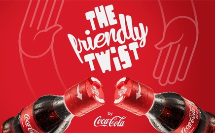
This Coca-Cola advert analysis focuses on a particular advertising campaign called “Friendly Twist.” A powerful marketing strategy should ‘support the supreme sensory experience by focusing on the aesthetic and emotional aspects of the targeted buyer’ (Plessis 2008, p. 47). Coca-Cola always treats advertising as a creative strategy that should focus on the best results. The inclusion of creativity is something that completes Coca-Cola’s advertising approach. Creativity focuses on all business functions, such as marketing, research and development (R&D), planning, and advertising. The video “Coca-Cola Friendly Twist” is one of the successful examples of Coca-Cola’s advertising campaigns, which delivers a creative strategy for encouraging more consumers to purchase Coke. This Coca-Cola advertisement analysis addresses the sensory experience associated with this outstanding advert.
Coca Cola Advertising Techniques: The Sensory Experience
The advert “Coca-Cola Friendly Twist” employs the power of visual elements in order to attract more customers. For instance, the company’s brand name “Coca Cola” is indicated in the advert. The slogan “Friendly Twist” is repeated severally in order to ensure more consumers associate the brand with friendship. The slogan encourages more customers to remember the brand (You Can Only Open This Coke Bottle with Another Coke Bottle 2014). They also use the advert to outline the major benefits of Coke. For instance, the advert encourages people who want to establish stronger friendships and relationships to share a Coke. This kind of confidence plays a positive role towards informing more youths about the brand.

Visual
The advert begins by visualising the hurdles experienced by individuals during their first days in college (You Can Only Open This Coke Bottle with Another Coke Bottle 2014). During the first day, conversations and interactions are minimal since the individuals are alien to each other. The advert indicates that ‘interactions and talks are reduced to zero during the first day’ (Chohan 2014, p. 1). These messages portray the environment experienced by freshmen after joining school.
The ad uses powerful footages to show how new students in school find it impossible to engage in new conversations. Coca Cola uses powerful aspects and visual elements in order to establish the most appropriate brand image (Staff 2014). The advert combines a wide range of visual elements in order to increase the level of curiosity. As well, the elements arouse new interests and experimentations thus making the targeted product successful in the market.

The visual aspects of the drink are embedded in the new bottle. The ad shows that the newly-introduced bottles have unique caps. As well, the caps ‘are not easy to open’ (Chohan 2014, p. 1). This fact explains why the buyer should match the bottle with another one in order to open it (Chohan 2014). The approach used here shows clearly that the aspects of product development have been merged with the needs of the targeted consumers. It is notable that individuals who want to make new friendships find it hard during their first encounter. However, a Coke experience changes the situation by giving strangers the opportunity to open their bottles. This emotional act plays the best role towards establishing new friendships.
The advert introduces Coke as a revolutionary product that can be used to encourage more freshmen to bond (Chohan 2014). The brand is known to deliver the best refreshment and unforgettable taste to the consumer. However, the inclusion of an innovative feature makes the brand more appealing. It gives the audience a new sense of friendship and human bondage. The inclusion of the new cap is an innovative approach delivered by Coca Cola’s research and development (R&D) team. However, the outstanding message is that the new cap has the potential to empower more freshmen and bring them together as new friends. The strategy ‘breaks the ice and encourages people to start talking’ (Chohan 2014, p. 1).

It is agreeable that the ad has prominent visual aspects or elements. The advert is characterised by Coca Cola’s traditional red colour. This visual approach presents a seductive force that encourages more individuals to come together and form new bonds. The seductive red colour encourages individuals to come together and share a Coke experience (Coca-Cola: Open Happiness 2015). This visual approach makes it easier for Coca Cola to attract more customers and eventually increase its sales. The use of colour and loneliness at the beginning of the ad evokes strong emotions of adventure. Coke is presented as the best tool for addressing this kind of loneliness. Visual elements such as words capture the attention of every potential buyer.
Verbal
Human communication takes place in different ways. Advertisers and marketers focus on such communication practices in order to achieve their business potentials. The targeted ad does not present any verbal element. However, the undeniable fact is that several body languages and elements have been used to fulfil this sensory need. Traditionally, Coke has been advertised as the best source of refreshment. Many people buy the drink to become refreshed and energised.
The inclusion of new texts in the advert makes it easier to augment this traditional aspect of the brand. The use of powerful visual texts and body languages play a significant role towards encouraging more students to enjoy a fresh Coke (Coca-Cola: Open Happiness 2015). The act can deliver a powerful experience and create new friendships. Such visual texts therefore play a significant role towards marketing the product to more students.
The ad indicates how the individuals communicate nonverbally as they share the bottle-opening experience. They smile to each other thus promoting similar behaviours among the targeted consumers (Plessis 2008). The students appear to smile, walk, and embrace each other (Coca-Cola: Open Happiness 2015). These strategies deliver a strong verbal message to the audience. As well, the actions undertaken by specific students show how Coke is the best foundation for new friendships. Towards the end, the ad portrays the traditional Coca Cola bottle using red colour and a white background. The words “Coca Cola: Open Happiness” are presented to support the company’s brand (Coca-Cola: Open Happiness 2015). These visual aspects therefore play a significant role towards supporting the success of the brand.
Sound
The Coke advert has a unique soundtrack. The rhythmic soundtrack begins with a low tone and note (You Can Only Open This Coke Bottle with Another Coke Bottle 2014). This kind of sound has an emotional aspect. The soundtrack changes as the advert progresses. As well, the sound appears to rhyme with the presented footages. A song begins when the lonely students find something to bring them together. Although the sound might not be seen to have any important value, it plays a major role towards enhancing flavour.
The song enhances confidence, sweetness, and anticipation among the targeted consumers. Coca Cola therefore focuses on this sensory aspect to encourage more students to purchase the brand. The sound used in the advert is not coupled with speeches or verbal elements. However, the sound and the song included in the advert arouse a feeling of fulfilment (You Can Only Open This Coke Bottle with Another Coke Bottle 2014). The soundtrack also supports the memorable experience of opening the caps and establishing new bonds. This situation creates a sensational, unforgettable, and meaningful experience. The effective use of sound therefore makes the advert more appealing to different customers.
Taste and Smell
The advert is founded on the fact that Coke is one of the revolutionary soft drinks with an outstanding taste. With this understanding, freshmen in colleges can use the drink as a new tool for initiating new friendships. The advert shows clearly that students can enjoy the revolutionary taste of Coke in a special way. The experience also makes it easier for them to establish new friendships (Chohan 2014).
Taste in the advert is also supported through the use of an innovative bottle. The plastic bottle comes with a new cap. The individual who ‘wants to consume the beverage feels so nice to hold the bottle’ (Chohan 2014, p. 2). This process creates a new sense of taste. More freshmen in the advert are also willing to buy the drink and enjoy the same experience. As a result, the number of consumers increases as they focus on the powerful taste of the product (You Can Only Open This Coke Bottle with Another Coke Bottle 2014). The ultimate message delivered to the students is that meaningful friendships are founded on the good taste of Coke.
After opening the caps, the good taste and smell of Coke will complete the remaining role of strengthening the newly-established bond. The individuals will break the ice and start talking (Chohan 2014). The powerful taste of Coke becomes the best source of confidence, inspiration, and motivation. The advert explains how the exemplary taste of Coke can establish the best friendships.
The power of taste is also supported by the new Coke bottle. The ‘sizeable bottle containing the intended beverage feels smooth’ (Chohan 2014, p. 1). This kind of feeling delivers the best experiences associated with Coke. Every consumer will find new reasons to purchase and share the cap-opening experience with a different stranger. This kind of experience is admirable because it involves two strangers (Coca-Cola: Open Happiness 2015). The strangers will celebrate and eventually establish the best friendships.
Coca-cola Advertisement Analysis: Conclusion
The advert includes most of the aspects of the sensory experience. The ad uses the best visual elements and colours in order attract more potential consumers. The tactile and verbal elements deliver a powerful experience that can produce new friendships. The sounds and audio aspects used in the ad also encourage more people to purchase the product. The strategy makes the ad outstanding thus encouraging more consumers to purchase it and establish new relationships (Hulten et al. 2009). This analysis therefore shows clearly that the advert is outstanding. This fact explains why it does not require any enhancement. It supports the intended message and encourages more people to purchase the targeted product. Companies such as Pepsi should therefore consider similar creative approaches in order to market their soft drinks to more customers.
List of References
Chohan, T 2014, ‘Why students love Coca-Cola’s “Friendly Twist” marketing campaign’, Marketing Tech, vol. 1, no. 1, pp. 1-2.
Coca-Cola: Open Happiness 2015, Web.
Hulten, B, Broweus, N & van-Dijk, M 2009, Sensory Marketing, Palgrave Macmillan, New York.
Plessis, E 2008, The Advertised Mind: Groundbreaking Insights into How Our Brains Respond to Advertising, Kogan Page, London.
Staff, J 2014, Friendly Twist: Watch College Freshmen Bond Over Unique Coke Bottles, Web.
You Can Only Open This Coke Bottle with Another Coke Bottle. 2014. Web.