Introduction
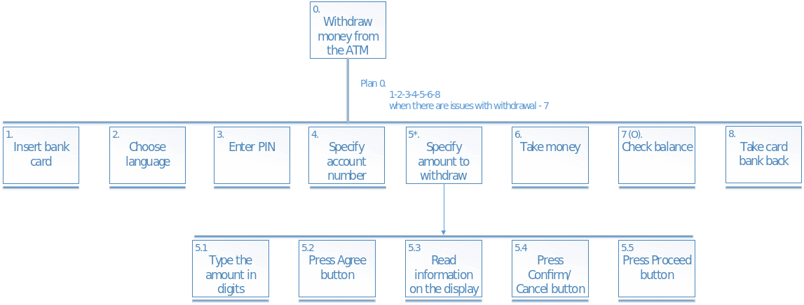
Information technologies have become an integral part of any modern civilized society. Human computer interaction became normal everyday practice for billions of people all over the world. Computers and the appropriate interfaces of interacting with them are used for very different purposes, including Automated Teller Machines (ATMs). Considering the peculiarities of ATM-user interaction, the paper aims to explore the ATM’s graphical user interface, provide the appropriate Hierarchical Task Analysis (HTA) including the diagram, evaluate the interface using such criteria as usability and design, and suggest valuable improvements of the design.
Graphical User Interface
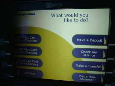
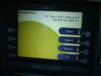
The graphical user interface of a usual ATM is the object of evaluation. ATM was produced by NCR, the reputable company, present on the market for a long time (NCR par. 1). The model of the particular ATM is 5877. It has the following specifications: Dimensions 1380 x 470 x 727mm, weight 500kg, temperature range +10˚C to +40˚C, … Installation is completed in lobbies, business areas and in ‘pods’ or vestibules” (TestLink par. 1-4). It has 15″ CRT screen and mechanic buttons in the amount of four on each vertical side of the screen. The interface is regular for an ATM of such design, considering the presence of mechanic buttons and non-touch screen usage. It utilizes contrasting colors such as yellow, dark blue, and white, which makes the text easy to read. Each button corresponds to the appropriate image near it and is responsible for confirming the choice of an operator. The ATM’s system provides regular functionality, common for most of the ATMs: dispenses cash; allows checking balance procedure, money transfers, making deposits, and various operations with checks (see fig. 1). The interface of the ATM provides the opportunity to choose a language of interaction (see fig. 2). It does not have any help documentation sections to choose.


Hierarchical Task Analysis

Interface Evaluation
Usability
In terms of safety, the ATM’s interface is performed at the decent level – it is not possible to press such a button that would lead to dangerous outcomes like card damaging, for example (Caroll par. 5; Sears and Jacko 120). Effectiveness is at the high level as well since the ATM is a very robust machine with specific, limited set of functions, so it provides an operator with either cash or information on demand. As for efficiency, this particular ATM has moderate one due to the fact of mechanic buttons use – they start to jam after a certain period of exploitation, and it makes the process of interaction rather complicated in some cases (Cockton par. 17; Kim 65). The system is very easy to learn to use, so learnability is high. Memorability is good too since there are not that many options to choose on the screen. Finally, the utility is at the high level too because it is hard to make the wrong choice, using eight large buttons with hints during the entire process from inserting a card to printing the check with balance on it or receiving cash.
Design
The visibility is well organized since it is easy to see what has to be done next to proceed with operations. Feedback is normal; the operator always sees if it is necessary to wait and for how long and what button should or should not be pressed at the current moment. As for affordances, the operator always sees what has to be done next to have the necessary result, so it can be called good (Cockton par. 20; Kim 67). Constraints are implemented in the following form: Buttons that cannot be used at the moment have no graphical hint near them and so they are inactive to eliminate the possibility of accidental interaction, which is very convenient (Caroll par. 7; Sears and Jacko 137). Finally, the interface has considerably consistent design of all elements, from buttons to hints on the screen, so the process of ATM operating is easy, recognizable, and appealing.
Suggestions regarding Improvement
The major suggestion is to implement touch screen instead of buttons. It would improve the user experience greatly and make the process of ATM use easier. In addition, it would be practical to make on-screen buttons’ response in the form of vibration as it is performed in the modern smartphones. It would make the interaction much more informative.
Conclusion
Summing up, the paper explored the ATM’s graphical user interface, provided the appropriate Hierarchical Task Analysis (HTA) including the diagram, evaluated the interface using such criteria as usability and design, and suggested valuable improvements of the design. The ATM’s interface design is performed at the high level, but mechanic buttons should be replaced by touch-screen technology to improve functionality and user experience.
Works Cited
Caroll, John. “Human Computer Interaction – Brief Intro.” Interaction Design Foundation. n.d. Web. 2016.
Cockton, Gilbert. “Usability Evaluation.” Interaction Design Foundation. n.d. Web. 2016.
Kim, Gerard J. Human–Computer Interaction: Fundamentals and Practice. Boca Raton: CRC Press, 2015. Print.
NCR. History and Timeline. 2016. Web.
Sears, Andrew and Julie Jacko. Human-Computer Interaction: Development Process. Boca Raton: CRC Press, 2009. Print.
TestLink. NCR 5877. 2016. Web.