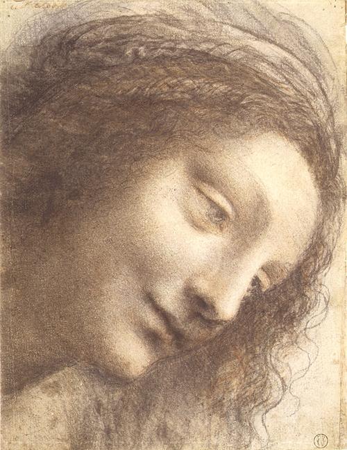
The first work of art to be analyzed in this paper is the “Head of the Virgin in Three-Quarter View Facing Right” by Leonardo da Vinci. The very first thing to define in the work is what kind of art it belongs to. It can be said that the painting represents realism, which can be proved by the natural and three-dimensional view of the depicted head. However, some elements of mannerism are present too, expressed with the light and smoky style of painting. Leonardo tried to depict things just like they are in real life; however, he was a perfectionist of forms and textures. This explains the double nature of the painting from the perspective of style.
The painting was created in 1508-1512. It constituted a part of Leonardo’s great heritage, and was kept with other paintings, planes, schemes and codes of the author. Some researchers find the depicted face very similar to the face of a virgin in another painting of the artist called “Virgin and Child with Saint Anne”. Therefore, this painting can be considered as an initial version of the figure (Frazer, 1).
The painting absolutely represents the manner of its creator. The size of the picture is not too big: 8 by 6, 12 inches (Berman, 1). However, as far as all the Leonardo’s paintings excerpt for oil ones reminded sketches, “Head of the Virgin in Three-Quarter View Facing Right” might have been a separate work. Da Vinci used chalks and charcoal for the painting.
The technique applied is called sfumato, which was popular at the period of Renaissance. This technique allowed the artist make the painting extremely smooth because of the great attention to transitions between light and shadows. What is more, to achieve the mentioned effect, the artist blurred the vivid lines into shapeless stains. This technique was used by da Vinci in most of his paintings.
One of the remarkable features of the painting is the line quality, which is soft and often waving. These lines help the artist to be precise with the form, making it voluminous and lively. Indeed, the depicted face “face has a firm classical, sculptural quality composed of large, simple planes” (Rackow, 1). In addition, the whole work can be viewed as a number of light and dark areas, which flow one from another. This is due to the exceptional unity achieved by the artist. Even when viewed from distance, the painting remains unified and complex.
All the visual effects, created by Leonardo, point to his intentions about the picture. Obviously, the artist wanted to draw a kind face with an angel’s ease. The lightness and transparence of the materials and technique used create a light and dreamy mood for the image. Being a great inventor and scientist, da Vinci tried to find the secrets of visual effects. “Head of the Virgin in Three-Quarter View Facing Right” proves that he succeeded.
Apart from the many mentioned merits, the painting is very significant for the world art and history of art. It represents the style of painting and materials, which are not used anymore and will barely be used in the future. The hand-made portrait, drawn to perfection, is a real treasure for connoisseurs of art. In fact, being a part of Renaissance culture, this particular painting is one of the best visual representatives of the time.
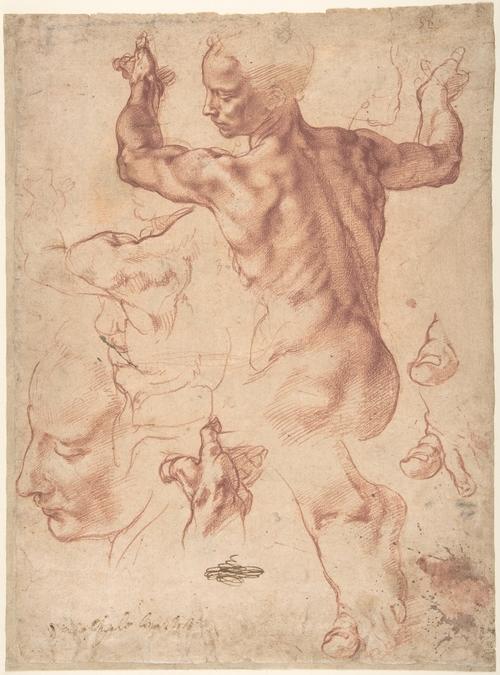
Another remarkable heritage of the Renaissance art is a sheet with paintings of Michelangelo Buonarotti. The sheet contains the Studies for the Libyan Sibyl and the Studies for the Libyan Sibyl and a small Sketch for a Seated Figure. They belong to the period of 1508-1512, when the painter was developing sketches for a great project. Michelangelo was supposed to paint the famous Sistine Ceiling in Vatican Palace (Green, 1), and the analyzed picture served as a previous version of one of the figures. After it served its aim, Michelangelo kept it with his other works, and after his death it became the property of family of Buonarotti.
Concerning the style of the work, it can be stated with no hesitation that the painting is realistic. The explanation for this is the fact that the ceiling design was one of the most responsible projects in Michelangelo’s life. Therefore, the author had to work out the smallest details. He wanted the people, their postures, gestures, and expressions look natural and close to life. That is why we can see fingers and parts of body painted several times; Michelangelo was improving his style upon perfection.
The artist used chalk for this painting. Obviously, it cannot be viewed as a completed work, as far as the figures are not composed, and there is no unity in the painting. Therefore, it is more rational to analyze the work by parts. The most completed one is the figure of a person standing with a back to the viewer. It may sound strange for some viewers, but the Michelangelo wanted to depict a woman.
However, the body proportions and muscles seem to point to the painter’s miscalculation or lack of knowledge. The explanation for this phenomenon is the cultural background of the time. In Renaissance period women led a modest way of life, and were deeply believing. Posing naked for painters was unacceptable, and therefore Michelangelo had to work with a male model for this sketch (Coney, 1). The precise masculine forms once more prove the realistic nature of the painting.
Concerning the tools used to achieve the present visual effect, it can be said that Michelangelo used the emphasis on shape. Instead of spending time on intensifying the contrast, the painter preferred working on shapes, paying attention to the smallest details. This also determines the perfection of form, which is three-dimensional and looks lively. In addition, the line quality suggests using only thin lines, which makes the depicted figure look more complex and natural. However, the right hand of the woman is more detailed than all the other objects; in addition, the value difference is much higher at that area. The hand is painted closely to chiaroscuro technique, where light and shade are contrasted. This is probably because the author wanted to make the hand perfect and spent more time on it.
In comparison with other works of the period, the painting has a similar style. The technique of painting demands concentration and attention to details, and Michelangelo performed excellently. However, the work is not complete, and has several drawbacks, such as masculine shapes of the female body. Still, it allows us seeing the painting on Vatican ceiling in preparation, analyze all the stages of its creation, and access it critically.
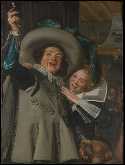
The third work of art, which is to be discussed in this paper, belongs to a Dutch painter, Frans Hals. The oil painting has a double name; to be more precise, it can be called either “Young Man and Woman in an Inn” or “Yonker Ramp and His Sweetheart”. The painting is dated by 1623.
Unlike the formerly analyzed works, the painting of Hals represents mannerism. This is obvious because of the work’s technique and visual effects. The materials used for the picture are oil paintings and canvas. It has to be said that the technique of painting is rather controversial. As one of the critics of early XIX century noted, “The speed of the painting is bewildering, but the brush strokes are dashed on the canvas with perfect sureness in spite of it” (Unknown, 1).
Indeed, the lines of the painting are rather dynamic, sometimes even nervous; however, the general effect of the picture is rather smooth. It should be noted, that while the face of the man, which looks rather textural, reminds more of the impressionists technique with short and light strokes, the face of the woman and the rest of the picture have the Renaissance smooth texture, achieved by patient work on details.
An interesting point about the painting is the use of colors. In the picture with warm palette Hals uses two stains of cool blue. This is probably a try to balance the composition, which is rather heavy at the bottom and too spaced above the people’s heads. The color values are mostly dark; however, some areas in the picture are very light. One of such areas is the face of the woman and her hand, which are unreasonably highlighted, as they should be placed in shadow. The brightness of the elements makes them seem to be placed before, not next to the young man.
Another controversial detail about the painting is the discrepancy of the woman’s facial expression and posture. While the face of the lady expresses joy and delight, her hand is rather tense. Comparing to the man, who looks naturally, the woman seems to be nervous because of her gestures. However, one of the authors suggests that this was a compositional plan. He claims that Hals created a “diagonal leading from the man’s upraised right arm, to his sweetheart’s hand, down to this left hand under the dog’s chin” (Borofsky, 1). This point of view justifies the choice of forms, but makes the emotional value of the image rather doubtful.
All the mentioned controversies are now a subject for criticism and evaluation for anyone interested in art. However, despite some doubtful nuances, the painting’s merit is great. It represents the ideas and moods of the period; in addition, it constitutes a part of Dutch artistic heritage. This gives us an opportunity to compare the tendencies of one period in different countries. While some of the painters worked in special schools or took apprenticeship in different masters, others, like Hals, worked alone. Thus, his painting does not only represent the style of the period, but also shows the individual approach of the painter to the art. One more precious feature of the picture is the depiction of elements of clothes and other objects, which lets the viewer be acquainted with the social life of middle class of that time.
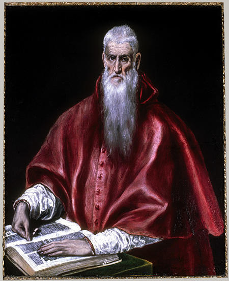
The next work out of the six analyzed in the paper is dated by 1610-1614. Its author, Domenikos Theotokopoulos, is more popular as El Greco, a famous Spanish artist of Renaissance period. This oil painting, called “Saint Jerome as Cardinal” is one of the numerous various versions of Saint Jerome depiction by the author. Saint Jerome is known for having translated the Bible from Greek to Latin; therefore, in this picture of El Greco the man is depicted with his hands lying on the book, which is probably the result of his work, the Vulgate (Grace, 1).
The style of this painting suggests that the artist was working in mannerism. Despite the elements of realistic painting, such St, Jerome’s as wrinkles or hair, the general technique represents a very individual manner, not obeying to any stylistic rules of the time.
In spite of the religious context of the work, it was not aimed at serving any purpose connected to religion. The original depiction of Saint Jerome is expressed in shape, color, space, and form. The composition of the painting is rather plain: the sitting figure of Saint Jerome with his head drawn from the front view and his hands lying on an open book. The background solution seems to be primitive at first sight: El Greco simply filled it with pure black hue. However, in fact this is a tool for creating a certain visual effect. Using the undiluted black for the background is an attribute of the chiaroscuro technique, which developed in late Renaissance. The technique was aimed at creating an additional contrast in the image. Indeed, the very first impression “Saint Jerome as Cardinal” makes is being extremely contrastive. The contrast of color values, together with the contrast between the light and dark areas makes the picture very sharp.
It should also be noted, that, despite the fact that the background is black, the figure does not look like cut out of the paper. This is because of the three-dimensional form of Saint Jerome and the cloth, achieved with working on half shadows. Another remarkable point about the picture is the variety of textures demonstrated in it. El Greco painted skin with all its imperfections like wrinkles; the white sleeves differ from the red cape; and, most noticeably, the hair and the beard have a very natural texture. This proves the high level of artist’s skills and application of different techniques to different objects in the image.
One of the distinguishing features of the painting is the obvious distortion of proportions. Indeed, we can see a prolonged head and unnaturally long arms, while the shoulders are wide enough (Brown, 127). This makes an impression of a tall and strong, yet very slim man. However, the painter might have applied this technique to show the majesty of the depicted character.
It is needless to say that the painting is very precious from the point of view of art. It has an original style, and at the same time performs an educational function, showing the viewer the person of Saint Jerome. El Greco achieved a very impressive result by improving his skills and putting his ideas on canvas. The number of techniques applied and the depth of the work make its merit for the world hard to overestimate.
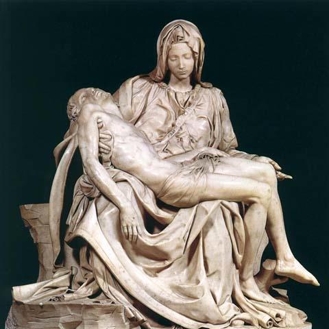
The next work of art analyzed in this paper is different I conception, though belongs to the same period of time in art history. The reason for that is the fact that this work is a sculpture. The personality of our analysis is the world famous artist and sculptor Michelangelo, and his work with even greater popularity called “La Pietà”.
Curved in 1498, the sculpture is told to be made from a marble, which was selected by the artist in Carrara pits (Kidney, 1). The name of the work, translated as “pity”, determines its character and mood. The sculpture is of a definite religious character, and depicts a well-known scene. The sculpture depicts Mary holding the dead body of Jesus, and it was made by a contract with a French Cardinal. Initially, in 1499, the sculpture was located in San Pietro, in the Chapel of Santa Petronilla.
The intention of Michelangelo was definitely to make the work as realistic as possible, which leaves no place for mannerism in this sculpture. The outstanding feature of the sculpture is the lightness and precision of all the forms presented. The author showed the knowledge of anatomy, proportion, and composition. Mary, holding Jesus, with every inch of her body expresses sorrow and hopelessness.
Besides the facial expression, which contributes to this mood, Michelangelo involved the clothing in creating the mood. The streaming cloth underlines the Mary’s posture and every curve of her body. In contrast, the body of Christ is uncovered; however, the sculptor manages to make it by no means less expressive. Every muscle and bone of his body look as realistic as possible. Indeed, “No corpse could more completely resemble the dead than does this” (Kren, 1).
One of the most burning arguments nowadays are concentrated around the choice of Mary’s face for this work. Obviously, she looks younger than Jesus, her son. Many critics call it a mismatch because Michelangelo was only 23 while working on the sculpture. However, then a question occurs: can there be a mistake in such a perfectly exquisite work? One of the possible explanations for such choice of Michelangelo is his will to make the work more philosophical. Mary could have represented the world of mortals, who are the children of God. In addition, she could have been depicted like an angel, a half holy woman, who had a special mission on Earth. Another version is that Michelangelo had his own vision of the scene, where Mary had the feeling of piece and pity more than a passionate grief.
Due to the well designed composition, the sculpture definitely has a great unity. The bodies and the cloth complete each other, united in a sole marble figure. One of the contributing factors in this case is the homogeneous texture of the sculpture. Michelangelo made the marble perfectly smooth even in the smallest details, which points to a high level of mastery.
The merit of the sculpture is impossible to put in words. For more than five centuries, it impresses the viewers with its realistic and natural forms, softness and precision of creation, and emotional depth. Michelangelo managed to create one of the most remembered scenes from the traditional Passion of Christ. The sculpture barely has some competitors among its contemporaries and among modern works.
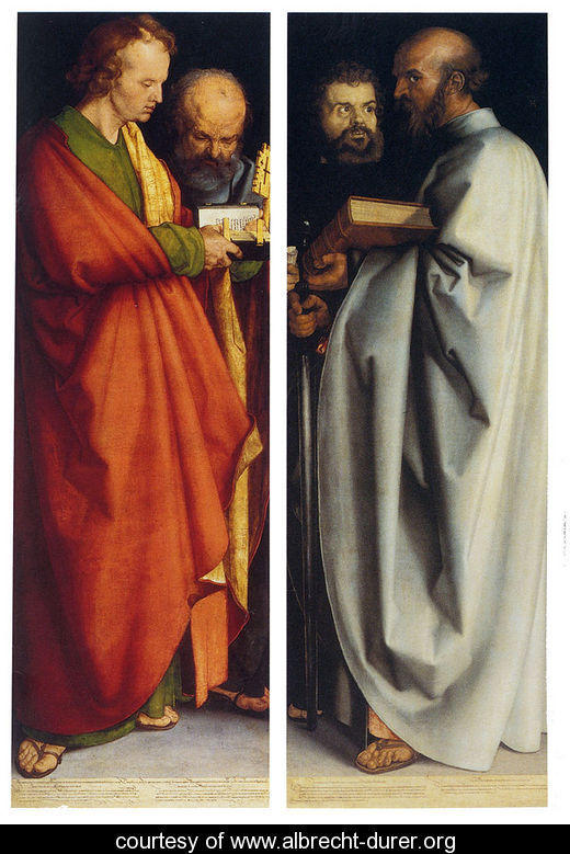
The next, and the last of the analyzed works, is the painting called “Four Apostles”, created in 1526. Its author, Albrecht Durer, was a representative of Renaissance art, and one of the most successful developers of it. The painter represents Germany, which signals about some individual features present in his style of painting. The analyzed work is an oil painting on canvas, and the more detailed description of the manner of its performance is given below.
On the left panel the painter depicted the apostles John the Evangelist and Peter. The right panel depicts the evangelist Mark and apostle Paul (Gizzarelli, 1). The four figures are holding different attributes of Christian religion, such as the Bible, the sword, and the key. Some of the critics perceive these details as a part of the author’s plan concerning the painting’s purpose. For instance, the painting is treated as a “reproach to the secular powers not to conceal the divine word in seductive human interpretation” (Bowl, 1). The painting was initially located in Nuremberg, the Durer’s native town.
Typical of other Renaissance paintings, this one has an outstanding smooth texture. It has to be added, that there is an obvious mannerism in this painting. The author avoided sharp forms and lines, preferring to make all the details of the painting smooth and rather smoky. That is why the line quality is soft, which was a helping tool for achieving such an effect.
Indeed, the brush strokes are impossible to notice, the transitions between light and shadows are invisible. However, the mild character of the whole painting is contrasted with the solely black background in the upper part of the picture. This background creates a contrast with colors and with light, making the forms more vivid and voluminous. In addition, the heads of the apostles on the black look rather mysterious and even menacing in some respect.
An interesting detail about the painting is the choice of colors. The left panel contains the red cloak, which makes this part bright and warm. In contrast, the right panel contains a light blue cloak, which makes this part less intense and cool. The same kind of contrast can be noticed when the painting is viewed from bottom to top: the floor is cool and pale, while the faces of apostles on the black background look warm and rather bright.
Such solution for color intensity and quality contributes to the general composition of the painting, making it more complex and unified. In addition, there is no compositional center in this work. The viewer watches either the upper or the lower part; in other case, the left or the right one. However, there is no object or area that holds the whole composition together. This, however, does not prove an impediment to the work’s unity.
The significance of the analyzed painting in the history of art is great. As it was mentioned before, Durer was a German, which means that this work is a part of a puzzle, from which the world art of that period consisted. Today we have an opportunity to analyze this work and compare it with others. Its completeness, depth of character and purity of technique makes the painting competitive with the other works of art of the period.
Works Cited
Berman, Greta. “A Study in Contrasts: Two Master Artists Celebrate Life.” The Julliard Journal Online 18(6). 2003. Web.
Borofsky, Scot. “Past Masters: Frans Hals, Master of the Smile.” Gallery Walk. 2008. Web.
Bowl, Richard. “Durer, Albrecht.” Web Gallery of Art. 2007. Web.
Brown, Johnatan, Mann, Richard. Spanish Paintings of the Fifteenth through Nineteenth Centuries. London: Cambridge University Press, 1991.
Coney, James. “Nudity and Art.” God Artist. 2005. Web.
Frazer, Margaret. “Leonardo da Vinci: Head of the Virgin in Three-Quarter View Facing Right (51.90).” Heilbrunn Timeline of Art History. New York: The Metropolitan Museum of Art. 2006. Web.
Gizzarelli, Camille. “Durer’s ‘Four Apostles’ Painting Misinterpreted.” BellaOnline’s Art Appreciation. 2001. Web.
Grace, Susan. “El Greco: Themes and Variations.” Absolute Arts. 2007. Web.
Green, Charlotte. “Studies for the Libyan Sibyl.” Ms Green’s Visual Studies. 2009. Web.
Kidney, James. “Pietà by Michelangelo.” Roma Viva. 2007. Web.
Kren, Emil. “Michelangelo Buonarotti.” Web Gallery of Art. 2003. Web.
Rackow, Marcia. “Is Art Really & Urgently About Life? The Drawings of Leonardo da Vinci.” The Journal of the Print World. 2003. Web.
Unknown. “Yonker Ramp And His Sweetheart – Frans Hals.” Old and Sold. 2002. Web.