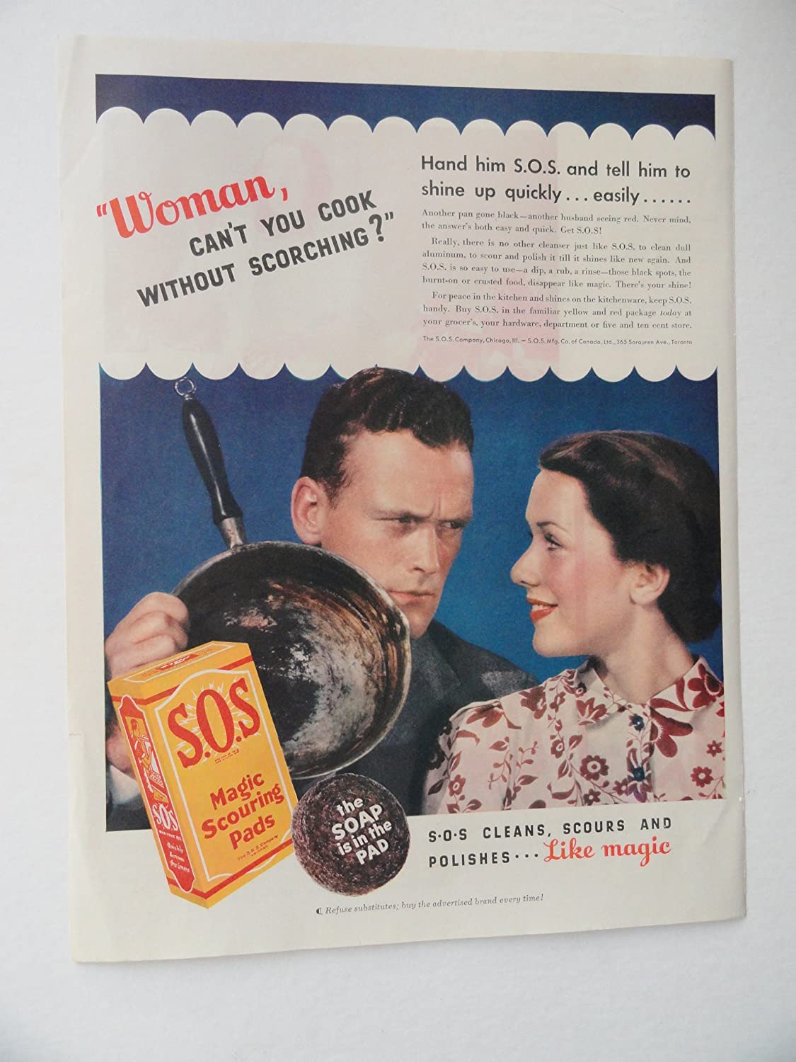
Despite the progress humanity has made in this regard during the last 100 years, household chores may still be a genuine challenge – a never-ending stream of uncreative mechanical actions performed daily. Due to this fact, the products that promise to ease this burden – such as the S.O.S. scouring pads for cleaning – have their audience cut out for them and are likely to find willing customers. However, the success is far from granted: to win a place in a saturated market, a product needs either a considerable qualitative advantage or an effective marketing strategy – preferably both. The latter is precisely what a 1937 advertisement for the aforementioned S.O.S. scouring pads aims to achieve by depicting them as a way to easily clean cooking utensils. The ad’s simple visual composition is fairly effective, yet its unnecessary use of text and sexist undertones might have worked in the 1930s but would only dissatisfy the customers of today.
One of the strongest parts of this particular as is its composition because it facilitates a logical flow of thought as the audience looks at the image. From left to right, the ad depicts a burned cooking pot, an angry frowning man holding it in his hand, and a smiling young woman – supposedly the man’s wife – on the right. This composition relies on the fact that most Western audiences are used to perceiving visual information from left to right. Thus, the viewer would first see the dirty pot, then a husband angered by the dirty pot, and then a wife completely unperturbed by her spouse’s evident dissatisfaction due to having a remedy for the problem at hand. The faces and poses of the two also speak for themselves: in particular, the man looms over his wife, which contributes to his image as an authoritarian figure (Grau and Zotos 761). An image of S.O.S. scouring pads, conveniently posed at the bottom left, as if in the next line of text, solidifies the message. Thus, the composition of the ad succeeds in delivering the message effectively through purely visual means.
However, the creators of the as do not limit themselves to visuals alone and complement it with a considerable and, one might even say, overbearing amount of text. Admittedly, the slogan “S.O.S. cleans, scours, and polishes… like magic” at the bottom part of the ad is necessary because it reiterates the message. However, the words “Woman, can’t you cook without scorching” on the upper right seem to be entirely unnecessary. First of all, they do not add anything to the value of the ad, as the visuals already make it clear that the scorched pot is the core of the problem. Secondly, they do not even relate to the main content of the ad, as the phrase does not even refer to the product being advertised. Thus, the only thing that the upper piece of text achieves is putting the blame on a woman and depicting her in a subordinate position (Grau and Zotos 766). Consequently, the ad leaves the viewer with an impression that a dirty pan is bad not because it is impossible to use until cleaned, but because it is a sign of a neglectful woman.
Unnecessary use of text relates closely to another problem with the ad – its heavy emphasis on sexist stereotypes. As mentioned above, the husband is depicted as looming over the wife, and the latter is clearly in a subordinate position, exposed to her spouse’s anger. This depiction fortifies traditional gender stereotypes of depicting men in authoritative positions and women as associated with “more family-oriented roles” (Grau and Zotos 761). Considering that S.O.S. as a brand survived and even thrived for decades after 1937 when this ad was first published, it was reasonably effective in its time. However, the ad’s heavily sexist undertones would likely make it unacceptable in the 21st century. American audiences, in particular, are already used to women in advertising being depicted in stringer roles (Grau and Zotos 766). Hence, it is feasible to assume that the image perpetuating the stereotype of women as little more than subordinate housekeepers would anger potential customers rather than appeal to them.
To summarize, the advertisement for S.O.S. Magic Scouring Pads looks like a relic of the 1930s, and some of its parts would harm the product rather than advertise it today. The visual composition is fairly effective in portraying the problem and then presenting the product as a solution in the same order that the viewer’s gaze is likely to travel. However, some parts of the text unnecessary, as they do not add anything to the visuals and do not even refer to the product in question. The ad’s sexist undertones, with the man a position of authority and the woman only being safe from her husband’s wrath because she has S.O.S. Magic Scouring Pads is another problem. Considering these factors, the ad might have resonated with the audiences of its time but would be appalling for those of today.
Work Cited
Grau, Stacy Landreth, and Yorgos C. Zotos. “Gender Stereotypes in Advertising: A Review of Current Research.” International Journal of Advertising, vol. 35, no. 5, 2016, pp. 761-770.