Introduction
The examples of design works that will be provided below in chronological order can be discussed as closely related to each other. They illustrate various approaches to combining textual and graphic components in one work that were used during different time periods. Examples of such works include illuminated manuscript pages, posters, and book and magazine covers among others. These visual products are usually eye-catching and easily attract the audience’s attention because of their illustrative elements and emotionally-colored textual messages. The purpose of such products is the representation of a certain message or idea that needs to be presented in a textual form using different typeface attributes and in a graphic form to illustrate the idea.
The Anatomical Zodiac Man (1413 – 1416)

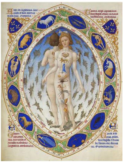
Les Très Riches Heures du Duc de Berry is the well-known illuminated manuscript that was created by the Limbourg Brothers in the 15th century. The manuscript represents a unique collection of prayers, and each page of this work is decorated with the help of small and larger images, gold, and silver. Thus, Fig. 1 represents the Anatomical Zodiac Man: two figures (supposedly, a man and a woman) are surrounded by the twelve zodiac signs (Weigert 134-146). This work inspires me because the illustration is rather detailed, colorful, and unusual, and it demonstrates how it is possible to combine a text with the illustration in order to accentuate the latter. Additionally, the work shows how the elements of astrology were combined in the manuscript with prayers.
Pantomimes Lumineuses (1892)

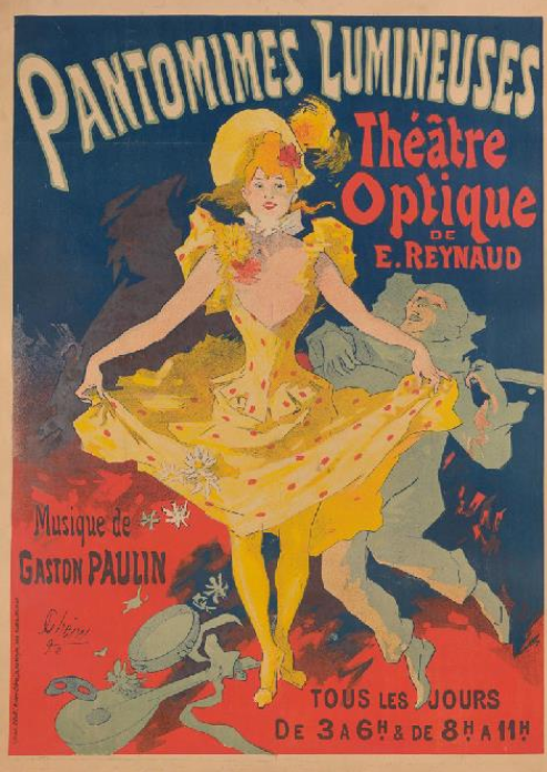
Jules Chéret created Pantomimes Lumineuses in 1892, and it is one of his popular posters for the theatres in France (Fig. 2). Chéret utilized the technique of lithography in order to produce his remarkable works. In most cases, he applied a rather limited color palette, but this approach did not prevent the artist from creating striking and vivid works that attracted the audience’s attention and made them visit performances in a certain theatre. One should state that, in posters, the textual component was secondary, and Chéret used hand-written lettering (Rymer 122-136). This work inspires me because it portrays one of the author’s “Cherettes” using only three basic colors usually applied by the artist: blue, red, and yellow. However, the poster still seems to be rich in color and contrast.
ABCD (1923)

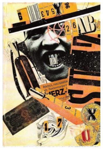
Raoul Hausmann’s ABCD, which was created in 1923, is an example of applying the technique of photomontage in order to create a collage in the form of a poster (Fig. 3). The artist was influenced by the aesthetics of the Dada movement. In this work, the author portrays himself (a self-portrait) with the help of showing his face and his name below the picture. He used different letters, including VOCE and ABCD, to support his visual images. The author’s message is created with the help of both images and letters to accentuate his voice as an artist (Didi-Huberman 8-24). This work inspires me because it makes a viewer spend much time examining it and thinking about its message as some images included in a collage are rather provocative.
Magazine Cover (1926)

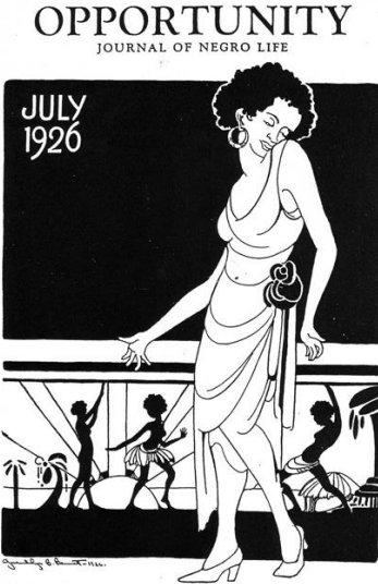
Gwendolyn Bennett was a famous female artist who worked for Opportunity: A Journal of Negro Life. The Harlem Renaissance significantly influenced the woman’s vision and philosophy, and her covers for the mentioned journal represent African American men and women in their diversity. Furthermore, her works were also influenced by the stylistic peculiarities of Art Nouveau and Art Deco movements. Fig. 4 provides the example of one of Bennett’s works (Wheeler and Parascandola 45-56). The main heroine of this cover is a Non-White woman who is dressed in a manner resembling the clothes of some tribes or Indigenous People. The selected colors for the image are black and white. The textual components presented in the picture are explained with reference to the fact that it is a magazine cover; therefore, they do not support the image. This work inspires me because it is rather simple in its style, but it provokes thinking about the background of colored people, their traditions, and beliefs. Moreover, the work also stimulates thinking about the role of a woman and her voice during the period of the Harlem Renaissance.
Music Album Cover (1972)

It is important to note that Afrofuturism was developed in contrast to primitivism associated with Non-White nations, and the examples of this movement are presented in different types of artworks, including even music album covers. The combination of the text and image typical of these covers allows for discussing the cover for the album Astro Black by Sun Ra, which was released in 1972, in the context of its visual value (Fig. 5). Afrofuturism was characterized by representing cosmic and scientific elements in their relation to the representatives of the Black race. In this picture, Sun Ra is vividly depicted in the background of the cosmos and Saturn, as well as a colorful triangle and pyramids. All these elements point at the connection between ancient pyramids and the cosmos mysteries explained in the philosophy of the artist (Szwed 12-56). This work inspires me because it is quite mystic and eye-catching, allowing for focusing on the details of Afrofuturism to find these elements in the art pieces of other artists.
Conclusion
The five examples of visual art have been presented and discussed in this paper in detail. It is necessary to state that all the provided pictures can be viewed as closely related to each other because they all have both textual and graphic elements to convey a particular message. Thus, the selected posters, book pages, or magazine and album covers seem to be rather similar with reference to the idea of expressing the message through the combination of texts and images. However, referring to the fact that these works were created during different time periods and the impact of various art movements and aesthetics, the selected pieces are still dissimilar. They represent artists’ unique visions and styles, and all these art pieces are organized in chronological order to accentuate the changes in styles and dynamics in visual art. All these works have inspired me because of the artists’ ideas and their realization with the help of textual and graphic forms.
Works Cited
Bennett, Gwendolyn. The Magazine Cover for Opportunity: A Journal of Negro Life. 1926. Web.
Chéret , Jules. Pantomimes Lumineuses, Théâtre Optique de E. Reynaud, Musique de Gaston Paulin. 1892. The Metropolitan Museum of Art, New York. MET Museum. Web.
Didi-Huberman, Georges. The Eye of History: When Images Take Positions. RIC Books, 2018.
Hausmann, Raoul. ABCD (Self-Portrait). 1923. The Metropolitan Museum of Art, New York. MET Museum. Web.
Limbourg Brothers. Les Très Riches Heures du Duc de Berry. 1416. Musée Condé, Chantilly, France. Web.
Rymer, David. The World in Prints: The History of Advertising Posters from the Late 19th Century to the 1940s. White Star, 2020.
Sun Ra. Astro Black. 1972. Sun Ra Music Band Camp. Web.
Szwed, John. Space Is the Place: The Lives and Times of Sun Ra. Duke University Press, 2020.
Weigert, Laura. French Visual Culture and the Making of Medieval Theater. Cambridge University Press, 2015.
Wheeler, Belinda, and Louis J. Parascandola, editors. Heroine of the Harlem Renaissance and Beyond: Gwendolyn Bennett’s Selected Writings. Penn State Press, 2018.