Introduction
Websites tend to implement different types of graphic styles based on their functionality and purpose. Proper design catches the viewer’s eye, puts emphasis on the most vital parts, as well as makes searching and reading information simple, fast, and comfortable. However, there are numerous mistakes that website creators make in graphic design, such as lack of contrast, consistency, add misaligned elements, or place similar items away from one another.
In this essay, four common principles of design will be shown on the example of two websites that serve similar content: Bleacher Report and ESPN. Both websites provide news and articles related to a variety of sports, such as football, baseball, basketball, and others. I chose these two websites because of their apparent differences in styles, which significantly alter content delivery and user experiences. They have easily distinguishable designs while providing the same type of content, and their traffic overlaps for 35.6% (“Bleacherreport.com competitive analysis, marketing mix and traffic,” 2020). However, the statistics website Alexa shows that ESPN has a major advantage over Bleacher Report in regard to the number of daily visits, and the average time a user spends on the website (“Bleacherreport.com competitive analysis, marketing mix and traffic,” 2020). This essay aims to find the differences in design that might affect these statistics.
Proximity
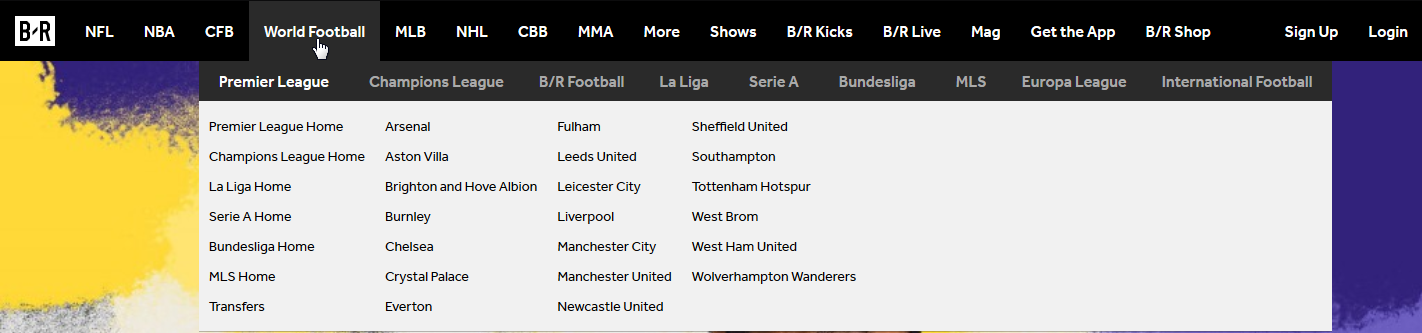
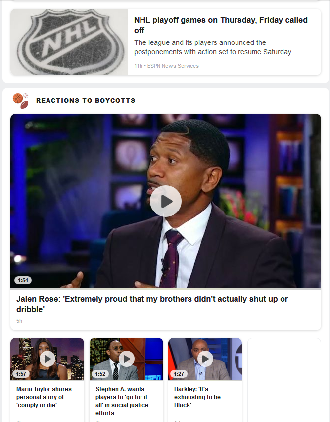
The first parameter is the proximity of similar elements, which makes the layout more user-friendly and intuitive for use. For example, header navigation bars are useful for providing easy access for groups of items. It is worth mentioning that while the navigation bar on ESPN sticks to the top of the visible part when scrolling, the same element on Bleacher Report is static, and the user has to scroll back to the top in order to access it. The apparent differences in the number of tabs in the navigation bar show that the proper categorization is crucial for a compact, yet neat design.
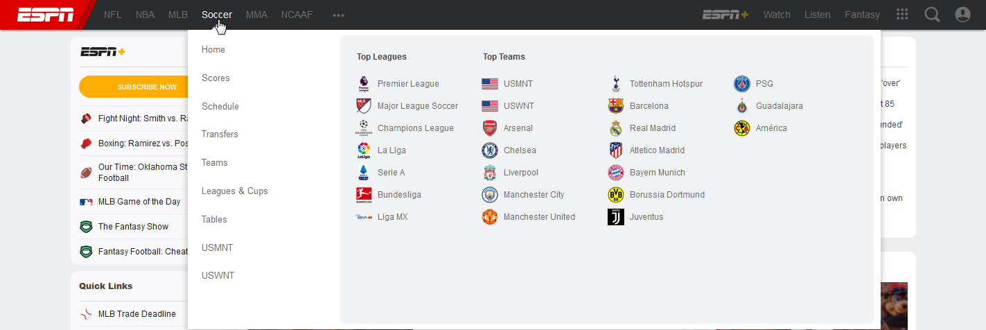
Moreover, the proximity of elements requires their placement in the most accessible position. McGrath (2016) states that “proximity works with alignment to help with efficient interpretation of a website and its messages.” The ESPN website uses both left and right sidebars in order to present them in a position close to the top of the page, where the user will see them immediately. The only reason for the difference in the number of is the advertisement on the right sidebar.
Alignment
When related items are aligned, they appear more distinct from others and are easier to understand. The alignment of the elements leads the reader’s eye and adds clarity to the hierarchy of the text and graphics (McGrath, 2016). More refined designs tend to include a higher number of aligned elements. On the example of these two sports news websites, ESPN contains three differently alinged columns, as shown in Figure 3.
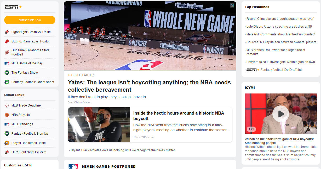
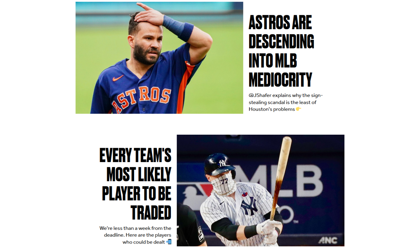
The alignment of elements of the title page differs significantly between websites as well. As shown on Figure 4, all items on Bleacher Report, excluding the navigation bar, are center-aligned. However, the ESPN website displays the information below the header as three groups, where each has its own width and is separated by a 40px blank space. It allows the users to access links on the sidebars quickly, however, due to the length of the central column, it creates large empty areas below sidebars that take almost a half of all space on the screen.
Repetition
Repetition of the style of elements, fonts, and headings is vital for the website to look organized and complete. By following this principle, graphic designers make a more cohesive image and a straightforward composition of the page that allows the user to predict the appearance of future elements (McGrath, 2016). On the example of ESPN and Bleacher Report, there is a visible difference in the number of headline styles used throughout the title page. The headlines on ESPN have more variety, which can be attributed to the higher number of types of displayed information.
Despite this fact, ESPN uses fewer fonts in its design. ESPN primarily uses Arial, aside from its own ESPNIcons font for custom icons, while BR uses both Effra and Druk fonts for its headlines, but advertisements and embedded content from twitter add a visible disparity, as shown on Figure 6. At the same time, the advertisements on the ESPN website are less outstanding due to their size and style, and the website does not have any embedded elements on its title page.

Contrast
Contrast is used for highlights of critical elements on the website, as well as for separating data. The necessity of usage of contrasting elements depends on the purpose of the website and its audience. It is recommended to avoid placing multiple high-contrast elements close to each other in order to avoid cluttering the screen (McGrath, 2016). The title page of Bleacher Report contains a high number of such elements.
These websites have different background layouts, where ESPN looks more reserved with its bleak background. ESPN uses Arial and its Bold and Black variants, which creates a higher contrast between elements without making them stand out. Bleacher Report uses another approach to make its items more distinct, as each element on the title page takes an entire screen width and a significant portion of the screen height. Both websites have highly contrasting advertisements below their navigation bars and draw the immediate attention of visitors.
Conclusion
In conclusion, one of the reasons why ESPN has a higher number of visitors and clicks per visitor is its neat design, which is easier to navigate and has more structure than Bleacher Report. Bleacher Report is more obtrusive in its design, and the navigation can be hindered by the inconsistency of its elements. Moreover, ESPN has more content in close proximity, and all items follow the same style. Each website will attract different types of regular visitors depending on their preferences, however, the design of the ESPN website gives it an advantage over its competitors.
References
Bleacher Report | Sports. Highlights. News. Now. (n.d.). Web.
Bleacherreport.com competitive analysis, marketing mix and traffic. (n.d.). Alexa. Web.
ESPN: Serving sports fans. Anytime. Anywhere. (n.d.). Web.
McGrath, O. (2016). Web users demand clarity. Endless Gain. Web.