Introduction
The design of the Calhoun Community College home page is simple, concise, and visual, but the structure and logic of the site remain uninformative. Searches for relevant information by applicants risk being unsuccessful, as the page is a combination of multi-directional links to the rest of the site. The purpose of this note is to encourage the webmaster to reconsider the concept in the direction of changing the logic and structure, as well as changing some design elements, such as the location of buttons.
Problem with Focus
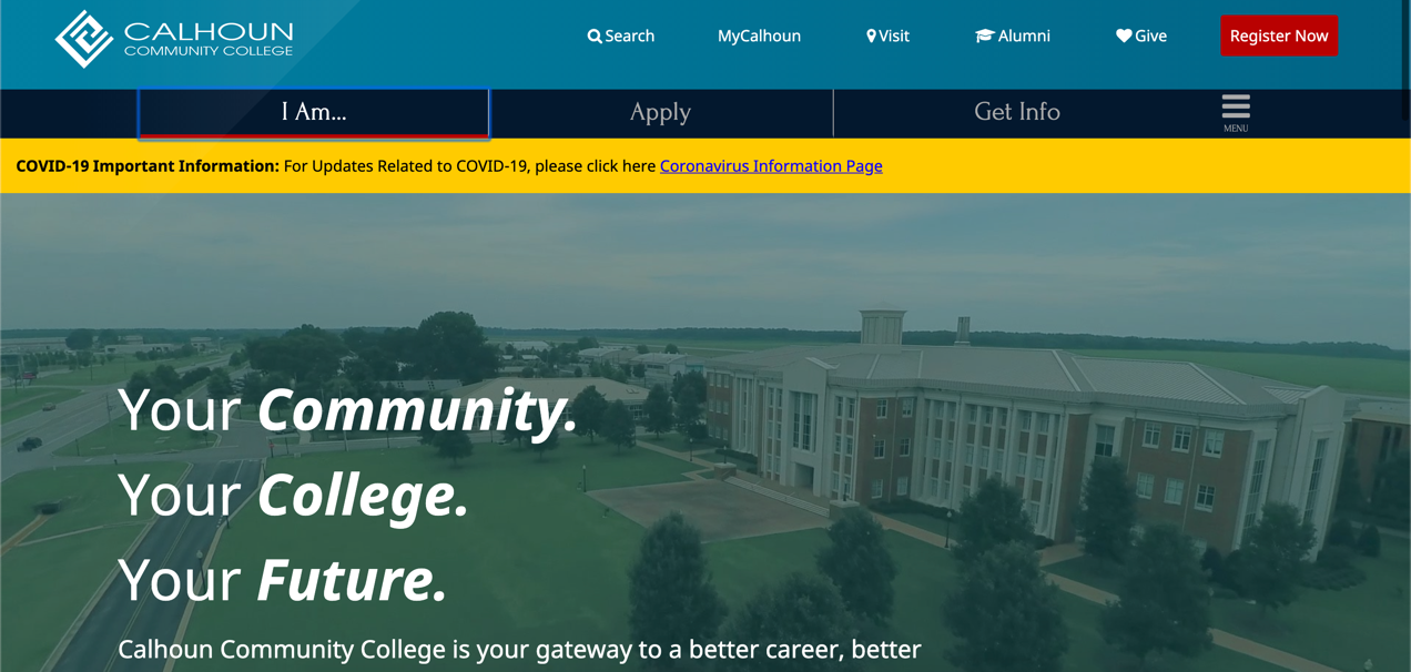
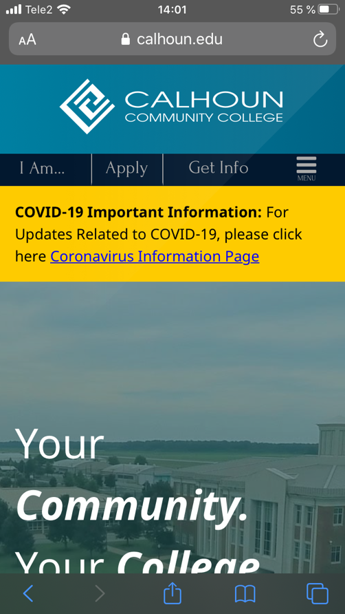
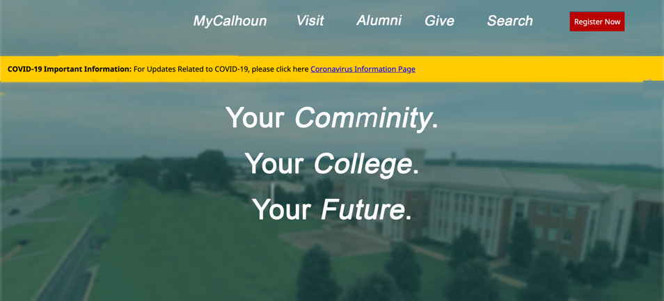
The College website is designed for students, applicants, teachers, and people interested in getting an education or taking a course at this institution. However, it is essential to understand that there is no second chance to make a first impression, therefore, it is important to approach the design of the homepage correctly. It is necessary to consider that the homepage’s primary purpose is to give an idea of what the organization is, hence, the key focus should be on self-presentation. In the case of Calhoun Community College, the first attention is drawn to three short and elegant but meaningless sentences, which, in addition, fall slightly below what is needed because of the coronavirus prevention insert (Fig 1). Moreover, when looking for information from a mobile device, the situation is even worse, since the shift of emphasis is more noticeable (Fig. 2). As a result, the user gets a homepage with no central idea.
Problem with Navigation
First, it should be noted that the presence of a search button dramatically simplifies the work with the site, so its location should remain visible, but not forced. Placing this button in the center of the site header is a serious drawback because it immediately provides a context that as if tells the university entrant to use the search, and all other elements of the home page to ignore (Fig. 1). Knowing that any information can only be found using this functionality devalues the great work on the homepage’s design and configuration.
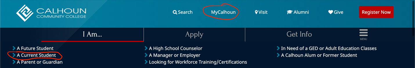
The second question relates to the emphasis of the homepage and, accordingly, the structuring of sections. The homepage is supposed to guide users carefully for information (“The 31 best homepage design,” 2020). However, Calhoun Community College leaves the top two lines of the page, which not only do not correlate but also contradict each other: if the user can get current information on the transition to “MyCalhoun,” the button “I am a current student,” as shown in Fig. 3, loses its relevance.
Proposed New Focus
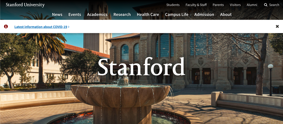
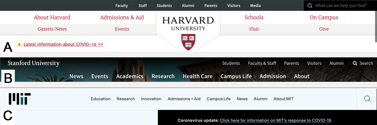
The proposal to change the focus of the webpage comes from an analysis of other educational institutions’ specific sites. In particular, it is possible to solve the problem of a work of the first impression by leaving the format of the video cover and three sentences, but by making a more excellent contrast between the background and the first layer. This can be achieved by seeing the upper blue bar as an extension of the video file and placing the welcoming words in the center, as presented at Stanford University (Fig. 4; Fig. 5). In this case, optimizing for mobile devices will allow guests to see the text, and elements of color complexity will disappear.
Proposed Navigation
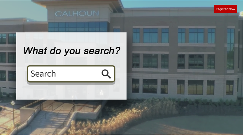
Changing the navigation of the homepage starts with moving the “Search” button to the right edge, as is the case with most educational organizations (Fig. 6). In addition, it is necessary to simplify the use of the site, perhaps to the extent that it would offer users to find relevant information based on the machine learning mechanism (Fig. 7). Such access would allow users to obtain accurate and relevant information without the need for lengthy searches. In addition, the introduction of such a homepage will revolutionize educational websites, positively distinguishing Calhoun Community College from the rest.
Conclusion
In summarizing the above, it is necessary to emphasize the importance of regular homepage updates to ensure that design, navigation, and logic are in line with changing industry conditions. The analysis of the Calhoun Community College website has demonstrated the need for quality not only in remodeling navigation elements such as the Search button but also in removing repetitive elements, as well as revising the existing page design. In this regard, particular attention should be paid to the willingness to discuss future steps for improvement and the implementation of a new design.
References
The 31 best homepage design examples and ideas for your website. (2020). The Daily Egg. Web.
Calhoun Community College (2020). Web.
Stanford University (2020). Web.
Harvard University (2020). Web.
MIT (2020). Web.