Introduction
The Architectural Review magazine has undergone tremendous changes over the years due to shifts in architectural phenomena such as modernism, as well as the evolution of the various technologies and materials used in the production of the publication. These changes have affected both the content and layout of the magazine in such a way that it is possible to establish a clear distinction between the older versions of the publication and those produced in recent days. This essay seeks to analyze the layout and formatting changes that have taken place in the magazine. Each and every different presentation of the magazine since its inception shall be discussed in the report and this shall form the background of the essay.
Methodology
Page layout and design is critical aspect of magazine production that cannot be effectively analyzed without obtaining information from real case scenarios. As such, the research will be primarily based on an analysis of the magazine pages since the first publication to the most recent. However, using secondary sources a link will be provided between the definite brand image and association elements of the magazine and its impact on the market. Data will be extracted from various journals, articles and books to provide enough content to support the observational findings from the magazine.
The criteria of selection for the literature will be the relevance to the research topic as well as the year of publication. Both public and private libraries as well as online libraries will be visited in order to access the data. This research will be partly evidence-based and partly founded on professional research by professionals in the field. Various articles will be studied in order to provide background information that will essentially give credibility to the final essay.. Information from the books will serve to provide an explanation as regards the internal machinations of financial departments of a company. This will be very crucial information that will make the research report appeal to both professionals and the general public.
For the latter, it may require that some of the information obtained from the books and other publications be broken down into simple language and at the same time illustrations drawn from the commonly applied systems of internal audit. Empirical data will be collected from recent studies with numbers and figures used to show the costs and economic impact of internal audits in a particular institution and how they could effectively be used to serve as a guide for other organizations that would like to make the switch. Like with any other professional field of study, business researches have to be conducted in such a way that they offer credibility to the practitioner. In such a professional field, the strength lies in the figures and particularly the numbers obtained from real-life scenarios to support collected evidence. With this knowledge in mind, the effort will be made to obtain relevant information to the particular topic in question and this will be accompanied by proper citation.
Architectural Review
After the industrial revolution, the need of the society for change was stronger than ever and the ground for a new movement in art and architecture that would express this need was fertile. The model of urban life needed “an eminently rational solution: order and efficiency, like that of the machine”. The Architectural Review was one of those publications that captured the spirit of this particular age and has been heralded as one of the main contributors of change to the architectural culture in Britain.
As has been documented by various scholars, without the AR in this period, Modernism would either not have arrived in Britain or it would have taken a completely different orientation.
Peter Reyner Banham notes: ‘Modernism was the first movement in the history of art that was based on photographic evidence rather than on personal experience, drawings or conventional books.
The power of this magazine and the rest of the architectural scholarly and professional influences, such as books, journals, architectural schools, were sufficiently influential to affect a shift in architectural discourse, to configure the new Movement. As Andrew Higgott notes in his book Mediating Modernism, Architectural cultures in England, this configuration created the functional basis of Modernism through the theoretical and aesthetic principles which the new generation of architects accepted as important.
The Architectural Review (AR) was first published in London in 1896 as “Architectural Review for the Artist and Craftsman’ and was one of the most influential magazines of the Modernist era because it had a critical influence on the history of architecture in various ways. The publication has been described as one of the most “visual” magazines in the 1930s; the era of modernism.
Being one of a handful of magazines of its era that is still in publication today, one can distinctively see the evolution of both content and page layout in all issues from the time of inception to current days.
Page layout
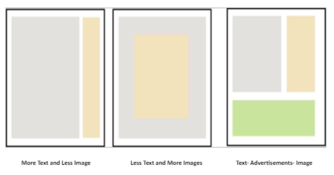
Page layout basically means the general placement and arrangement of text, images (sketches, technical drawings, paintings, posters and real-life photographs) and other visual elements such as advertisements on a page.
All the page components described above have undergone sporadic changes through time with the amount of text being reduced tremendously to give way to images that have in turn become larger and have gained more color. The changes have become more obvious in the relationship between text and illustration. The architectural paper is now usually judged almost entirely upon the quality of its illustrations, the text matter being not only secondary but in some cases serving only as a vehicle for the plates.
The cover of the magazine has in the period of the evolution become more attractive as a result of using colors that are spontaneously appealing to the eye, and this attractive trait has been backed by the quality of paper evolving from the coarse type to the glossy kind.
Advertisements occupy are now integrated in a seamless way with other page elements and the revolution has seen some pages being entirely dedicated to single advertisements.
The first publication-1896
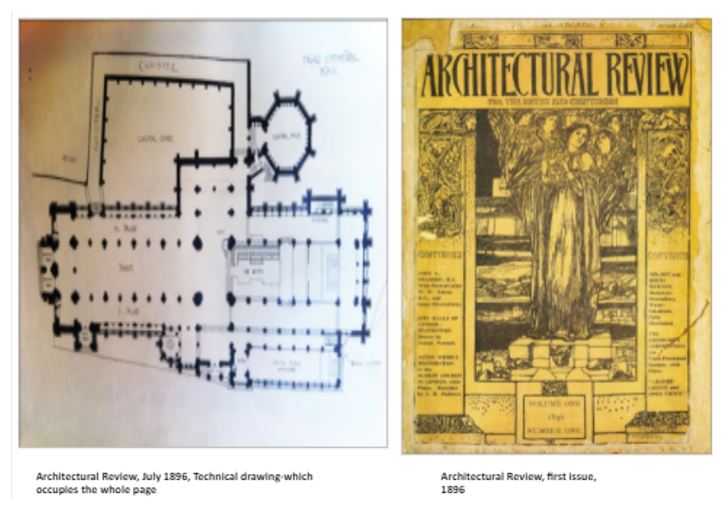
In the formative years, the Architectural Review was very much an Arts and Crafts periodical, inspired by John Ruskin and AWN Pugin, the movement’s great patriarchs. The first decade saw a long-running series, The Practical Exemplar of Architecture, which was intended to provide architects with a universal pattern book illustrating various architectural styles of the day. This publication was relevant to its role as it contained plenty of photographs and measured drawings.
The first decade’s issue was envisioned to be more like a book than a magazine; the format was large and with a plain layout so that readers could savor the visual designs as well as the text. The text itself was heavy, but in a very distinctive language so that it could appeal to readers from different backgrounds. It occupied more space on the page than the illustrations.
The illustrations in the first issue comprised black and white paintings, technical hand drawings, different kinds of sketches in oil and charcoal. A few photographs of real-life buildings were presented in a thick blank frame while several full pages were dedicated to architects’ portraits.
Embracing classical architecture
The layout slowly changed with the magazine’s authorship becoming conscious of stirring international development and started devoting itself to classical architecture. By 1900, the magazine could boast that it was ‘the only magazine in the British Empire dealing with the artistic, as distinguished from the business side, of architecture’, a description that still, curiously, rings true today.
As far as photography and the use of images were concerned several changes occurred in the early 1900s publications. These issues contained many photographs of buildings and large-scale urban projects in the centerfolds. There were many photographs of interior spaces, which occupied whole pages alongside a limited number of sketches. Most of the pages carried just one picture without text. Some select pages had a combination of both photographs and drawings.
Advertisements were successfully placed at the end of each issue and always appealed to the architect’s interests as they mainly dealt with the likes of heating and ventilating systems, ironwork, glass and elevators. The emergence of commercials was important since they were the ones that transformed the publication’s appearance from a book to a magazine.
The Re-launch
The 1910s issues saw the re-launching of the Architectural Review heralding a new and lavish format. It took advantage of the quality of photographic reproduction to print large quantities of whole page photographs illustrating the great works of a confident Empire.
The 1910s issues contained less text and explored new architectural subjects. For example, Arthur J. Davies wrote about the need for ships to be like buildings, something that had not been hitherto thought of.
The placement of advertisements also underwent a transformational shift with some of them finding space in the front pages of the magazine as opposed to being reserved for the final pages.
The impact of modernism on the magazine’s content and layout
The 1920s saw the AR engage become more actively involved with new architectural movements. It proposed ideas and plans for the League of Nations. It reprinted Louis Sullivan’s speeches verbatim and commissioned pieces from Le Corbusier, ErnöGoldfinger, Berthold Lubetkin and Walter Gropius. Indeed, it was at the AR that Nikolaus Pevsner, the famous German art and architecture historian, began his illustrious career.
During this period, the magazine became much more lively and diverse with the arrival of John Betjeman, Hubert de Cronin Hastings, new authors, idiosyncrasy and modernism which changed the content and the layout of the pages. For instance, the 1922 July issue focused more on interior design thus, publishing oversized photographs of interior spaces and of decorative objects and furniture such as floors, lamps, canapés and textiles.
AR as an advocate of modernism
It was under James Richards’s editorship that the Architectural Review shifted from the adherent of the British historical tradition, with antipathy for the new, to a champion of modernism. By1935, the journal of the avant-garde traditional architects started to become a manifesto that expressed the need of the age, the ground for the “mainstream of practice”. Indeed, it underpinned modernist’s fervor with eclecticism to the ‘correct’ aesthetic. However, aesthetics were not the priority. Rather the ‘correct’ was translated as the modern building developed under the idea of reflecting the needs of the society. The way of representation with the appropriate photograph and layout showed the difference between the “correct” and the “incorrect”.
It was also common practice to shift the focus from Britain to the rest of Europe. For instance, Scandinavia was one of the countries that often appeared in articles, especially referenced for its approach to materiality, which had strong resonance within Britain. The works of international professionals reflected on the layout of the magazine in the form of some pages being entirely dedicated to both graphical and pictorial presentations of their works.
Even though the AR did not promote individuals’ works as a professional privilege mainly because it was believed that architecture was more of a ‘collective effort’ of a group and a practice that worked under the same values, the journal was the most visually innovative and modern magazine of the 1930s.
Over-size paper (28×35) and innovated layout with large, carefully chosen photographs, particular type and size of the font, the best qualities of paper with a variety of textures and different colors presented always a graphically strong result.
Attention was paid to printing, using different methods and gradually embracing the element of color, as well as an eclectic mix of materials like Victorian typefaces and wallpapers; always in the best possible quality. The mission of the magazine was not to constitute a ‘dictionary’ of what was modern but to promote all the new ideas through the visual document, encountering every single issue as an “art object”.
AR in the War period
Illustrations emphasized the visual qualities and analyzed the program of the building and its functionality. Imagery became the direct language that conveyed the message as it allowed the usage of the visual effect to communicate to the viewer. A representative example of this innovative way of illustration of the AR is the house at Bentley Wood in Essex by Serge Ivan Chermayeff published in 1939. The project is lavishly illustrated with a series of photographs and diagrams that explain its function, with limited descriptive text. The use of landscape format of the photographs emphasized the horizontality, founded in most of the modern houses of the period, underling the relation between the simple interior and the wooded landscape.
The text usually occupied less space on the page, but with a very controlled language, a comprehensive and descriptive context that responded to the modernist typography. Photographs and drawings though are the main ‘instruments’: usually used under the rule of ‘details large, general views small’ emphasized on form and mass, volumes, light or detailing. Sometimes they covered a whole page, but without the intention to dismount importance from the text. With such integration of text and graphics, not witnessed before in Britain, AR became the most innovative and attractive magazine.
During this time, the architectural intentions through the presentation embraced a varied outlook. There were articles that did not support the photographs but instead questioned the ‘purity’ of buildings and their loyalty to Modernism. These articles appreciated the fact that even though a project might not embody precisely the elements of modern architecture (like pilotis, horizontal windows, roof gardens and the glass façade), the way of presentation could support its ‘modernity’.
Other projects and subjects which had material qualities and responded to the modernist principle took a place in the magazine’s pages.
The magazine also focused on the research and design process of “making”, for example, mass production as an easy way of reproduction, thought by Le Corbusier.
Often many pages were dedicated to health projects underlying the concern on health as a social problem and often implying that architecture could help solve the problem. Generally, the projects that the AR covered expressed a consciousness about engaging with society rather than the rigor design and the aesthetic.
Despite the fact that during this period the journal was focused on Modernism, it avoided a doctrinaire approach. Its critical language did not always glorify any work that seemed modern. Rather, it usually appeared in the articles on projects that would not respond to the new movement, for example, the eighteenth-century pantheon in Oxford Street in 1937, or anonymous projects found in the urban or rural landscape. Simultaneously, it looked at the unfashionable, the engagement of traditional values of craftsmanship and picturesque, blending the modern with the traditional. It is possible, that with intent, the Architectural Review, under Richards’ editorship, seemed not to be a merely revolutionary press as it has been written.
During this period, there was probably an irresolution in the influence between industry and architecture: Modernism had influenced the industry to produce a variety of new materials and techniques that would serve the needs of the modern building or match the new aesthetic; at the same time industry brought in the market new products that were attractive enough to influence those who practice out of the new movement. Architectural Review dedicated a big part of every issue to advertisements for new materials and suppliers. A few of the advertisers adopted a modernistic language in order to promote their products and support the movement. For instance, there was a tendency by manufacturers to emphasize the durability and cost-effectiveness of factory-made parts.
Adopting this explorative mentality, they aimed to adopt a non-exclusive profile and not the doctrinaire expression of modernism, as happened with other journals of the period. We could argue that the strategy of the juxtaposition of the new and the traditional was not only a way to highlight the new movement but to help people to understand what was ‘appropriate’ for the period. At the same time, the look to the traditional was a kind of education and reference for the modern looking. Richards says: ‘Discarding the historic styles as a source of forms and detail began a process of looking as them with very different eyes, of looking at the past in the same perspective as the present.’
AR in the immediate post-war period
There were significant changes in content and layout in the 1940’s issues that brought the Architectural Review to what it is today. As far as content is concerned, most of the photographs from the issue were “real life”, depicting people moving around the buildings. Most posters in the issues contain anti-war messages. Also, advertisements become more colorful by encompassing strong colors such as red and orange thus, becoming more attractive.
The quality of the paper changed from the coarse texture characteristic of a book’s paper to a much smoother kind. Articles written on various “social” subjects like school, hospital and university were printed in different colors of paper with an aim of showing the distinction between topics.
The numbers of the pages become less evident, but the letters increased in the font. Their usage of facing pages for continuous stories became more and more popular with pictures and illustrations lying on one page and the descriptions running on the next page. Past events were printed in a sepia light brown color to give emphasis to the historical nature of the happenings.
In the post-war years of new ideas, AR’s reputation for scholarship grew and Pevsner was succeeded by a young Colin Rowe, who made memorable contributions to the magazine. After the strong foreign flavor of the war and its immediate aftermath, the 1950s witnessed a shift back to the conscientious efforts of British architects to rebuild a shattered nation.
Reyner-Banham joined in 1952 and made an almost immediate mark on the magazine that seemed to him ‘rather fusty and run by elderly men’. In its Townscape, Subtopia and Outrage sections, pioneered by Ian Nairn and Gordon Cullen, the AR campaigned vigorously against the curse of mediocre philistinism and celebrated the apotheosis of modernism.
The shift from modernism to post-modernism brought many changes to the layout of the Architectural Review. Successful magazine photographers adopted a propagandizing style because they needed to sell modern architecture as a product of progress and technology. The photographs mirrored a lifestyle intended to work within the framework of the building.
Some architectural photographers even solicited the services of visual “witnesses” – people who illustrated how the spaces could be used. The placement of their works in photographs of building interiors and gardens demonstrated exactly how these spaces could be occupied.
This made images of new homes seem more comfortable to the average American consumer, paralleling trends in television and magazine advertising. From the mid-1950s to the present, the photographic depiction of modern architecture continued to evolve. As magazine requirements changed, commercial architectural photographers began working in both color and black and white.
The layout of the pages became more organized, and a divide between the text and the illustrations was established. A combination of illustrations and text on the same page, photos of physical models, photos with bold frames were some of the magazines’ characteristics that made it stand out from other publications of the time. Stronger colors were used for the photographs and a legend that described each photograph was also present. The titles of the subjects were colored and the text was presented in black.
The entry of post-modernism and rivalry in Architectural magazines
The 1960s brought an end to the certainties of monopoly and the magazine faced increasing commercial peril. The Man plan series of the late ’60s was designed to reposition the AR at the heart of the debate, setting out to ambitiously correct the ills of Britain with huge photographic coverage of its problems, complemented by verbose essays on suggested solutions.
These can be seen today as an analogy of the hubris of the profession, whose architects had begun to believe that they could build a new society by the imposition of enlightened architecture.
Trends of individual expression and informality surfaced in architecture, a breach between accepted standards and creative design grew are some of these decade’s characteristics.
A new generation of architects emerged, forming a communication network that promoted and expanded the exchange of ideas outside academia. This new breed of architects proposed that architecture was more than the creation of isolated structures but that it required social and environmental considerations as well. The use of space-age technology, real and envisioned, coupled with the new concepts of complex architecture, led the way toward environmentally and ecologically focused designs which in turn found prominence in the pages of the magazine.
AR in the post-modern era
A new direction for architecture in the 70s was the trend toward restoration and rehabilitation of existing buildings. Economic constraints and increased awareness of environmental issues caused demand for architecture plans for the restoration of old houses, barns, schoolhouses, etc for homes. The above changes in architecture brought many changes in magazines’ layouts and pictorial content. Issues of the Architectural Review of the time carried many black and white photos that were used to emphasize the contrast between run-down houses and their restored forms.
By the 1980s the AR had regained its focus under Peter Davey, shifting into a theme-based format, in which buildings were grouped by function or idea. It was during this period that the magazine reclaimed its intellectual and visual superiority, with special issues on the environment, landscape, art and ecology, and architecture and climate, indicating a prescient engagement with environmental issues.
The Architectural Review in the 1980s witnessed the following changes: A modern cover design, advertisements before the index, new style advertisements (including prestige items not related to architecture such as cars), interviews, photographs of physical models, landscape images, a combination of blue and black and white images, the first use of gradient, details of a modern style, glossy paper and white letters in black background.
The designers of the magazine also began experimenting with different layout formats. Most notable was the usage of an abstract presentation of page content where both text and images were laid out in an arbitrary method irrespective of the page and column alignment. This was mainly a stylistic device used to captivate the readers.
Architectural Review today and the role of today’s architectural magazines.
Now, a decade into the new century, pluralism, parametricism and plagiarism reign, though the AR is still skeptical of fashions and fads, believing architecture to be, at its core, a socially responsible art. As with all media, it becomes impossible to tell how far the AR has accurately recounted the preoccupations and ideals of several generations, and how far it has defined and shaped them. Yet through time, it has changed in format, design and personnel and it still maintains a spirit of constancy and continuity. And as the AR’s immense archive is gradually digitized, its deep historical roots will hopefully inform, enlighten and reconnect with new generations of readers.
In our days, there is a need for visual representation. Our society is a visually driven one and therefore, contemporary architecture, architects and architectural education work towards accomplishing the visual image, as it has become as important as an impression.
The production of images using several techniques such as realistic renderings and photomontages through computers, photos taken from models, even from the initial moment of the designing process, has been the priority of architectural practices. Additionally, the juxtaposition of image and text where the message derived from a value system, like in modernism, has now been replaced with a more ‘methodological’ description. Now, architects work towards a description of the process and methodology of a building but most of the time without addressing a specific idea.
The take-over of magazines by digital media
The layout and the content of architectural magazines changed and become more ‘’glamorous’’ and more attractive as the readers are more and more interested in skimming and browsing as opposed to going into in-depth reading. Today’s architectural magazines have a different character as most of them are only available in digital versions and this is because of the reasons presented below:
First, most publishers prefer the digital versions as they offer the unique opportunity to optimize their publications with video, audio and hyperlinks while saving the money traditionally spent on printing.
Secondly, digital magazines remain available for as long as the publisher allows them to. Similarly, an advertiser’s message remains available longer than it would in print. Most publishers keep past publications immediately available online so that the audience for a particular issue continues to grow over time.
Finally, the advertisements can be enhanced with animations and video hence heightening the impact alongside the added advantage of direct access to the website of the company whose products are being advertised.
Conclusion
The importance of layout and design cannot be underestimated in today’s competitive print/magazine business atmosphere. By identifying the customers’ needs, publishers can come up with creative ways to attract the attention of the public to a product that is targeted at addressing this need. In order to serve the purpose of academic analysis, this essay has underscored the value of both brand image and brand association in relation to how products and services are received by the public. To this end, a proper literature review has been provided to study common trends and influences of the layout of the Architectural Review magazine in the period spanning from 1896 to 2010. Accompanying the literature review was a set of primary data collected from the various issues of the publication.
In conclusion, it can be said that the way the authorship of the Architectural Review magazine has over the years confronted contemporary architecture has essentially been driven by the need to captivate reader visual reader interest through the attractive content presentation. This has in turn seen it grow from strength to strength and still maintain a committed readership.
Reference
- Banham, R., 1986. A concrete Atlantis: U.S. Industrial Building and European Modern Architecture, Massachusetts: MIT Press, p.18
- Higgott, A., 2007. Mediating Modernism, Architectural cultures in Britain, Oxon: Routledge.
- The Architectural Review, 2010. Web.
- Landau,R., 1981-1982. Notes on the concept of an Architectural position, AA files , 1 (1) p.111-114.
- Colomina, B., 1994. Privacy and Publicity, Modern architecture as Mass Media. Massachusetts: MIT Press, p.13.
- Robinson, C. & Herschman, J., 2001. Architecture Transformed: A History of Photography of Buildings from 1893 to the Present. Massachusetts: MIT Press.
- Sustainable World Architecture, 2010. Architecture in the 60s and 70s. Web.
- Articles Base. Digital Magazines. Web.
- Aaker, D.A.,1991. Managing brand equity: Capitalizing on the value of brand name. New York: The Free Press.