
Introduction
In data visualization, graphs serve as a conduit that connects intricate datasets to the comprehension of general audiences. However, construction varies among bridges. The graph examined, obtained from a fictitious article on climate change, purports to depict a concerning increase in global temperatures over the last century.
Analysis of Data Visualization
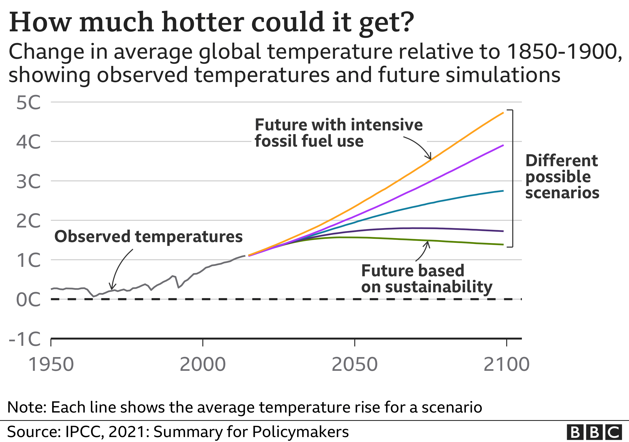
The abrupt increase in the graph’s value first suggests a catastrophic event of unprecedented magnitude. Upon further analysis, however, a nuanced narrative of design decisions emerges, which may gently deceive the observer. The graph’s initial success stems from its visual impact, which draws the viewer’s attention and stirs anxiety through the conspicuous rise in temperatures. The ability to promptly grasp a multifaceted matter is what distinguishes effective data visualization (Schuster et al., 2023). The degree to which the Y-axis, which represents temperature change, is magnified on the graph determines the magnitude of the temperature increase. Although technically precise, this choice of scaling magnifies the perceived rate of change, potentially leading the public to perceive excessive alarmism.
Regardless of the aim, this alteration raises concerns about the graph’s deceptive nature. An erroneous perception of the climate change narrative may result from the emphasis on a transient surge in figures while neglecting to mention enduring trends (Morini et al., 2023). Even though the graph emphasizes temperature swings, it fails to account for the broader historical context of climatic oscillations.
Given the aforementioned observations, a revised graph might offer a more impartial perspective. Although not entirely erroneous, this selective dissemination of data may mislead the public about the gravity and immediacy of climate change’s consequences (Driessen et al., 2022). By integrating a broader spectrum of historical data, for example, recent temperature rises might be contextualized within the inherent variability of the Earth’s climate system.
Conclusion
In summary, although the graph effectively highlights the pressing issue of climate change, its design decisions raise concerns about the potential for misrepresentation. It is crucial to adopt a more sophisticated approach to data visualization that acknowledges the intricate nature of climate research while ensuring transparency and integrity. When attempting to educate and sway, it is critical to use caution and ensure that the graphs we use shed light on the facts rather than conceal them.
References
Driessen, J. E. P., Vos, D. a. C., Smeets, I., & Albers, C. J. (2022). Misleading graphs in context: Less misleading than expected. PLOS ONE, 17(6).
Morini, F., Eschenbacher, A., Hartmann, J., & Dörk, M. (2023). From shock to shift: Data visualization for constructive climate journalism. IEEE Transactions on Visualization and Computer Graphics, 1–11.
Schuster, R., Koesten, L., Gregory, K., & Möller, T. B. (2023). “The main message is that sustainability would help” — Reflections on takeaway messages of climate change data visualizations. arXiv (Cornell University).