Introduction
There are several ways through which companies can make buyers aware of their products or services. They can use a variety of media, such as through digital or print advertisements. Companies have realized the importance of advertising that creates mental images, especially with reference to visual images, in the consumers’ minds. In the advertising media, this can be referred to as the power of pictures. Pictures have well been known for their superiority over words when it comes to learning (essential for brand awareness and belief) (Albakry and Ghazali 31). They are also superior in communicating emotions (Albakry and Ghazali 31).
Coca cola and Pepsi, giants in the carbonated cola beverage industry, stand out in the history of marketing as one of the greatest fights between two brands. This paper seeks to compare and analyze two picture ads that have been used by either company in their advertising endeavors.
Coca Cola and Pepsi Picture Ads
Since Coca Cola and Pepsi have unveiled numerous picture ads since their inception, the best comparison of picture ads from the two companies would, therefore, be that which was unveiled to communicate their most recent tagline in their brand repositioning drive. For instance, Coca Cola revealed its new tagline, “Taste the Feeling”, in 2016, while Pepsi launched its new tagline, “For The Love Of It” in early 2019. The pictures used by the two companies in the brand repositioning drive fall in different ends of the spectrum.
Coca Cola picture ad

Overall, the picture seems authentic and unscripted; hence, its authenticity enables it to feel more relatable to the reader. Second, the image is an accurate depiction of the “Taste the feeling” tagline and the company’s values. Coca Cola communicates about sharing happiness, especially with those close to us, that is, Coca Cola is the companion of fun and joy. The picture shows a group of two girls and a boy being silly and having fun. It is such a happy and refreshing moment for them as they are cracking up laughing while drinking Coca Cola.
Third, the picture ad holds a strong sense of society and sharing differences through common experiences, such as sharing the love for Coca Cola. It is evident in the picture that the individual present are from different racial backgrounds, and each is holding a bottle of Coca Cola while having fun. Fourth, the Coca Cola drink appears to be fizzing and foaming, and this might make the viewer want the product. This is because the image of the fizzing and foaming creates an auditory illusion of the familiar delicious and refreshing sounds that freshly opened Coca Cola usually makes in the mind of the reader.
Fourth, the use of young people in the ad suggests that the image is trying to connect with the target audience, which comprises of the millennials. Moreover, the ad tries to connect with the feelings and passions found in the young generation by giving the “it is us against the world” aura. This has been achieved by taking the picture from a high vantage point, which is a building located in a vibrant city, and blurring the surroundings. As a result, it communicates that the lifestyle the image is trying to promote is fun and hip.
Pepsi picture ad

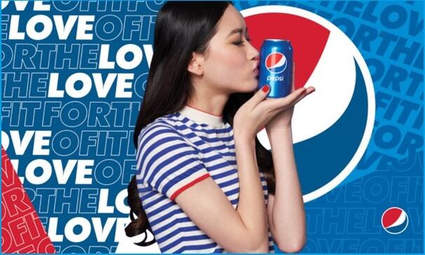
“For The Love of It” tagline is Pepsi’s cry that beckons people to go for the things they love. The picture of Pepsi’s “For The Love Of It” debuted tagline is of a young woman kissing a Pepsi soda can. The act of the young woman kissing the soda can communicates her love for Pepsi. Moreover, the use of a young model in the picture ad suggests that the advert targets the young millennials. Overall, the picture ad is very straightforward, and the elements used appear to hold no emotional background, that is, simply no information is being communicated. Moreover, the photograph seems to be staged, hence, it holds no authentic value as the readers might find it challenging to relate to it.
The only two elements of the picture ad that appears to make sense are the colors and writings used. This is because they align with Pepsi’s theme colors, which are blue, red, and white. Furthermore, the words “FOR THE LOVE OF IT” and the Pepsi logo are shown in the background, and this communicates their new tagline that is specific to the company.
Conclusion
Both Coca Cola and Pepsi have tried to redefine their brands in significant ways in the past years. Although they have mainly focused on TV commercials, picture ads have their place in their promotional campaigns. Overall, Coca Cola has a better picture ad to communicate the new tagline as compared to Pepsi. This is because the Coca Cola’s picture ad has effectively employed the use of color texture and emotion. However, Pepsi’s ad is straightforward and “flat”; therefore, it does not leave much to the imagination of the information being communicated in the mind of the reader. Moreover, it seemed to not align with the tagline. As a result, Coca Cola’s picture ad sufficiently conveyed its tagline better than Pepsi.
Works Cited
Albakry, Nur, and Ghazali Daimin. “The Visual Rhetoric in Public Awareness Print Advertising toward Malaysia Perceptive Socioculture Design.” Procedia – Social and Behavioral Sciences, vol. 155, 2014, pp. 28 – 33.
Coca Cola. “Taste the Feeling Out-of-Home ads.” Coca Cola. Web.
Net Imperative. “‘Pop and Fizz: Pepsi gets new tagline in brand repositioning drive.” Net Imperative. Web.