Introduction
In the corporate world, data analysis is a crucial tool that enables executives to make fact-based decisions. It offers an in-depth comprehension of the trends, patterns, and insights that can inform strategic business decisions. Data analysis helps people assess the performance, profitability, and conformity of a new product launch to profit objectives.
Data Analysis
Visual Representation of Financial Data
The cost, revenue, and profit spreadsheet reveals numerous significant facts. The information includes a range of topics, including labor, supplies, overhead expenses, profit targets, units produced and sold, unit pricing, overall sales, cost of products, and actual profit. The yearly profit percentage is currently 4.18 percent, much less than the desired profit of 25 percent. This discrepancy indicates that the new product is not meeting expectations for profitability.
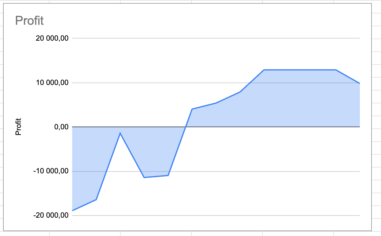
The information depicts the new product’s cost structure, sales, and profitability. It provides a thorough overview of the product’s monthly and yearly performance, which can be used to identify patterns and forecast future trends. I suggest using line graphs and bar graphs to display these results; a line graph would efficiently depict the monthly trends in sales volume, overall revenue, and profit, enabling people to see any recurring patterns or outliers. On the other hand, a bar graph would clearly contrast the current profit and the profit objective, emphasizing the difference people need to close.
The Role of Effective Data Visualization in Decision-Making
The analysis is greatly improved when the data are shown visually. It translates complicated statistics into understandable graphics, making it easier to see trends and patterns. It also enables a more robust data display, making it simpler for stakeholders to comprehend how well the product is performing and where improvements are needed. In fact, the demands and characteristics of the intended audience influence how people portray data. As business executives, people often have limited time, so they must quickly assimilate information and understand its implications. Thus, data presentations must be clear, succinct, and professional.
Visuals are essential in this process because they simplify complicated information into simple, understandable formats, allowing people to quickly comprehend its main points. A well-designed graph, for instance, might highlight trends and patterns that would be missed in a table of statistics. It is not only about making the facts simple to interpret; the main findings must likewise be highlighted in the visualizations. These can be instances where the business exceeds its goals, or prospective problems might require attention.
Visuals help people direct their attention to the areas that require it the most by highlighting these essential facts (Padilla et al., 2018). A well-designed data display can also help decision-makers make well-informed choices. It offers a strong basis of proof that people may rely on to defend their choices and convince others that they are sound. This is crucial in a corporate setting since choices can have enormous financial repercussions.
Conclusion
In conclusion, data analysis is a potent instrument that has provided crucial information on the effectiveness of the new product. Although the product is not currently achieving the profit targets, this study provides a robust framework for identifying areas for improvement and planning future strategies. By continuing to use data in this way, people can make decisions that are grounded in reality, strategically oriented, and aimed at achieving sustainable profitability and growth, ultimately leading to the firm’s success.
Reference
Padilla, L. M., Creem-Regehr, S. H., Hegarty, M., & Stefanucci, J. K. (2018). Decision making with visualizations: a cognitive framework across disciplines. Cognitive research: principles and implications, 3(1), 1-25. Web.