In order for the recipient to gain more insights into the data, it is of paramount importance to create a consolidated and distilled summary of the content. In most cases, creating a graphic component to the data demonstration has the advantage of being more accessible and memorable for the end-user. As a result, data visualization has become an integral part of every reporting. According to Schwabish (2014), “because our eyes detect a limited set of visual characteristics, such as shape or contrast, we easily combine those characteristics and unconsciously perceive them as an image” (p. 209). Thus, separating the highlights from an overwhelming flow of data serves as a pre-attentive attribute to processing, combining the ability to draw attention to the information and simultaneously help the recipient define the most significant aspects of the report.
Moreover, one of the fundamental features of the visualization is its ability to demonstrate the interconnection between the data variables, as the plain collection of data is a manuscript that frequently has rather complex systematization approaches. According to Lima (2015), the interconnection of components matters when it comes to the assessment of a holistic picture. Hence, presenting visual data contributes to a better understanding of such interconnectedness.
Currently, there are three fundamental principles of visualizing data. The first principle, according to Chen (2017), is clarity. Indeed, the less ambiguous the data in the graphic attribute, the less confusion will emerge among the recipients. The second principle of visualization is precision, as it should not distort the initially presented data. The pre-attentive aspect of visualization implies that the recipients are likely to consume the data from the graphs without seeking textual evidence, so precision is crucial in terms of mass representation of the findings. Finally, an essential principle of visualization is efficiency, which means that the charts and graphs should include only essential information.
Bearing these components in mind, it is now possible to dwell on the application of visualized data to the database provided for a medical transcription specialist. Prior to identifying the most suitable visualization method, it is imperative to look into the aims of rendering these data to the audience. The primary goal of medical transcription is to provide clinicians with exhaustive data on the patient’s well-being without being distracted from face-to-face coordination with the patient. For this reason, the transcription database should be used to spot the interconnections between the client-provider communications in order to draw a bigger picture and outline the most common concerns.
Hence, the first proposed method is a graph-based visualization that integrates discreet and continuous optimization. For example, the graph provided by Sun et al. (2013) represents a movie storyline with major events:
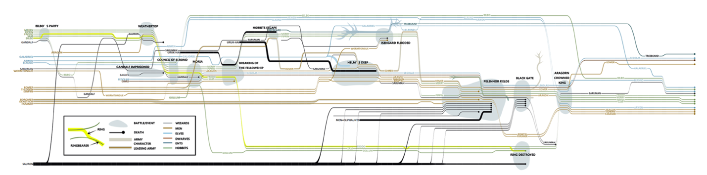
However, in the context of medical transcripts, this design can be used to systematize and highlight some major events from the client’s medical history, including hospital admissions, health status deterioration, and check-ups.
The next method is text-generated, and it serves as a transcript-analyzing tool for emphasizing the highlights of one’s medical record. The image of a word-cloud visualization is as follows:
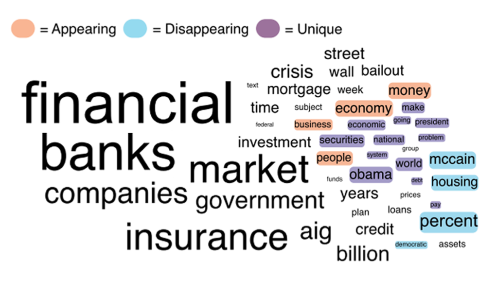
In such a way, the practitioners will have more opportunities to differentiate the leading health issues among patients. Indeed, according to data journalists, using one’s eyes more is currently one of the most efficient ways to perceive the data critically (McCandless, 2010). Hence, data visualization is presently one of the most important means of presenting quality data to the audience and allowing the analysts to have a more distinct image of the data context.
References
Sun, G. D., Wu, Y. C., Liang, R. H., & Liu, S. X. (2013). A survey of visual analytics techniques and applications: State-of-the-art research and future challenges. Journal of Computer Science and Technology, 28(5), 852-867.
Chen, H. M. (2017). Information visualization. Library Technology Reports, 53(3), 1-33.
Lima, M. (2015). A visual history of human knowledge [Video].
McCandless, D. (2010). The beauty of data visualization [Video]. TED.
Schwabish, J. A. (2014). An economist’s guide to visualizing data. Journal of Economic Perspectives, 28(1), 209-34.