Introduction

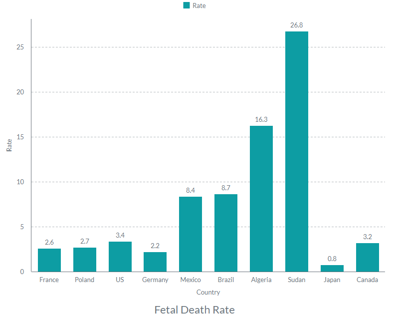
Data from the World Bank has been used to compare the fetal death rates across the nations. The nations have been chosen so that to include data from Europe, Asia, Africa, as well as Northern and Southern America. Namely, European countries include France, Poland, and Germany. Next, the Asian country in the diagram is Japan, while the African ones are Algeria and Sudan. For Northern America, the US, Canada, and Mexico have been included, while Brazil represents the Southern. The data has been visualized as a histogram for better comprehension.
Discussion
Compared with other nations, US fetal death rate could be viewed differently. For example, the country’s rate could be considered high when compared to any chosen European and Asian country. However, in terms of Northern America, it seems not a lot higher than in Canada and much lower than in Mexico. The same perspective applies to South America, which is represented by Brazil. However, when one considers the rates of African countries (Sudan and Algeria in this case), it is clear that the US rate is much lower. Therefore, the US fetal mortality is relatively low, although it is higher than in European countries, Japan, and Canada.
Nevertheless, the proposed diagram and findings that ensue from it are not demonstrative of fetal mortality. Namely, the graph includes only ten nations, neither of which represent global scale or regional tendencies. For example, although Japan’s fetal mortality rate might be low, it does not imply that the situation is the same in all of Asia.
Conclusion
Finally, the diagram does not provide any additional data regarding the possible correlation between fetal mortality and other factors, so the findings cannot be explained thoroughly.