Quantitative analysis refers to the study of values of data expressed in statistics, with each array having a distinct numerical score. This data usually represents any measurable information that may be utilized for arithmetic operations and statistical analysis with the goal of making real-world decisions based on the results. This information can be validated, and mathematical techniques be employed during interpretation (Sheard, 2018). An application of methods of descriptive statistics for two variables (vote share for gubernatorial candidate and percentage of female employment in Europe) as well as their characteristics form the basis of discussion for this paper.

Characteristics of the Distribution
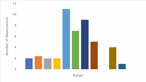
According to the above representation, the data is either single-peaked around the mean (0.478) and median (0.471), or it appears to have two peaks. In both cases, the distribution shows that a significant sample size is concentrated around its center. In addition, the set appears to be nearly symmetrical. The summary statistics support this conclusion, as the mean (0.478) and median (0.471) are very close1. The section that follows highlights the aforementioned features for better clarity and understanding.
Substantive Interpretation of the Features of the Variable
Owing to the fact that gubernatorial politics in the United States is a two-party system, if the vote count was larger than 0.50, Democrats would not have won the election in that state. Conversely, if the vote share is less than 0.50, the contest is won by Republicans. Furthermore, the bar graph shows that Democrats could have won the majority of votes if some states in the 0.45 to 0.50 range had registered a Democratic candidate vote share that was only 0.05 or lower than the actual one. In other words, while Republicans won more states, both parties appear popular and viable in the sense that they might have won a majority of the votes. The tendency of votes to be densely distributed around the mean is explained in the following section.
Further Analysis
The clustering of regions around the distribution’s center, which is similarly near to 0.50, implies that the race was quite competitive in most of the states. For example, the number of states where Democrats received between 0.45 and 0.55 percent of the vote is 16, or about one-third of the entire jurisdiction. A winning (or losing) margin (the difference in a vote tallied from 0.50) was within 0.05 points in these localities. With a change in vote percentage of 0.05 points or less, parties could have overturned the outcomes of the elections in these states. Majority of states with extreme vote share figures in both directions suggest that the contest was uncompetitive. The number of states where the Democratic candidate received more than 0.65 percent of the vote, for example, is six. As a result, it would be difficult for Republicans to reverse the results in these states because the victory margins were more than 0.15 points.
Mean and Median Implication
There were seven states where the Democratic candidate received less than 0.35 percent of the votes. It would be tough for Democrats to change these results, given the 0.15-point margin. These figures show that elections in nearly a quarter of the states (13 states) appeared to be relatively uncompetitive. Based on the features of this distribution, three types of states can be deduced: competitive states that could go to either Democrats or Republicans, safe states for Democrats, and safe states for Republicans2. The two measures of central tendency have been used to interpret the data represented by the graph is the section below.

Analysis of Data from the Graph
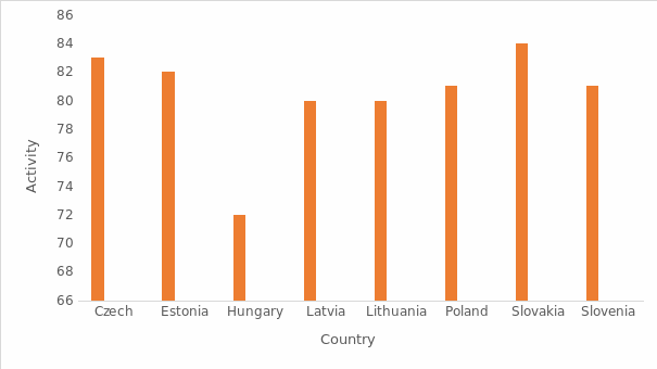
When the eight observations are arranged in ascending order, the median is found to be 81, the mean is approximately 81, and the standard deviation stands at three point seven. Despite the fact that both 81 and 80 appear twice, they are not the highest values in the observation, thus the mode becomes 84. Slovakia has the highest percentage of female employment while Hungary lags behind at 72 percent. The table below summarizes the information represented by the graph.
Discussion
From the above illustrations, it can be concluded that all the countries represented have a large ratio of employed females compared to men. A majority of countries have female employment levels of more than 80%, with large disparities between male and female workforce participation. This is because they experience significant demographic aging and have better chances to grow their labor supply by getting more women into the workforce. Czech Republic, Slovenia, and Poland suffer from substantial gender imbalance margins, with Slovakia having the largest (68 percent considering full-time equivalent rates).
Reference
Sheard, J. (2018). Quantitative data analysis. In Research Methods: Information, Systems, and Context. Second Edition, (pp. 429-452).
Footnotes
- While a substantial number of observations cluster around the center, there are significant data sets with somewhat extreme values in both positive and negative directions (the range below 0.35 and that above 0.65) that must be taken into account.
- The bar graph’s near-symmetric shape further implies that there is about an equal number of safe states for both Republicans and Democrats.