The US Grant –Exquisite Weddings Autumn-Winter 2009
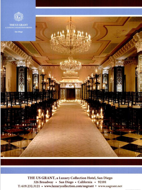
The advertisement that appeared in the Exquisite Weddings Magazine promoted a chain of luxury hotels. The ad only contained a picture of a hall in the hotel along with the name of the chain and contact information. The main creativity element of the ad is in emphasizing the luxury level of the hotel. The use of a golden color palette emphasized the expensiveness of the promoted product, with a minimalist approach in the textual information contained in the advertisement. The text used a white font with a blue background which contrasted against the main picture used in the advertisement. Other than the name of the hotel and the contact information, no emphasis was placed on the product, except for the picture.
The target audience of the advertisement can be seen through the direction and the theme of the magazine – weddings. Thus, the target audience is mainly women –brides, planning their wedding. The main strategy is minimalistic. The picture shows a wedding hall which is the main selling idea, and which aim is to deliver the level of luxury to consumers. The creative strategy statement is emphasizing that luxury speaks for itself. Consumers draw their own conclusion in this case (Belch & Belch, 2009, p. 193), whether such level of luxury is what they want or not. The strategy is successful, where all the intended objectives and the message are conveyed in one picture, and thus, any other words will be redundant in this case.

Ad for the Movie “Hall Pass”, a banner on Yahoo! Sports
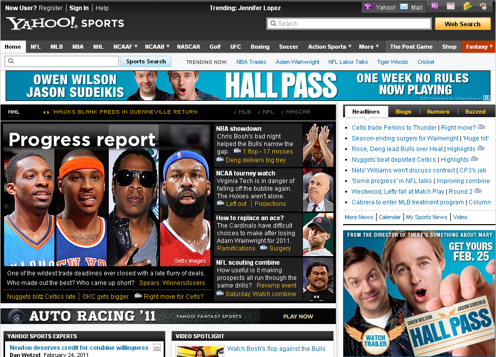
The ad consists of two spots on the main webpage of Yahoo! Sports. One rectangular oblong banner is located at the top of the page, where the banner is animated with a sequence of the film’s tag line and the main performers. The other banner is of a square shape featuring the main picture from the film’s poster, the title of the film, and the date of the premiere. Both banners feature the same background color and font, which were used in all promotional materials used for the film, and accordingly, both banners lead to a website dedicated to the film.
The main aim of the ad is to increase the awareness of the film. The main selling points are the main leading stars, which order on the screen outlines their celebrity status and the ability to sell the film; Owen Wilson is on the forefront of the banner. Another selling point is the credentials of the directors, which in this case is making the highly successful film “There’s something about May”. Thus, those main selling points of the film are successful in attracting those who are either familiar with the works of Owen Wilson, “There’s something about Mary”, or both. The role of the principal star, in that regard, is the highest factor influencing the choice of the movie (Kerrigan, 2009, p. 83). The strategy used in the banner is in attracting the attention of the reader, capturing attention when scanning the webpage. In that regard, the blue background works well as a contrast to the webpage, while animation attracts the attention of the viewer.

“Hip Hop Abs Workout Infomercial”
“Would you like to get flat, firm, sexy abs, without ever getting on the floor for painful sit-ups, boring crunches, or gimmicky ab machine”?
“Well, now you can with ShaunT’s Hi Hop Abs.”
The infomercial advertises DVDs of a workout program by the fitness trainer Shaun T. The infomercial is structured around promoting the main selling point of the product –Hip Hop. Such selling points can be seen through the use of music during the infomercial, the use of the font, the dance routines, and others.
The infomercial is successful in promoting the main selling point of the product through showing contrasts. Such contrasts can be seen through providing black and white pictures of people exercising user traditional styles, picturing them as boring and useless. The latter is shown to contrast the images of joy and pleasure gained through exercising using Hip Hop Abs. The main tag line of the product can be stated as “exercise can be also fun”. The emphasis of such tag line can be seen through the use of music, the reactions of the participants, who identify themselves with the hip-hop culture. The strategy can be seen twofold, where on the one hand, it cannot be perceived as creative, as the main template for infomercials is the same: condemning conventional or traditional representations of a product or service, showing the innovative representation of a product or a service, providing testimonials, and bonus offers for calling immediately. Such strategy target impulse buying(Agee, 2001), and despite being repeated, such approach was proved successful, where studies indicated that infomercials are watched and sell products (Belch & Belch, 2009, p. 471).
The Philadelphia Inquirer 25 Feb. Issue. Page A17 –DNB First
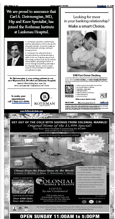
The advertisement promotes the online banking services of DNB First Banking. The ad is reflected through a black and white picture and two layers of text, combined with the logo of the bank. The picture shows a couple using a laptop. The main creative strategy in the ad is appealing to consumers’ rationality and emotions, providing an innovative feature. The main elements of the ad can be seen through the message conveyed in the picture and the differentiation of the size of the fonts, each bearing a different significance.
The ad promotes a service whose main selling point is an innovative service. The strategy used can be seen successful as it both targets the rational and the emotional appeal of the customer (Belch & Belch, 2009, p. 287). The rational appeal is targeted by listing the features and the benefits the customer will receive. The emotional appeal, on the other hand, is conveyed through the text – make a smart choice, appealing to the need of the customer to feel that he/she is making the right decision. Additionally, the picture itself carries emotional weight, showing a picture of a family and the potential benefits they will receive from using the service. The use of the words relationship, as the connection between the customer and the bank, plays a role in making an emotional bond, similar to the one shown in the picture.

Laura Torrado Dental Services
The direct mail catalog promoted dental services. The main creative strategy was through emphasizing the selling point of the service through images and fonts. All the pictures in the catalogs were focused on showing images of perfect smiles. The emphasis on the smile can be also seen through the way the color of the font in the word smile contrasted against other words in the text. The use of the color blue as the background provided a comfortable background for the contrasting whiteness of the font.
The tag line of the ad appealed to the emotions of the customer, emphasizing their trust. In that regard, the use of such words as care and trust was successful in outlining the importance of the service to the consumer. Accordingly, the inclusion of the address and a picture of the location of the clinic were successful factors in addressing a target audience with higher levels of income. The benefits of direct mail catalogues is in their ability to target specific audience, and in that regard, the brochure emphasized the high level of the service through its location.

References
Agee, T. M. (2001). Planned or Impulse Purchases? How to Create Effective Infomercials. Journal of Advertising Research, 41(6), 35-42.
Belch, G. E., & Belch, M. A. (2009). Advertising and promotion: an integrated marketing communications perspective (8th ed.). Boston: McGraw-Hill Irwin.
Kerrigan, F. (2009). Film Marketing: Elsevier/Butterworth-Heinemann.