Jacob Lawrence (1917-2000) is considered to be the most acclaimed African-American artist of the last century (“Jacob Lawrence Biography”). He grew up in Harlem, New York. Lawrence’s most popular collections are the Migration Series and War Series. With these works, he “brought …to life” the African-American experience by using “blacks and browns” set side by side with bright colors (“Jacob Lawrence Biography”). Lawrence became familiarized with art at the age of thirteen when his mother signed him up for an after-school art program at Utopia Children’s Center. Although he dropped out of school three years later, he took classes at the Harlem Art workshop. In 1937, Lawrence won a scholarship to the American Artists School. Upon graduation, he earned funding from the Works Progress Administration Federal Art Project (“Jacob Lawrence Biography”). Apart from working as an artist, Lawrence was a professor at the University of Washington.
I chose this artist for the paper because his paintings made a huge impression on me. In his works, everyday life is reflected in simple forms, but simultaneously, there are such deep emotions and feelings engraved in the paintings. Lawrence did his best to portray people’s lives without unnecessary pathos and exuberance, pointing out only the essential details. What I particularly loved about Lawrence’s paintings was his choice of colors. Although black and brown are present in every piece, there is also an abundance of bright and expressive colors: blue, yellow, green, red, orange, and others. These contrasts of darkness and brightness seem to reflect the diversity of our life: for some, it is gloomy and uninteresting, whereas others look for light and sparkles. However, it was not only the colors that enchanted me in Lawrence’s paintings. The themes of his works are so simple and significant at the same time that I could not take my eyes off them. In particular, the Migration Series collection made me think over the hardships of the people who are forced to leave their native land in search of a better life.
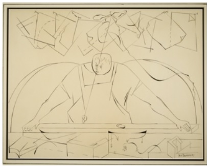
The first painting by Lawrence I would like to analyze is The Carpenter (see fig. 1). The balance of this work is almost symmetrical. The objects in the two parts of the painting are situated similarly. In the center, there is a man whose hands spread equally in both directions, holding a board with which he is working. The pieces of paper with sketches hanging on the wall are also situated symmetrically, as well as the arcs behind the man. Since the colors in the painting are not vivid, it is difficult to find an emphasis in it. What catches the eye is probably the head of the carpenter – it has a square shape instead of the round one. The movement is vividly expressed in the work. The eye goes from the square and rectangle shapes at the top and bottom of the picture to the central part: the man’s head and body in an apron. The principles of pattern and repetition are represented by the shapes of the carpenter’s instruments and sketches: there are many of them, and they are predominantly similar in shape. The whole picture is rather proportional, with the exception of the man’s head: it is too little for his body. The rhythm and variety are also expressed in the painting. The array of objects holds the viewer’s attention. The rhythm is reflected through this variety, and it creates a mood like music: I imagined some steady repetitive knocking and beating sounds that combined, singing a song of this man’s work. The whole picture creates a sense of completeness, thus including the principle of unity.
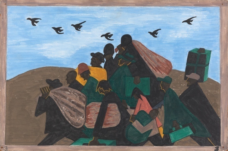
The next work of art created by Lawrence that I would like to characterize is The Migration Series, Panel 3: From Every Southern Town Migrants Left by the Hundreds to Travel North (see fig. 2). The balance is asymmetrical, but the picture still looks equitable. There is a division between the land and the sky, and the positions of people and birds are almost symmetrical. There are two emphases in the painting: a green trunk on the right which the man is carrying very high, and the yellow coat of the man on the left. These areas immediately catch the viewer’s attention. The principle of movement is also presented by two features. The eye moves along with the birds, and it also follows the people walking. The whole picture looks rather dynamic. The pattern and repetition are represented by the birds and the trunks and bags carried by people. The repetition of these elements makes the work seem active. The proportion is generally well-kept in the painting. Probably the only thing that seems disproportional is the size of the mountains. The variety and rhythm are represented vividly in the work of art. The viewer’s attention is held by the repeated elements such as birds or trunks, green ones in particular. With the help of rhythm, it is quite easy to imagine the movements in the painting: people walking and birds flying. The unity in the picture creates a sense of harmony. All elements seem to form a single picture where every object has its place, and the replacement of any of them would lead to incompatibility.
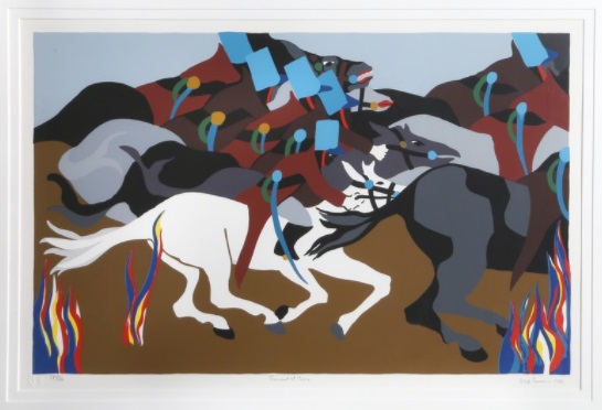
The third painting by Lawrence under analysis is Toussant at Ennery from Toussaint L’Ouverture (see fig. 3). The balance in this work of art is asymmetrical. Still, the whole picture looks balanced due to the regular repetition of the colors of the horse and horsemen’s clothes. The most emphatic element is the white horse situated nearly in the center of the picture. By contrasting with the other components, it stands out as the most prominent feature. The movement is represented by shapes and colors. The variety of colorful elements catch the eye, but eventually, the viewer focuses on the white horse, which is the focal feature. The pattern and repetition are reflected in colors and shapes. Horses are gray, brown, and black. Men’s swards are blue with green handles. Masks are blue and have a rectangle shape. Also, there are several depictions of symbolic flames of bright colors: blue, red, yellow, and white. Such a repetition of patterns creates unity within the painting. The proportion is well-kept in the work of art. The rhythm is represented by the repetition of the elements such as horses, horsemen, and flames. In this picture, the rhythm creates an atmosphere of movement. The variety is reflected through the use of different elements: swords, masks, and flames. Through using a variety of elements, the artist holds the viewer’s attention. The principle of unity is kept in the painting, creating a sense of completeness and harmony.


Works Cited
“Jacob Lawrence Biography.” Biography. 2014, Web.
Lawrence, Jacob. The Carpenter. 1957, ACA Galleries, New York.
The Migration Series, Panel 3: From Every Southern Town Migrants Left by the Hundreds to Travel North. 1940-41, The Jacob and Gwendolyn Knight Lawrence Foundation, Seattle / Artists Rights Society (ARS), New York.
Toussant at Ennery from Toussaint L’Ouverture. 1989, RoGallery.