Design Problem and Project Objective
Despite their widespread use as a vital part of the information culture of the twenty-first century, online applications present several obstacles for certain user groups. One such user group is the elderly, whose peculiarities in their engagement with online tools constantly pose challenges from the perspective of user-friendly interface design. In this context, APP-ease Inc. was tasked with developing an application to enhance access to online banking services for older individuals.
User Research and Key Factors Influencing the Design Solution
The precise age at which a person can qualify as elderly is a matter of debate. However, many categories of “seniors” or “older adults” do exist, as there is clearly a need for such designations. Thus, within the framework of this assignment, users aged 65 years or older, without specific upper limits, will be considered elderly.
In general, people of this age group utilize websites almost half as slowly as users from younger generations (Msweli & Mawela, 2020). Comprehending the highly intricate nature of human aging is essential because it makes many tasks frequently used in device interaction, such as basic pointing and selecting, more challenging with age. In short, this is the primary implication of designing new apps or websites for older adults. This tendency can be attributed to the numerous barriers that older people experience during their online activities.
Thankfully, barriers to digital inclusion are common in the scholarly field. In particular, common issues include poor informational legibility due to small fonts and overly abstract icons, accompanied by informational overload caused by excessive textual data (Msweli & Mawela, 2020). In addition, design decisions involving poorly contrasting colors and indistinguishable elements, such as buttons and links, further complicate the issue.
Analysis of Existing Solutions and Market Differentiation
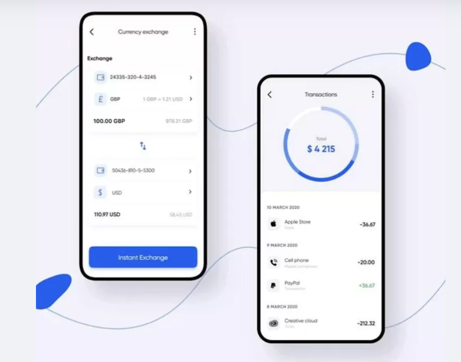
Comparing and contrasting particulars can illustrate the mentioned issues. In Figure 1 in the Appendix, one can see an Internet banking design utilized by Citibank. Although the color scheme might be rather appealing to the eye, the fonts used by the app are poorly distinguishable. In the meantime, bold fonts may unnecessarily distract the user from the app’s interactive features.
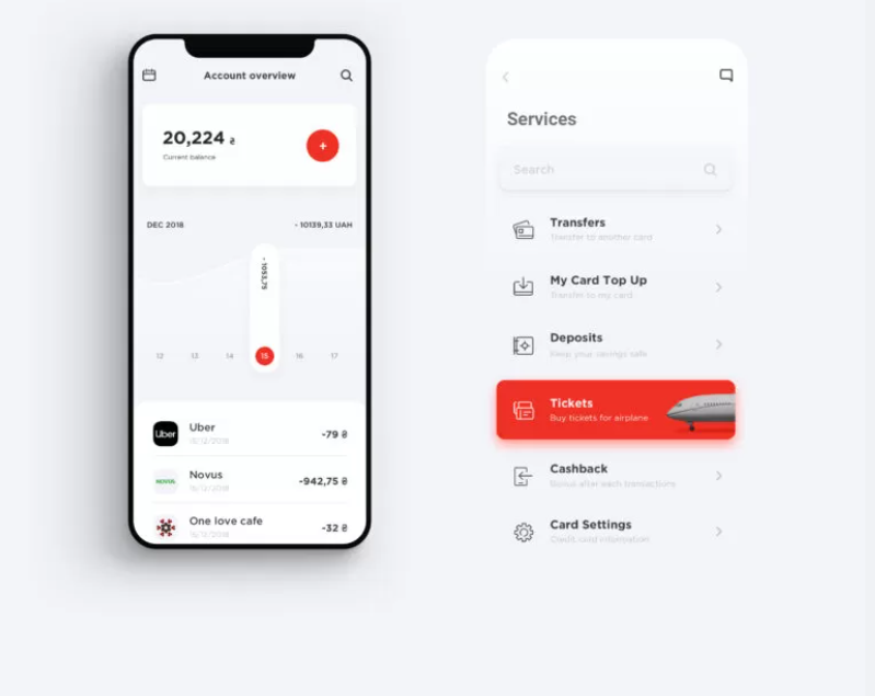
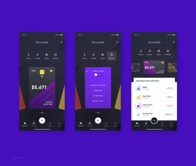
Conversely, Alfa Bank, as presented in Figure 2 (Appendix), highlights interactive elements in its interface more effectively. However, the black font color on a white background still lacks size, which might complicate its distinguishability. Finally, Figure 3 (Appendix) showcases Cradle’s futuristic approach to designing its banking application. Albeit appealing to younger audiences, the combination of black and purple would likely confuse older users.
Ideation Process, Draft Development, and Final Output
Based on the evidence presented above, APP-ease Inc. should design its application with greater attention to chosen fonts, colors, and interactive elements. In particular, a color palette should utilize a range of light- and dark-green backgrounds, accompanied by a white-colored text font. Like blue, green is incredibly appealing to the eye, whereas white letters will not overburden the user’s eyes as much as black-on-white letters. This design should be accompanied by a substantially large login button and fields, allowing older individuals to quickly recognize their intended use.
References
Holub, M. (2022). UI/UX design for banking apps: Best examples. EliNext. Web.
Msweli, N. T., & Mawela, T. (2020). Enablers and barriers for mobile commerce and banking services among the elderly in developing countries: A systematic review. In Responsible Design, Implementation and Use of Information and Communication Technology: 19th IFIP WG 6.11 Conference on e-Business, e-Services, and e-Society, I3E 2020, Skukuza, South Africa, April 6–8, 2020, Proceedings, Part II 19 (pp. 319-330). Springer International Publishing. Web.
Appendix A