Introduction
In the globalized world of rapidly evolving information technologies, designing and maintaining websites gained several forms, combining machinery and creativity. As a matter of fact, the website’s effectiveness depends on multiple undebatable factors, such as convenience, organization, and appealing design. Comparing and contrasting the websites of two prominent American media, The Washington Post (www.washingtonpost.com) and The American Conservative (www.theamericanconservative.com), provide excellent evidence for identifying common elements and features of the contemporary media.
Both online media serve as one of the primary sources for reliable news extraction for thousands of Americans. These websites are each other’s main competitors in the news delivery industry, continually developing new strategies to attract new audiences. Therefore, this assignment focuses on analyzing, correlating, and opposing several aspects of the websites, like proximity, alignment, repetition, that are accountable for the success or failure of these media.
Websites Proximity Comparison
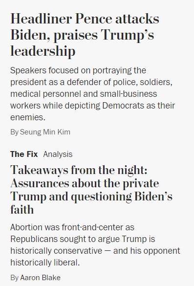
The human brain is designed to connect separate elements of the whole, defining whether the information provided on the webpage will be efficiently perceived and processed. Proximity is a fundamental component of a website since it provides readers with an ability to separate or connect the elements of a webpage (Campbell, 2017). The Washington Post’s website exhibits the convenient proximity for the readers, where headings, descriptions, and the author’s name of the same article are located close to each other (see Figure 1).
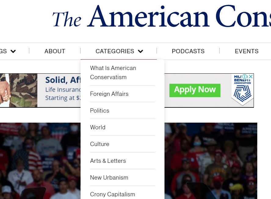
The American Conservative may also boast a convenient spacing of its elements. Similar to The Washington Post website, the thematically related articles are grouped together. However, the menu headings are positioned not accordingly to their importance. The American Conservative website’s primary asset is its convenient dropdown menu, which unites broader categories with more specific subjects (see Figure 2). Concluding, the proximity of both substantial media websites devises an effortless and efficient perception of information.
Websites Alignment Comparison
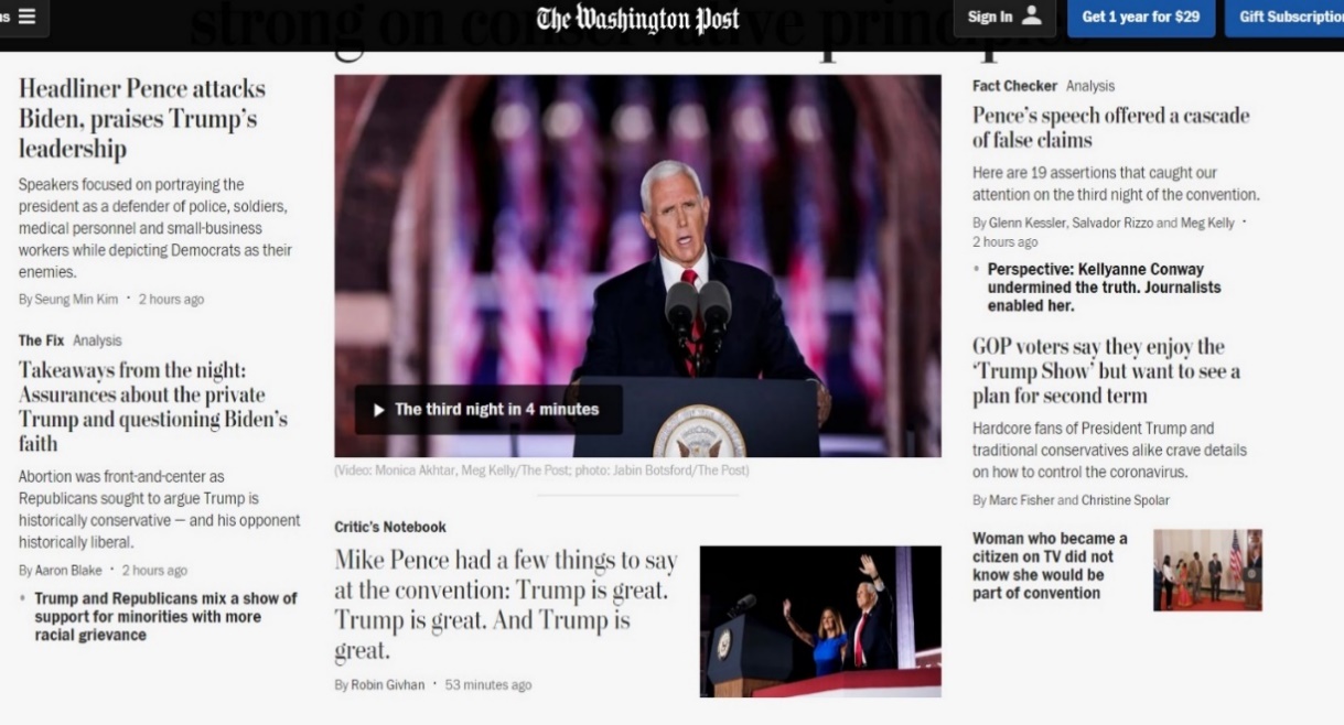
Another essential feature of a website is the alignment of its text, illustrations, and elements of design. Segmenting information into thematic groups and aligning them on a webpage is exceptionally crucial for online mass media since it provides for uncomplicated comprehension and systematization of the text. The Washington Post has a few distinctive alignment elements that formulate a unique style of the website. The homepage incorporates the most significant piece of news, positioned in the center of the page, aimed to instantly captivate the reader’s attention (see Figure 3). Simultaneously, less significant pictures are inconsistent in size, creating an impression of visual disorganization and inequality.
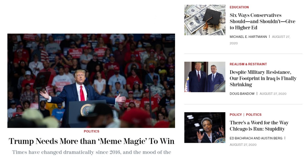
The American Conservative website practices a distinctly contrasting model of alignment. The most relevant article is situated in the left-justified position, closer to the center of the page. The primary asset of the website is the conciseness of the text in the feature preview and the size alignment of the pictures, which delivers the webpage perception as more appealing and neat (see Figure 4). The website does not distribute the featured news into sections like The Washington Post. Instead, it uses a different manner of captivating the readers’ consciousness, highlighting the topic headings in red color. To summarize the section, The American Conservative website appears to be more systematic and consistent in terms of alignment, while The Washington Post resembles a more chaotic and self-contradictory arrangement.
Websites Repetition Comparison
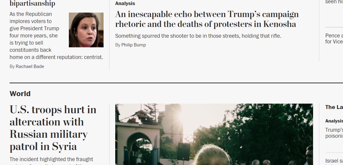
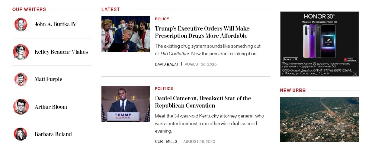
Since the online media analyzed in the present paper are mostly the sources of informative nature, they do not possess various significant design elements that could be considered monotonous. For instance, The Washington Post has a repetitive feature of the black horizontal line dividing thematic sections (see Figure 5). The same tendency can be noticed on The American Conservative website, where the articles are separated with grey parallel lines. Furthermore, the media adopted two primary colors for the brand representation – black and red, which are consistent throughout the webpage (see Figure 6). Thus, the repetitive traits of the two comparable websites are somewhat alike; they are harmonious and do not deflect the reader’s attentiveness from the central content.
Websites Contrast Comparison
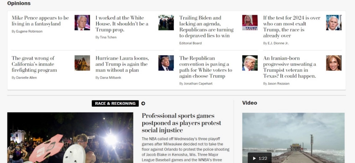
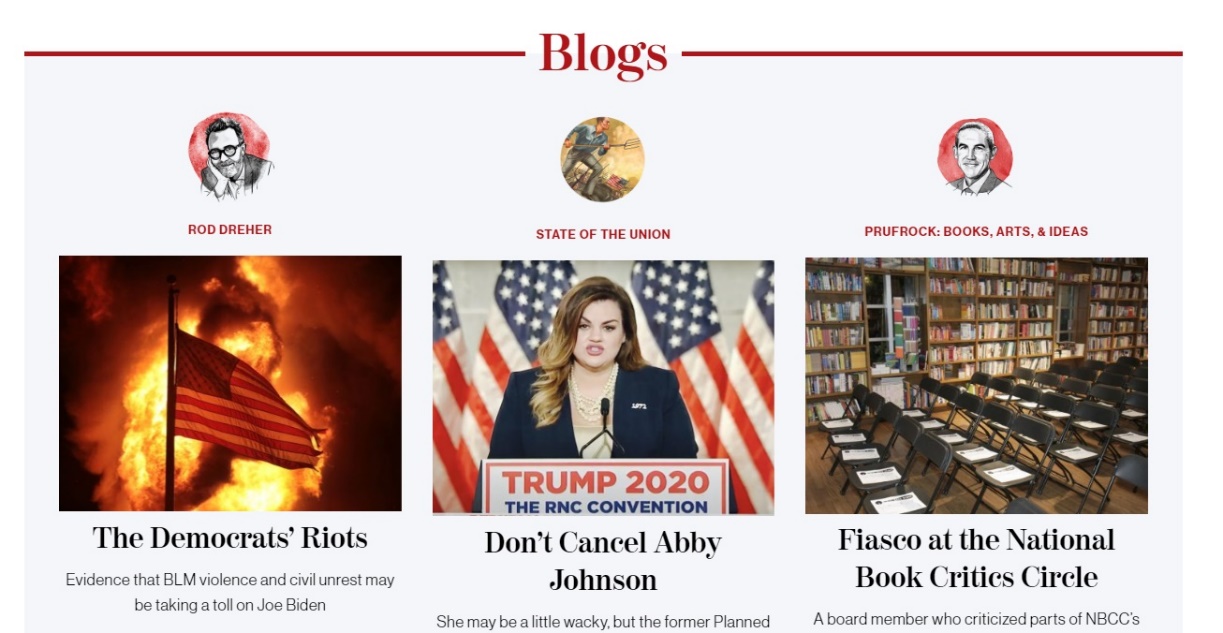
Finally, the contrast in website design is what advocates in establishing a valid visual representation of the webpage elements. Both websites utilize black font color of text blocks on the white background as for the color contrast. A divergent and straightforward color scheme allows for making the text well-defined and coherent. Both websites comply with the variation of form and size. On The Washington Post homepage, the despair in headings design is vividly noticeable, where the “Opinions” section distinctly deviates from the news sections (see Figure 7). The American Conservative follows such a tendency and likewise employs the divergent design, which deflects the blogs section from the standard preview of news articles (see Figure 8). Hence, the variation in designing options on the webpage on both websites primarily serves to emphasize certain content.
Conclusion
To sum up, the comparison of the two online mass media websites allowed identifying their common and different features. Both websites contain a significant amount of information, which is conveniently grouped with the use of different spaces and contrasting colors, fonts, and picture sizes. Alignment of The Washington Post appears to be less consistent, while the information on The American Conservative is structured in a more organized way. The latter website contains more repetitive elements of design, which do not affect perception. It can be suggested that the two websites analyzed in this paper are rather similar in their design, which, in general, can be considered effective enough for these information sources.
References
Campbell, J.T. (2017). Web Design: Introductory (6th ed.). Cengage Learning.
Washington Post: Breaking news, world, US, DC news & analysis. (2020). Washington Post. Web.
The American Conservative. (2020). The American Conservative. Web.