Shirley Gorelick (1924-2000) was one of the most prominent female artists of the 20th century. This American painter developed a distinctive realist style that enabled her to create “penetrating psychological portraiture” (Hottle). Gorelick studied at Brooklyn College and Columbia University. The artist’s early work was affected by surrealism, cubism, and abstract expressionism. However, she felt “uncomfortable” with the “distortion of the human figure” in modern art (Hottle). Gorelick became known as a strong figurative artist with her first exhibition held at the Angeleski Gallery in 1961.
She presented a collection of “truncated nudes” in the current abstract impressionist style (Hottle). In the 1970s, Gorelick’s works lost direct connection with her artistic forerunners, such as Picasso and Giorgione. However, she continued to find inspiration in their works. In the late 1970s, the artist started painting middle-aged people and couples, which disclosed her curiosity about psychological states (Hottle). Gorelick’s works were frequently exhibited and gained much attention and appreciation from the public. As Hottle mentions, the artist was one of the founders of Central Hall Artists Gallery in Port Washington, New York.
The main reason why I chose to analyze the works of this artist is that Shirley Gorelick had a unique sense of beauty and an understanding of people’s psychology and their inner state. Looking at her works, I can imagine a whole range of feelings and create complete pictures of the situations, parts of which are shown in paintings. People in her portraits are filled with animation, and it seems that they are sitting next to the viewer, and it is possible to talk to them, feel their perfume, or hear their chuckles. Gorelick’s works breathe individuality and invite viewers to contemplate the pictures not only as pieces of art but also as the representation of models’ lives. For the analysis of the design principles, I chose three portraits in each of which there is something peculiar and enticing.
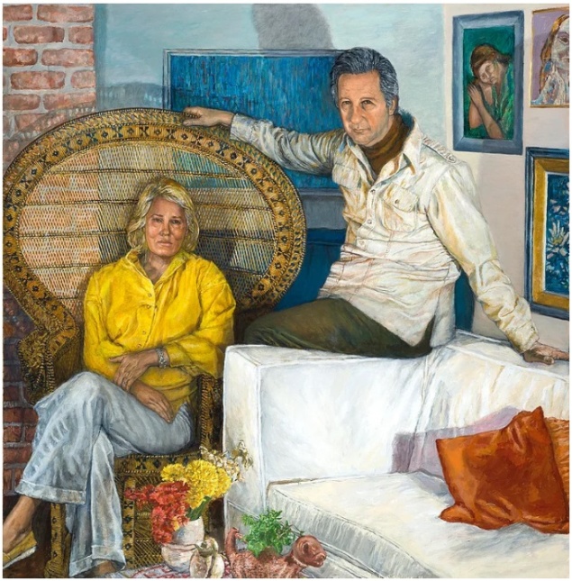
The first painting by Gorelick that I would like to analyze is The Bensons I (see fig. 1). The balance in this work of art is asymmetrical. Although the sides are different, they present a whole unity by placing the people and the objects harmoniously. Both the woman and the man are situated near the center of the painting, making the entire picture quite balanced. The emphasis in the picture is on the woman’s shirt. It is of bright yellow color that is further reflected in the flowers standing on the table. The movement is arranged with the help of colors and shapes. The eye takes a path from the woman to the man and further to the pictures on the wall behind him. Then, the eye moves a little back to the oval back of the chair in which the woman is sitting.
The pattern is represented by the repetition of rectangle shapes of blue color: two small frames, one bigger picture, and the wall on which the blue picture is hung. There is no vivid repetition, but it is possible to consider rectangle shapes on the walls as such. The painting is rather proportional. People’s bodies are kept within normal proportions. The relation of the people to furniture and walls is also proportional. The rhythm is represented by bright colors and flowers. The use of rhythm in the painting creates a mood of light music and of calm and organized movement. The variety is reflected through colors and shapes. There are several emphases: the use of different colors and shapes and a big white sofa that inevitably draws attention. The unity is represented by the completes of the picture. The work of art is the embodiment of glowing harmony.
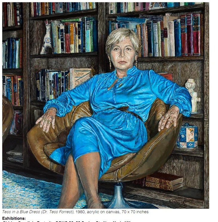
The second Gorelick painting that attracted my attention is Tess in a Blue Dress (see fig. 2). The balance is almost symmetrical: there are rows of books on the shelves, a big armchair in the center, and a woman sitting in the center of the chair. The emphasis is obviously the bright blue color of the woman’s dress. It immediately draws the attention of the viewer. What concerns the movement, the eye takes a path through the bookshelves and then turns to the focal area: the woman in the center. The pattern may be delineated in the shape of books on the shelves. Repetition is also concerned with the books. Also, two figures (probably made of clay or china) create a slight sensation of repetition. Other than that, the painting is relatively calm, with no activity. The work of art is rather proportional. The size of the objects and the woman correspond to the real-life proportions. There is no rhythm in the painting. It is rather calm, and objects do not create any movement. The variety is represented by different colors of book covers. However, this element does not draw much attention. The work of art creates a sense of completeness and harmony through the choice of settings and colors.
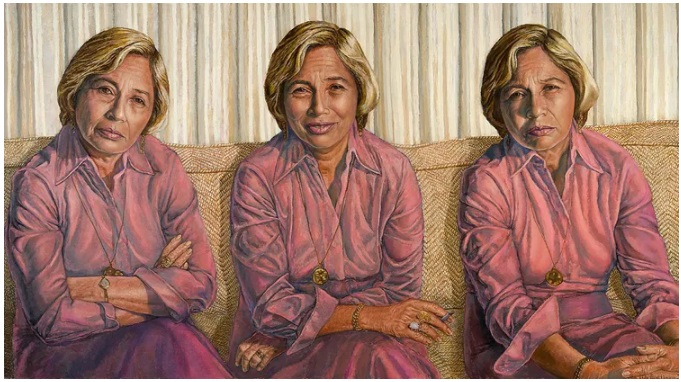
The third painting by Gorelick that attracted my attention is Tess Three Times (see fig. 3). This portrait is quite unusual since it depicts the same woman from three different angles. The woman has various facial expressions and sits in dissimilar positions in each case. The balance is almost symmetrical. The three figures are placed within nearly the same distance from one another. The back of the sofa is a little uneven, but this slight imbalance does not take away from the general sense of harmony. The emphasis is on the color of the suits the women are wearing. Also, small details draw attention: Tess on the left has a wristwatch, and Tess in the middle has a bright ring. Another emphasis is that the woman in the middle is smiling.
There is not much movement in this painting. The eye moves from the wall to the women’s figures. There are several patterns: the repeated pattern on the wall and sofa and the repetition of the same woman’s figure three times. The repetition works in unity with the pattern and is focused on the lines on the wall and sofa and the woman’s multiple representations. The work of art is rather proportional, all parts relating well to each other. The only indication of rhythm is the repetition of the woman’s portraits. However, it is not possible to say that this rhythm creates any mood because it lacks variety. It would probably be wrong to say that the painting has a sense of unity. The picture does not create a sense of harmony because it looks superficial. However, it provides much food for thought and inspires to contemplate the woman’s feelings in each of the versions.
Shirley Gorelick’s works made a strong impression on me. The most distinctively reflected principles of design in the analyzed paintings are balance, emphasis, and repetition. I highly enjoyed getting acquainted with this artist’s legacy.


Works Cited
Gorelick, Shirley. The Bensons I. 1980.
Tess in a Blue Dress. 1980.
Tess Three Times. 1981-2.
Hottle, Andrew D. “Shirley Gorelick.” The Shirley Gorelick Foundation, n.d., Web.