Statistics has been predominantly been used by the press to demonstrate the pictorial graphics of the data that has to be presented to the readers. Tables, graphs, maps and even text, whether static or dynamic, provide some means to see what lies within, determine the answer to a question, find relations, and perhaps apprehend things which could not be seen so readily in other forms. In this sense, information visualization takes us back to the earliest scratches of forms on rocks, to the development of pictoria as mnemonic devices in illuminated manuscripts, and to the earliest use of diagrams in the history of science and mathematics. The areas where this is most widely used are in business columns, whether forecasts, politics, economy related columns etc. They are a useful tool to represent the data and in a compact way. If used properly they complex ideas con be skillfully represented and communicated with precision, clarity, and efficiency. A graph or table used in a newspaper or magazine article shows the following: the data, it makes one think about substance rather than method, graphic design, or something else, many numbers in a small space, makes large data sets coherent, and encourages the eye to compare different pieces of the data.
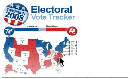
First let us consider the statistical graphics that has been extensively used by USA Today to demonstrate the campaign of Obama and Clinton in the recent polls. The above figure shows that the map of the U.S.A. represents the areas which have been won by Clinton and the areas won by Obama. This would have been a mammoth task if the data had to be represented in tabulated data forms. But the use of this simple graphics makes the data more ready and easy for interpretation and the whole data could be shown without providing clamored data. This visual representation of the poll data is complex and is difficult to interpret.
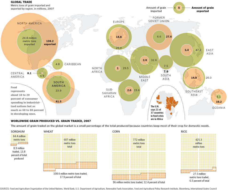
As figure 2 shows the grain crisis that the world is facing today and the contribution North America has in the supply of grains to the world and how much of it is consumed by the developing countries. The graphics shows the countries affected due to food crisis, the amount of grain produced per annum and the countries which contribute maximum to the world grain supply. This provides a comprehensive picture of the overall status. The statistical tool that has been used is pie charts and histograms.
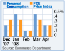
Figure 3 shows a bar graph which compares the consumers’ price expectations with the increasing inflation as shown in the Wall Street Journal. This shows a comparative figure between 2007 and 2008 expectations. Though this uses a purely statistical tool to represent the data this may not be clear to many readers as it involves a lot of statistical learning which may not be available to the readers.
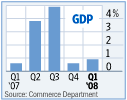
Figure 4 again shows bar graphs representing the quarterly US GDP as shown in the Washington Post. This represents the GDP per quarter and the data is very clearly presented without any ambiguity in the representation. This is easier to understand and to compare the data over the quarters. This shows a clear representation of the statistical data.
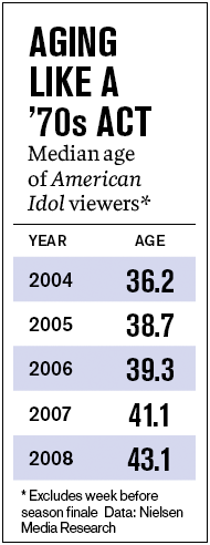
Figure 5 shows the use of statistical data in representating the yearly median age of viewers of the American Idol. This shows that the median age of the viewers has been increasing which indicates change in viewership demographics and serious implication for marketers and advertisers.
Hence we see that data visualization is a potent form of representating complex data defined as information which has been abstracted in some schematic form, including attributes or variables for the units of information. From the above study we see that the data represented in the magazines and newspapers are usually both in the form of visual representation of quantitative and categorical data. Cartographic visualization is primarily concerned with representation constrained to a spatial domain; statistical graphics applies to any domain in which graphical methods are employed in the service of statistical analysis. There is a lot of overlap, but more importantly, they share common historical themes of intellectual, scientific, and technological development.
As the above examples of the graphs used in magazines and newspapers show that the representation is not completely statistical. They have a pictorial element to it which makes it more eye catching. The graphs which show a combination of maps and statistical graphs are more enumerative and easier to comprehend as they provide a clear picture to the readers. But graphs such as shown in figure 3 are not self explanatory. They need added information in text form to explain their relevance. On the other hand, a simple tabulation of data, as shown in figure 5 is easier and more convenient for information. Hence we may conclude that statistical data representation in the magazines have to be done in such a way that the graphs or tables are self-explanatory and they provide accurate data which is decipherable, for in many cases the data depicted in magazines are unauthenticated. Further too complex a style can be misleading and lead to misinterpretation. But the most effective form are illustrated pictorial depictions which don’t only show statistical data but are also accompanied with maps which shows the actual data more clearly.
Reference
www.washingtonpost.com
www.usatoday.com
www.businessweek.com