Infographic

Analysis
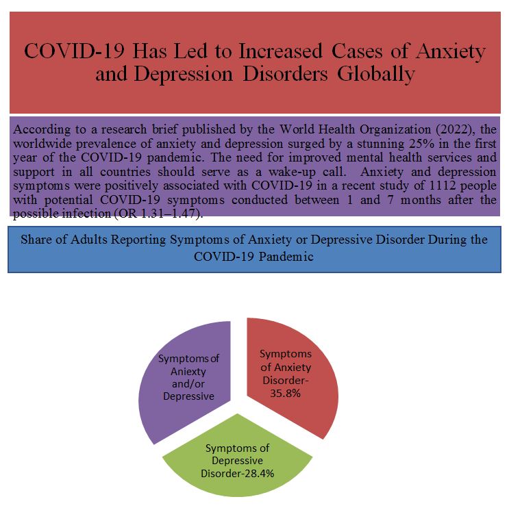
I chose this organizational pattern to help people understand the concepts of anxiety and depression about COVID-19. The concepts of suffering from depression and anxiety is a global phenomenon that has increased due to COVID-19. According to Markel & Selber (2018) about 5% of adult populations worldwide experience depression. Depression significantly increases the global disease burden and contributes to global disability. While I intended this infographic for medical and university students, the vast majority of people are in some way influenced by the topic it addresses. Campaigns are the backbone of what is done and tend to center around promoting overall mental health.
This infographic aims to show that depression could be a specialized way of thinking about hard challenges. It is possible that evolution’s physiological symptoms are meant to derail people from their regular activities so that they can zero in on the cause of the problem and find a solution. Dispelling myths and misinformation regarding depression and other mental health conditions requires a greater public understanding of these issues. As a result, by informing people about depression and anxiety through the infographic, they can see that they are not alone in their struggle with depression.
Infographics can break down a complicated topic while keeping the reader interested. Depression and anxiety can be presented engagingly through the use of infographics. Infographics are much more appealing to viewers than walls of text describing the same information (Markel & Selber, 2018). In this infographic, I used bright colors over dark because vibrant colors can significantly improve an infographic’s tone and feel. The colors I have chosen are striking, and they will likely hold the attention of my target audience readers for at least a few seconds. The infographic’s color scheme is also a great way to draw attention to specific data sets on depression and anxiety.
With the help of accessible graphic design, one can make sure that most people can read and understand the printed materials and the website’s content (Markel & Selber, 2018). Because I think everyone can benefit from being more accessible, I decided not to alter my infographic in this circumstance. My design also makes depression and anxiety resources on the web more accessible to those with and without disabilities. Sites that are easy to use and navigate speed up the distribution of data and services.
When people address their mental problems, it can be very healing and hurting for them and others. As well as reassuring listeners that they are not alone, personal stories can motivate and encourage readers in a similar position. I sincerely desire those listening to learn healthy ways to deal with pressure, boost their confidence, and prioritize their well-being. Second, the target demographic will get sufficient rest, maintain a healthy diet and exercise routine, and lean on supportive relationships when times are tough. Moreover, the target demographic will schedule routine checkups with their doctors and go in for treatment whenever they experience any symptoms of illness. At long last, those who suspect they are depressed will seek professional assistance.
Reference
Markel, M. H., & Selber, S. A. (2018). Technical communication. Bedford/St. Martin’s. Web.