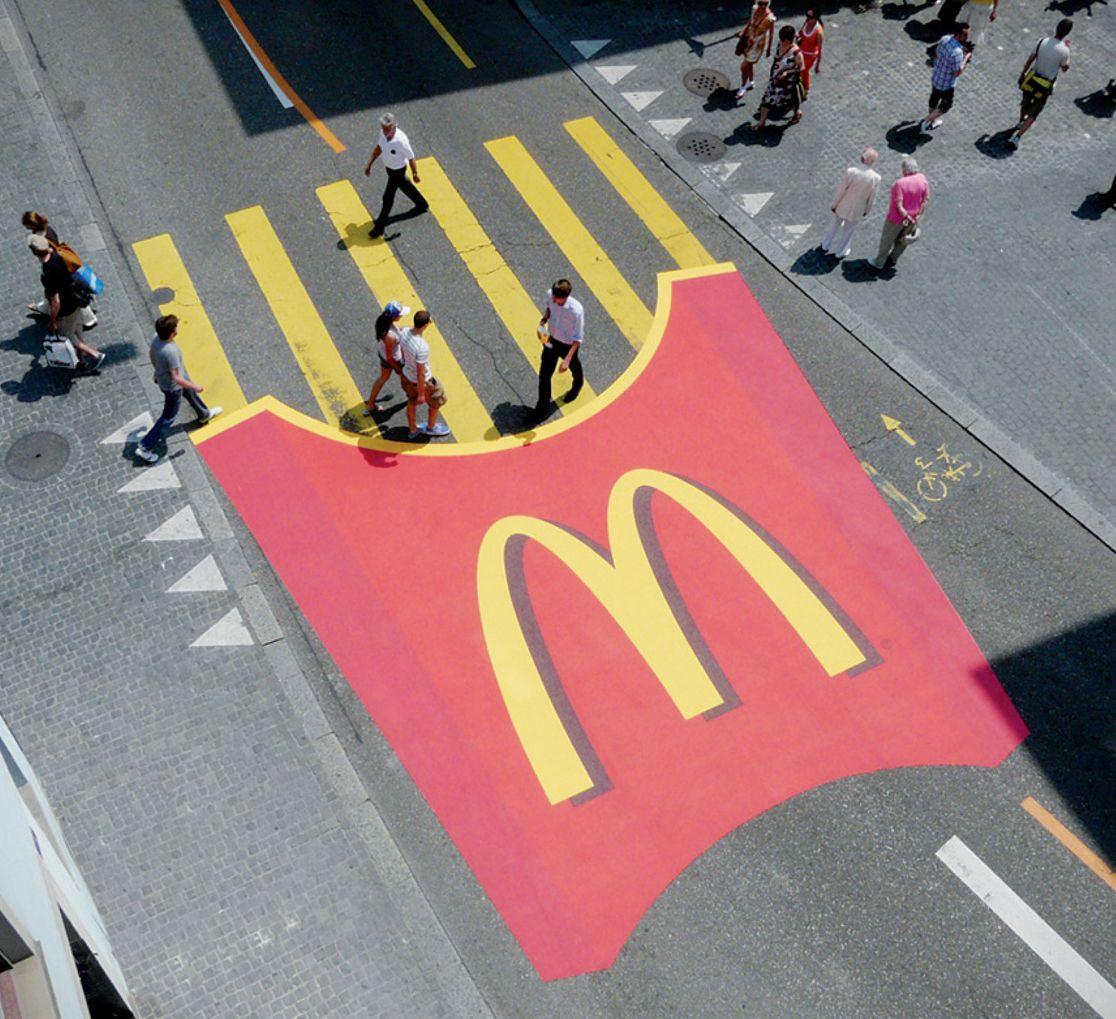
Though a catchy commercial jingle and an eye-catching logo might seem the quintessence of a successful advertisement, there are several other components that contribute to its impact, ad placement being among the key ones. The placement of the advertisement above reinforces its meaning and core message, making the statement all the more effective. Asa result, the brand and its image become significantly more memorable. Specifically, the clever use of the shape of the product to mimic the pedestrian crossing has allowed attracting the attention of every person crossing the street. Most importantly, the specified approach to ad placement provided a plethora of material for numerous discussing among general audiences. In turn, the interpretations of the image and the conversations surrounding it led to its astonishing popularity. Thus, the goal of increasing the level of brand awareness has been achieved successfully.
The ad also manages to reach its target audiences quite successfully. Namely, the company has clearly been striving to attract the attention of general audiences of no specifically discernable age. In turn, a giant image of McDonald’s French fries in their traditional packaging has attracted the attention of every single person crossing the street. The image has likely drawn the attention of younger audiences in particular, which must have contributed to arise in the popularity of the fast food chain among families. Therefore, the specified ad placement can be considered a success. Given the goal that it pursued, namely, gaining media attention and increasing the range of customers, the company has succeeded spectacularly. Thus, due to a combination of a witty image and an underlying message of the company’s accessibility to all customers, McDonald’s has managed to attract people’s attention.
Reference
McDonald’s pedestrian crossing. (2010). [Photograph]. Creative Criminals. Web.