Introduction: The Advertisement
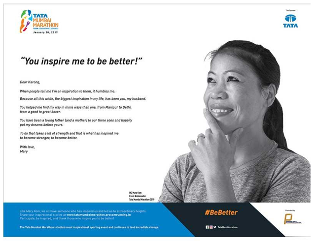
The “You Inspire Me to Be Better” advertisement appeared first on January 11, 2019, in the Times of India Newspaper (Mumbai Edition) and fascinated readers with its brevity, minimalism, and expressivity. “You Inspire Me to Be Better” promoted the TATA Marathon, which took place on January 20 (TATA 2). The advertisement stands out of the rest of the ads due to its realistic look and the inspirational idea that it carries, yet it also has a distinct intention of inviting people to buy tickets to the event.
Design Choices
First, the use of a minimalistic approach to conveying the visual message and using a triad of blue, black, and white as the key colors, the artist has managed to create a meaningful piece. By limiting the number of key colors to three, the artist made the viewer focus on the message and convey a specific mood of hope and optimism. On closer inspection of the advertisement, one will notice the elements of orange, red, pink, light blue, and violet, yet they constitute the logo and are barely visible in the ad. The specified logo is placed in the top right corner of the advertisement and attracts the minimum attention, allowing viewers to see the central picture first.
Second, the rest of the information about the event, including the logo of its sponsor, its mission, and other important data, is not simply shifted into the bottom of the advertisement. To ensure that the provided information does not distract the audience or distort the uplifting impression created by the advertisement, its creator incorporated the specified information into its design. Specifically, the described data is placed on a line of blue, black, and white colors, which constitute the elements of the frame (TATA 2). As a result, the additional information, while remaining visible, does not distract from the image and the mood that it creates.
Space and Mood
The use of space in the advertisement under analysis is also quite peculiar. Instead of covering every square inch of the paper, the designer has left quite a lot of empty spaces in the picture. The described approach allows the message to breathe and makes it easier for the audience to perceive the message. The use of pace described above is also justified by the combination of graphics and textual elements in the advertisement.
With a block of text on the left and an image of a woman on the right, the designer removed the elements that made the setting claustrophobic and, instead, made it possible for the advertisement to remind of open horizons and uninhibited opportunities.
Therefore, the described mood created by the advertisement aligns perfectly with the product that TATA aimed to sell, which was the parathion supposed to showcase the power of people’s physical abilities, motivation, and aspirations. The model whose picture is placed in the advertisement as one of the central elements of the piece establishes the mood as well, specifying some of the ideas that the event conveys, including multiculturalism, unity, and communication.
Rhetorical Appeal
The advertisement conveys its message directly and very clearly due to the choice of words and images incorporated into its design. The rhetorical appeal of the advertisement is incredibly strong since the concise message and the sparingly used elements contribute to the mood and the emotional response in the audience. The idea of open possibilities and the opportunity to discover one’s full potential is represented in the advertisement perfectly.
The textual part of the ad deserves particular attention as one of the tools for creating a proper atmosphere and making the message even more palatable. The fact that the text represents a letter from a daughter to a husband creates a sense of intimacy and appeals to the reader on a deeply emotional level, bypassing critical reasoning and resonating with the target audience immediately. For example, the following sentence has a particularly strong impact on its audience: “You helped me find my way in more ways than one” (TATA 2). Moreover, the picture of the woman smiling encouragingly makes the overall sense of the advertisement even more positive.
Additionally, the letter represented as the core message of the advertisement incorporates a range of rhetorical tools that emphasize the importance of its message. For example, the letter is filled with metaphors, some of which might seem rather commonplace: “You helped me find my way in more ways than one, from Manipur to Delhi” (TATA 2). However, the overall feeling of empathy that the specified advertisement creates makes the reader overlook the specified issue and receive a positive emotional charge.
The simplicity of the text and the lack of deliberate tools for attracting the audience’s attention make the discourse under analysis authentic and, thus appealing to a lot of readers. As a result, the advertisement has a huge effect on its audience, appealing to their emotions and their sense of familial unity. The author makes a connection between the idea of personal success and the concept of family ties, which imbues the advertisement with numerous meanings and, therefore presents it as relatable to virtually any reader.
Due to its original design, the advertisement has a very long-staying power and conveys its key message successfully. The choice of color deserves particular attention due to the choice of medium. With the rise in the influence of electronic media, print resources have been experiencing a bit of a crisis, using advertisements as the means of returning the revenues. At the same time, with the introduction of new tools for using the print medium properly and conveying an original message, the print media has experienced a certain renaissance.
The opportunities for creating a unique and original image with strong staying power have increased, which a range of newspapers have hurried to use (TATA 2). Digital tools have introduced artistic opportunities that were only restricted by artists’ imagination, which was why creating a poster that would stand out from the rest of advertisements was an incredibly challenging idea.
Conclusion
Overall, the spatial characteristics of the advertisement and the color scheme are the key aspects that make it particularly noticeable among the rest of the ads and help readers to focus on its message immediately. The specified specimen of traditional marketing shows that even in the digital era, the ability to connect the design choice and the message that it is supposed to convey outweighs the number of available tools and the extent of their technological advancement. Thus, TATA’s “You Inspire Me to Be Better” represents a perfect example of how a message can be made even more powerful with an elaborate and tasteful design.
Work Cited
TATA. “You Inspire Me to Be Better!” Times of India Newspaper (Mumbai Edition), 1 Mar. 2019, p. 2.