Introduction
The current report is aimed at investigating the effect of advertising on consumer behavior. Commercials and advertising messages have gained a significant level of influence on potential customers, thus defining the marketing success and the following revenue-generating of businesses.
If the consumer is relevantly exposed to an advertised stimulus, which attracts and sustains viewers’ or listeners’ attention and provokes anticipated perception, the advertising effort will lead to the targeted purchasing action. Some ads are effective in their ways of reaching the consumers and triggering the anticipated reaction, while others fail to pursue the intended outcomes. Despite a long history and a great scope of research in the field of advertising, some key elements, including exposure, attention, and perception, are commonly under-addressed in many advertising campaigns. In this report, specific examples of ads that generate attention, exposure, and perception in both effective and ineffective ways will be analyzed. Also, the products found in a hypermarket will be evaluated as per their effectiveness. Both ineffective ads and products will be suggested with potential improvements to demonstrate the efficient utilization of marketing techniques.
Report Body
Attention, Exposure, and Perception in Advertising
In the modern-day competitive economic environment ruled by free markets, reaching the target population and promoting a product or service becomes more and more challenging for companies. Advertising is one of the most accessible and beneficial promotional efforts that “let the customers know about a product or service to increase the sales and their revenue” (Rahman 22). To achieve this goal, an ad must relevantly generate exposure, attention, and perception in a favorable manner and by means that will help reach the target population. According to Yagi and Inoue, “attitudes toward advertisements influence a customer’s intention to purchase through affecting both attitude toward brands and brand cognition” (1). For a message to reach its target audience and the product to stimulate consumer buying decision-making, the presentation of the stimuli needs to comply with the requirements of effective generating of exposure, attention, and perception in the prospective customers.
The moment and medium of exposure to the advertising message are very important since it initiates the consumer’s connection with a brand and becomes a cornerstone of the overall consecutive effect of the stimulus. One might be exposed to advertising via television, social media, printed media, the internet, banners, and others. Perception is the key factor, which serves as a way to “understand the customer’s needs for a product or service” (Rahman 22). While the image presented in an ad or a product packaging design refers to its quality, perception of an ad message triggers people’s impression and emotional response that is followed by a need to purchase.
The effectiveness of an ad is closely connected with the initial reaction of a consumer to the stimulus. Importantly, “the success of an ad depends much on its predetermined brand familiarity” (Farney 10). Indeed, the ads of renowned brands whose logos and slogans are easily identifiable and well-known to the general public have greater recognition and generate better perception even when the name of the brand is not explicitly stated. However, for an ad to have an anticipated favorable effect on consumers, it must be visually compelling and provoke certain emotions to grab viewers’ or listeners’ attention.
Effective Advertisement
Ricola Cough Medicine Ad
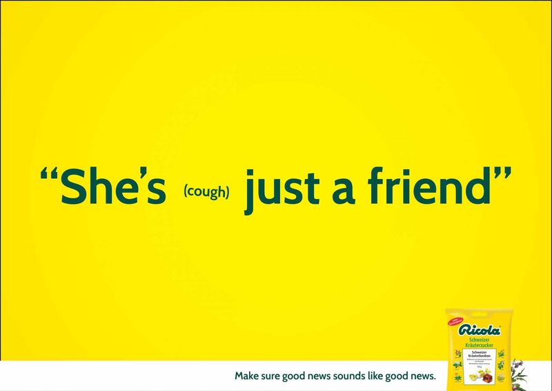
The bright yellow color of the ad background serves two purposes (Figure 1). Firstly, it attracts viewers’ attention, and secondly, it represents the brand’s color, since the packaging of the cough medicine is yellow. The ad generates exposure effectively since the potential consumers see the message and then look for the explanation of it in the right bottom corner where the image of the product is posted. Also, the ad is simple; the text is typed in distinctive font and color that allows for focusing the reader’s attention on the message. The stimulus of a humorous line saying “She (cough) is just a friend” is perceived positively, with a smile, and prompts the consumer to pay attention to how coughing may alter the meaning of a phrase.
Discover Card Customer Service Commercial
This TV commercial generates exposure through compelling marketing stimuli, where a wide audience can perceive the message (Figure 2). The ad is effective because it absorbs viewers’ attention with the help of funny characters and an intriguing plot. The footage is very short and to the point; it generates a positive perception due to the laughable story and the positioning of the high-quality bank’s customer service that is capable of solving the target audience’s problems. Overall, the ad creates a favorable, trustworthy, and positive image of the brand, increases customers’ trust in its services, and promotes its product in an effective way.

Netflix Banner Ad
The banner ad for subscription to the streaming service Netflix effectively utilizes the opportunities provided by the marketing stimulus, which is a static visual message (Figure 3). The ad generates effective exposure to a mass of potential subscribers wince it is located in the crowded city street where thousands of people are exposed to it daily. It grabs viewers’ attention by its bright red color and the big size; also it maintains the attention because the picture dominates over text. A glance at the banner allows the passing by viewers to perceive the message instantly. Importantly, the brand name is distinctively presented on a white background, which ensures effective recognition. The perception is also facilitated by the presence of celebrities in the pictures; the fact that there are three of them (representing three different series) expands the scope of the target audience and helps to attract more consumers.

Nike Ad
The print advertisement promoting new sporting gear from Nike is an example of an effective ad that is capable of reaching the target audience (Figure 4). It generates exposure and appeal by its simple design and the choice of colors. Easy brand recognition is achieved via the central placement of the logo. Viewers’ attention is attracted to the most relevant information about the benefits of the product and its cost, which are presented concisely. The picture of the running shoes is at the center of the banner, and the headline appeals to the product’s stability and speed so that consumers perceive the necessary information at once.

Ineffective Advertisement
First Bank Mortgage Ad
Despite a good idea for this web ad, the presentation of the main message is ineffective due to the incorrect placement of the catchphrase (Figure 5). At the moment of exposure, the ad generates confusing stimuli, where a viewer does not understand what the connection is between mortgage and dominoes. Although the ad grabs viewers’ attention, it does not maintain it because of the long text in the middle of the picture. A quick eye will easily pay attention to short phrases typed in big letters and avoid reading a long text. As for the perception, the overall message is humorous and positive, suggesting that the company provides reliable and beneficial terms so that customers do not need to worry. However, the placement of the line that explains the ad is wrong, since it is non-distinctively presented at the end.

Nivea Ad
This web ad posted on social media is an ineffective way of advertising the product due to several reasons (Figure 6). Firstly, although the stimulus generates exposure to the ad’s message, the attention of the viewers is attracted to the phrase that is placed in the center of the piece, stating ‘White is purity. The problem here is that attention is not focused on the product; moreover, the placement of the products is so indistinctive that one struggles to understand what exactly is being advertised. The phrase itself causes ambiguity in perception; firstly, it does not refer to the products’ purpose or benefits, and secondly, it might be perceived as discriminating against non-white consumers.

Pedigree Dentastix Ad
The Pedigree advertising poster is regarded to be ineffective based on its failure to focus consumers’ attention on the purpose of the product and the necessity to have it (Figure 7). From the moment of exposure, the humorous picture of a dog provokes a smile and a positive perception. However, the name of the product and the title of the brand are barely visible and difficult to recognize, which might leave the receivers of the information hesitant about what is being promoted. Moreover, the kind of perception the ad triggers does not provoke purchasing behavior, since the ad fails to present a common reason why one would need a product for cleaning dogs’ teeth.

Sony PlayStation Portable Ad
The banner advertising the new PlayStation does not serve its effective purpose due to the failure to provoke a favorable perception of the ad message (Figure 8). The viewers are exposed to the photo in the banner, in which a white woman expresses dominance over a black woman. The attention is captured by the portrayed characters, which provokes negative perception as a result of implied racial discrimination. Moreover, the brand name is not mentioned which makes it difficult for potential consumers to obtain necessary information about the product, as well as the reason to buy it.

Ways to Improve Ineffective Advertisement
One of the ways to increase the amount of attention to the analyzed ineffective ads via the marketing stimuli is to provide better identification of either a brand name or a product title. Also, the appeal to the perception of prospective consumers needs to be based on the adequate identification of the target audience. It might be done with the help of the segmentation, targeting, and positioning (STP) for allocating the market segments most exposed to the promoted product utilization, finding the best stimuli to reach the target audience, and introducing the most easily understandable message. The most important aspects of the message that might draw attention are humorous characters, images, or phrases, that capture the interest and stimulate consumers’ positive perception of both the brand and its product.
Since the message of the First Bank mortgage ad is difficult to understand, changing the font and placement of the catchphrase ‘Worry less about your mortgage and more about your free time so that the general message of the ad is easily understood. Also, to improve the message of the Nivea ad, it would be necessary to place the picture or the title of the product front and center so that the delivered message obtains more sense as per the purpose of the product. The Pedigree ad might benefit from enlarging the brand name and the title of the product, as well as adding some brief explanation of what purpose it serves. Finally, to make the message of the PlayStation ad more clear and less provoking in terms of racial discrimination, it would be better to substitute the opposition between white and black with the emphasis on other benefits the new PlayStation brings, other than its color.
Effective Products
Heinz Tomato Ketchup
An example of an effective product is the packaging design of Heinz tomato ketchup, which is simple, attracts attention by the sophisticated label design that appeals to natural components and the quality of the product (Figure 9). The easily identifiable brand name contributes to the favorable perception of the product and increases consumers’ trust toward the years of experience of the company. The buyers will likely purchase this product based on its visual appeal and the concise presentation of relevant information.

Pantene Shampoo
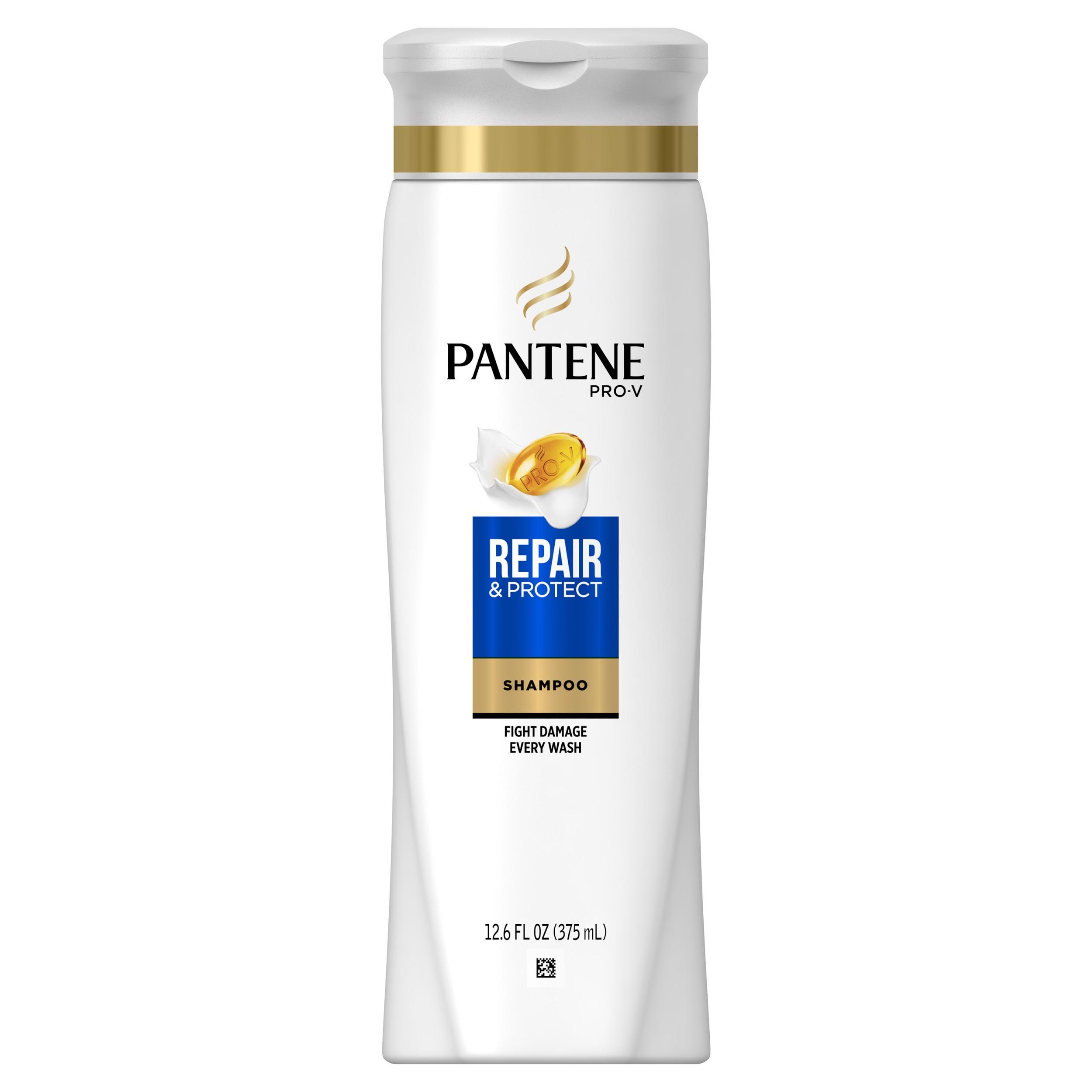
This product is designed in a manner that generates exposure, attention, and perception and stimulates purchasing behavior of potential consumers (Figure 10). The customer is exposed to a simple, minimalistic design of a bottle, where the identification of the product name and purpose, as well as the brand title, is clear and easy to understand at the first glance. The benefits and call for action appeal to the target audience and provoke a favorable, positive perception of the product.
Lay’s Potato Chips
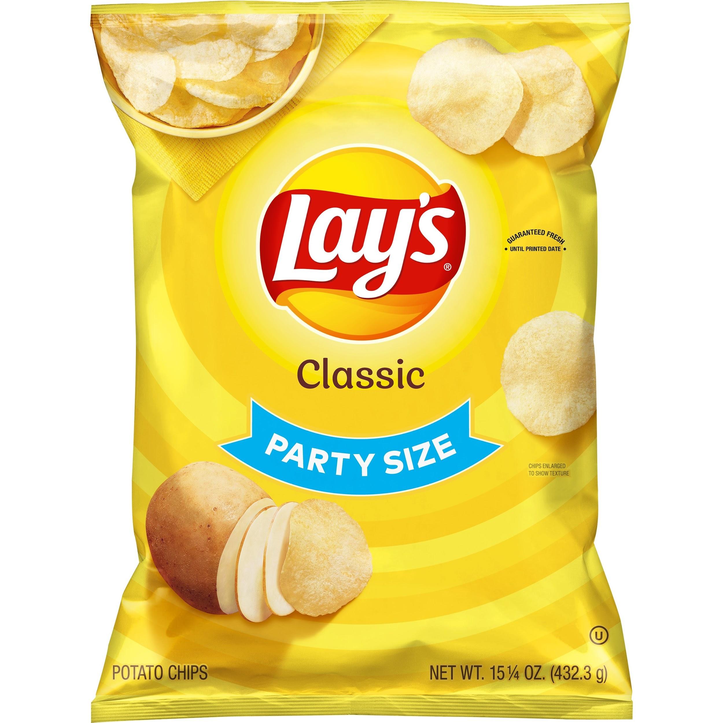
Another example of an effective product is a Lay’s potato chips package that is a productive way to trigger anticipated consumer behavior (Figure 11). Bright package color exposes the recipient to the product and captures his or her attention with a simple and concise presentation of the name of the product, its characteristics, and the picture of the main ingredient, implying the natural source and the lack of harm in consuming such a snack. Also, the indication that the pack is a party size is laid out in a bent line imitating a smile that provokes positive perception and stimulates purchasing.
Nutella
Nutella is a product characterized by significant effectiveness gained using successful marketing techniques application (FIgure 12). The design uses different well-combined colors to capture viewers’ attention on the key information, such as the brand name, the ingredients of the product, and its nutritional characteristics. Also, the picture at the center of the package demonstrates how the chocolate paste is used. This element triggers taste perception and stimulate buying reaction.

Ineffective Products
Fabuloso Cleaning Products
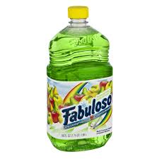
The reason why this product is ineffective in generating exposure, attention, and perception is that it sends a confusing message where it is unclear (at the first glance) if this product is a drink or a cleaning solution (Figure 13). As it is seen from the picture on the package, the first thing a buyer will see is fruit and colorful liquid inside the bottle. For this product to improve and become effective, one might place the word ‘cleaning’ in the front and center written using a large letter size to avoid confusion. There are many complaints about this product found on the internet stating that customers were confused with the intended purpose of the product, as well as doubted if its placement in the supermarket was right since it is easy to confuse it with a beverage.
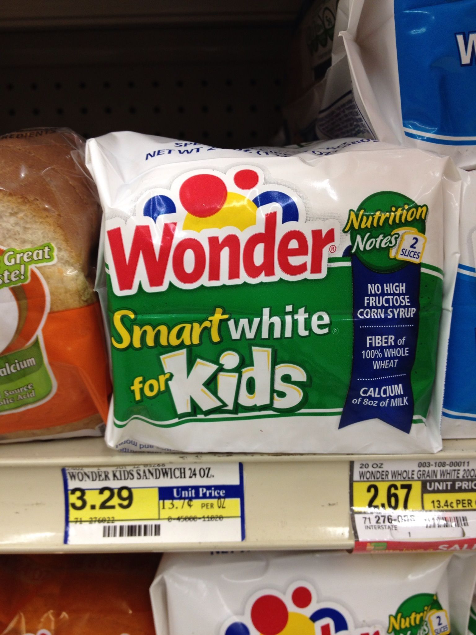
Wonder Smart White for Kids
The product design is ineffective due to its confusing exposure and the ambiguity of perception the package produces (Figure 14). The white packaging and the lack of product purpose identification leave the buyer wondering if it is a pack of napkins, diapers, or some nutrition for children. The viewers’ attention is attracted to the title of the product and the brand name, which do not provide any clear information but only lead to confusion.
Wild Mountain Honey
The product’s packaging is ineffective in terms of its potential to generate exposure, attention, and perception because it is overloaded with information (Figure 15). The potential consumer is exposed to the list of properties, production characteristics, brand name, product title, and benefits all presented in an illogical mix and typed in the same color. It is difficult to concentrate one’s attention on the main message; thus, the perception is not generated favorably.

Turkey Variety Pack
This product is packaged and designed in a way that obstructs consumers’ easy understanding of the content of the package and does not allow for receiving information about the benefits of the product (Figure 16). Although the brand title is placed in a visible spot, the customer will likely be confused with what kind of meat is inside the pack. The variety of turkey is listed in the front, but it is not clarified that all of the kids are inside. It confuses perception and might diminish the likelihood of consumer purchasing reaction.

Ways to Improve Ineffective Products
One of the ways to increase the amount of attention to the product is to minimize the amount of information using only the most important facts. The most important aspects of the message that might draw attention must include the purpose of the product and its major benefits for the consumer. Since the message the product designs deliver is uncertain, it is important to specify (by the visual presentation and verbal description) what the product is aimed at and how one may benefit from its purchasing. As the examples of effective ads and products show, celebrity endorsement is an effective contributor to increasing brand equity and product promotion (Mansour and Diab 148). Therefore, celebrities famous for their beauty care, such as Eva Longoria, Jennifer Aniston, or Kim Kardashian, might be good spokespersons for beauty brands. Also, celebrities known for their choice of natural nutrition products might be good endorsers of healthy foods, such as honey and similar natural products.
Conclusion
In summation, advertising and adequate product presentation are key elements in promoting a product or service and reaching the target population of buyers. From the moment of exposure, the image, sound, or visual presentation of an ad must create and maintain attention so that the target population memorizes the brand and, in the situation of a favorable outcome, purchases a product or service. As the examples of effective and ineffective products and ads demonstrate, it is important to apply STP strategies to align the advertising techniques in a manner capable of maintaining consumers’ attention and trigger perception that would lead to product demand.
Works Cited
Farney, Ryan M. The Influence Exposure Has on Consumer Behavior. Senior Theses, Claremont McKenna College, 2016. Web.
Mansour, Ilham Hassan Fathelrahman, and Dalia Mohammed Elzubier Diab. “The Relationship Between Celebrities’ Credibility and Advertising Effectiveness.” Journal of Islamic Marketing, vol. 7, no. 2, 2016, pp. 148-166.
Rahman, Mohammad Toufiqur. “Perception on Advertising Media: The Case of Newspaper Advertising.” International Journal of Commerce and Management Research, vol. 5, no. 4, 2019, pp. 22-25.
Yagi, Yoshihiko, and Kazuya Inoue. “The Contribution of Attention to the Mere Exposure Effect for Parts of Advertising Images.” Frontiers in psychology, vol. 9, 2018, pp. 1-7.