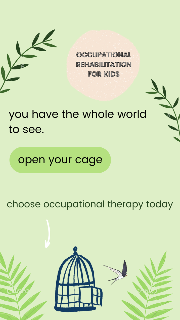
Since the product of interest for this marketing campaign is occupational therapy for the kids, it is vital for the visuals to resonate with the parents of children that require rehabilitation and assistance in performing activities of daily living. Considering the price policy and market location, the target customer for the product will be parents with long-term employment who have kids with disabilities or diseases that require post-traumatic rehabilitation, and the visual itself should be in English. After brainstorming a variety of options, the final draft of the visual is as follows:

The draft above is the project of a target Instagram story to be used as an advertisement inviting to the occupational therapy center’s link. At first, the idea was to use the image of children and graphic illustration with doctors and occupational therapy elements. However, the final draft does not explicitly address the idea of occupation therapy for the sake of reaching the maximum amount of unique Instagram users. The presented draft will be used as a prepaid advertisement Instagram campaign targeted specifically at people searching or mentioning information about interest in occupational therapy.
Hence, to begin with, it is necessary to explain the general concept of the visual structure. Professionals define occupational therapy as “the therapeutic use of everyday life occupations with persons, groups, or populations (i.e., the client) for the purpose of enhancing or enabling participation” (American Occupational Therapy Association [AOTA], 2020, p.1). By using this definition by AOTA, the mind map of the associated concepts was used. The notion of “enabling participation” was associated with “encouragement” and “resilience,” whereas the concept of resilience was associated with overcoming barriers and limitations. The idea of a barrier has eventually become a central visual and verbal concept for the ad. People commonly correlate the idea of a barrier with a physical restriction like handcuffs or cages. In this particular example, the visual concept of a bird flying out of the cage can be used as a visual metaphor for a child going through occupation therapy in order to feel free from physical and cognitive limitations to their autonomy. As a result, the verbal component of “opening your cage” is a central yet implicit call to action to address occupational therapy and let children go from their invisible but pressuring cages of physical dependence on others.
However, for the advertisement to be explicit enough for the target audience to understand the message, the visual draft consists explanation of the metaphor by stating the call to action (CTA): “choose occupational therapy today” with the arrow pointing to the website link. This phrase, however, is used in a font smaller than others for the average user to have the right order of perceiving the message. The central idea of “opening the cage” is underlined by font size and background while also being placed in the middle of the visual to make sure it is what the audience notices first.
After arousing the interest of the target user, the ad follows the customer to the explanation that opening the cage is the key to opening the world. In this case, the ad serves to inspire the customer to make changes in their lives. Hence, even if the person seeing the ad does not require child occupational therapy, their attention will still be grasped by the inspiring appeal associated with practically every aspect of human life. In such a way, the ad minimizes the risk of users skipping the ad after immediately realizing its purpose.
Hence, the last thing that catches the user’s attention is the actual explanation of the advertisement and practical call to action. No additional information was used for the ad in order to leave more space and avoid the users’ intimidation by a long read in the visual. All the additional information about the center will be presented in the description on the website’s landing page. The information will include both the definition of occupational therapy and the contact information of the particular center. In such a way, the targeting extends to the people implicitly interested in the therapy, including friends, relatives, and acquaintances of the ones needing help in child occupational recovery. Finally, the title of the organization is placed in the upper right corner using neutral colors to become one of the last things for the users to notice. To make sure that the recipient reacts to the advertisement, the verbal means of the ad are used in empirical rhetoric, including actions verbs such as “open” and “choose.”
In this case, the marketing collateral will be the landing page of the therapy center’s website. The user will access the page by clicking on the “See more” reference at the bottom of the page under the white arrow pointing to the link. The very access to the advertisement requires only that the customer has an active Instagram account and watches Instagram stories, as the targeted content will appear while browsing the content.
Having taken everything into consideration, it may be concluded that the primary goal of the presented marketing visual is to initiate interest and generate leads to the website rather than create an information leaflet for the ones interested. Such a decision was made due to the fact that people actively seeking therapy use direct Google search using the keywords, location, and additional information. In this case, attention is paid to the parents who hesitate or know little about the specifics. Hence, it is more necessary to evoke the emotional component rather than create informational value to the end customer.
Reference
American Occupational Therapy Association. (2020). Occupational therapy practice framework: Domain and process (4th ed.). American Journal of Occupational Therapy, 74(2). Web.