How the Design Meets the Specifications
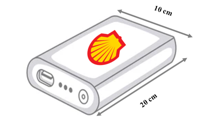
The freebie power bank illustration meets the design specifications in various ways. First, the Shell logo’s red and yellow colors enhance the product’s visibility and identification by all potential customers, including the colorblind men making up about 10 percent of the male population (“Prevalence”). Most of the color vision deficient men can hardly see the Shell logo; half of them have deuteranopia, i.e., the inability to distinguish between red, green, and yellow pigments (“Deuteranopia – Red-green color blindness”). As such, they can barely tell that the logo has two different colors; they only see a slightly darker outline. Avoiding too many colors in a design makes the product interphase distinguishable by more users. Overall, minimalism is a design trend incorporating the target audience’s abilities and helps promote visibility.
Second, the design consists of several elements and its shape represents the pectin or “shell” to refer to the company’s offshore explorations [for oil and gas]. The logo is dominated by green color, expressing the concerns about the planet’s safety. Green tones point out associations with spring and freshness. The image of green leaves showcases the idea of nature conservation. These are crucial aspects that the logo should reflect. They endorse the company’s new directions and promote Shell’s green initiative to reach a more loyal and younger audience and expand their profits with better economic performance. The color scheme is also important because it is somewhat observable by people with different kinds of colorblindness. More contrast colors are identifiable, attracting the attention of a broader audience. The logo requirement fits a 5 cm by 5 cm surface, which is approximately 190×190 pixels. One can successfully upload an image with these dimensions to most platforms.
The previous Shell logo needed clarity and consistency because it did not reflect the company’s products – gas and oil. Various options are available to correct this anomaly. Thankfully, the shape of the logo is the same because it has become the symbol of a world-famous company. The alteration combines the original logo with a flame, reflecting the company’s specialization. The primary color would change to green to symbolize renewal and sustainable recycling of products. The color would immediately pass as a company’s green initiative to potential client. Black and yellow elements included in the altered logo would be a reference to oil and gas products. Regarding size, the idea is to make the company name conspicuous and easily recognizable. The best way for me to achieve this is using Adobe Illustrator as the logo’s design software. Customers would notice the idea and the company’s strategic change, which is important given that Shell has faced reputational damage due to oil leaks. In one of these episodes, oil spills polluted and ruined several Nigerian farmlands. Thus, Shell must focus on sustainability and environmental protection to avert future crises.
The size is 4 cm by 2 cm to fit a 5 cm by 5 cm surface. It is vital since one can successfully upload an image with these dimensions to most platforms. According to primary research, the main point is that the loaded logo should look good, and the brand name will also be easy to read. When planning to print a symbol, the best way is to present it in vector format using PDF, SVG, and EPS to keep its quality. A designer should change an image of the maximum size working with raster graphics. In this way, one can easily edit the brand mark.
Aesthetically, the original logo of Shell lacks a flame icon in the background. The primary purpose for me changing the logo is because the current logo needs clarity and consistency. Based on my research in A2, Shell does not reflect its products in the brand image. Therefore, I think it is helpful for Shell to combine the theme of oil products with the well-known image of a shell. The shape of the logo should stay the same because it has become the symbol of a world-famous concern. The Shell emblem is registered as a trademark in more than 160 countries worldwide. However, the logo should reflect the company’s green initiative since it is unclear to the public that this is one of Shell’s main focus points. One should place a flame or oil droplet behind the original logo to symbolize oil and gas. It is a simple vector illustration, isolated on a white background.
The logo also uses vibrant colors to reflect the company’s new directions and promote Shell’s green initiative to reach a more loyal audience and expand their profits with better economic performance. The current logo is simple, but the red-yellow color combination makes references to the hotness of fire. According to my A2 research, in case of a damaging reputation due to an oil leak, which polluted and ruined several Nigerian farmers’ lands, it is better to develop Shell’s sustainability and concern about the environment. Therefore, the primary color should be green as a symbol of renewal and a recycling sign that would immediately associate a potential client with a green initiative. It can also include black and yellow elements as a reference to oil and gas products.
The logo’s font is clear and reflects the values of the company. The current font highlights the company’s nature, which can be considered severe. It reflects a status as a household name in the field of fuel. This viewpoint matters since the primary data I gathered in the A2 section confirmed that one of the issues is the accessibility and the visibility of the text. For the logo, a visually serious and businesslike font should be chosen in a soft black shape, opposing blue or yellow and green. The factors that determine the gaining of a correct font is a critical analysis of the target audience. The font size and style can be adjusted in the same way to meet the needs of the audience.
The advertisement must present the mission of Shell throughout. It is one way of ensuring that the company captures the new target audience’s attention. The commercial should not include too much wording as an excellent advert has easily recognizable motives that viewers remember easily. Considering this in Shell’s case, I would prioritize contrasting colors representing its goal, values, and products. The current advertisements need an understanding of the purpose of the presentation. By making the commercials more straightforward to follow, the company should attract a larger audience. It includes the images of oil and gas production and considers the natural forces and green landscapes to emphasize environmental concerns and sustainability. one can determine the effectiveness through millennials’ feedback.
Promoters should run the advertisements on popular social media platforms too. It is essential to include social media since one of the main goals of Shell’s rebranding is to increase the audience and draw the attention of millennials. Since the target audience is Millennials, the use of social media will bring benefits. Promoters can measure the outcome and analyze it since customers can share their opinions, interact with others, and give immediate feedback on Shell’s performance. People can spread positive experiences with the product and intentions. In the case of a company such as Shell, a personal approach may be practical. It is vital to engage the customers on a comfortable level, using Shell’s recognized intentions. The free aspects of giveaways can also work in the company’s favor, evaluated by financial performance. Simple designs and approaches bring a person’s attention to the main focus point.
Compared to other designs, mine meets the specifications in various ways, ranging from aesthetics to practicality. Thus, I settled for the design, even though it had a few imperfections. Some of the top reasons the design differs from others include:
- It is aesthetically pleasing because it uses the bright colors red and yellow.
- It is practical in that it utilizes a color scheme that increases visibility even among colorblind people.
- The logo fits snugly into a space measuring 5 centimeters by 5 centimeters, and the used font reflects company values.
My design’s strength is its simplicity and practicality, while its weakness is the inability to capture the company’s background. Thus, to improve it, there is a need to add a droplet or flame image in the logo’s background to represent oil and flammability, i.e., the company’s specialization. Others have praised my design for being adequate and appropriate, with most of them recommending that I add some aspects to it to reflect the company’s business focus.
Works Cited
“Deuteranopia – Red-green color blindness.” Colblindor, Web.
“Prevalence.” Color Blindness, Web.