An Executive Summary
Problem Statement
Review of the University of South Florida website, conducted as a part of this research, has allowed to identify several aspects of the website that could benefit from redesign. These include the size of the video player and some features of the virtual tour guide, such as the play and pause button for the audio. Another feature is the small section with photos at the bottom of the webpage, which opens automatically when the mouse cursor moves over it. This research will provide several suggestions to improve the layout of the USF website, present innovative techniques used in UX redesign, and apply the Google HEART Metric to the website.
Proposed Solution
The first solution is introducing the ability to change the size of the video player. Second, the pause and play button in the virtual guide can be replaced with standard symbols of ‘play’ and ‘pause’ icons to ensure that the users are aware of the audio guide function. In addition, it could be more convenient to click on the photo section to open it instead of it automatically opening by itself.
Value
Changing the features mentioned above might provide individuals visiting the website with a more positive user experience, increasing content awareness and minimizing effort. For example, if the virtual guide is easy to use and does not cause any confusion with a large number of pop-up windows, users will spend more time engaged in exploring it. If they have an opportunity to only play the audio when they want to, they will feel more in control of their experiences.
Improving the Layout of the Website
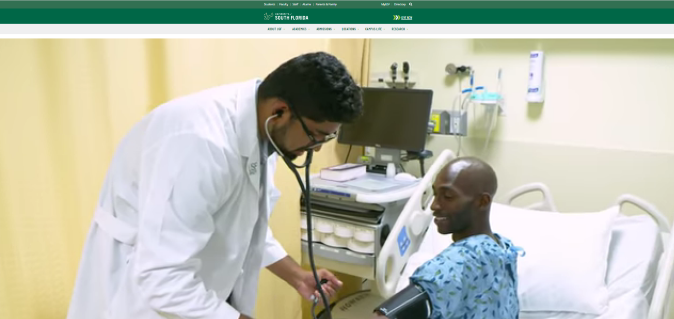
The first feature that could be changed is the video player. It could be more convenient for the users to be able to change the size of the player so that it is not significantly larger than the text on the page. While the videos do make the website look modern, inviting, and aesthetically pleasing, the screen print below shows that the player fills the whole screen even when other sections are reduced in size. If it was possible to make the player smaller, the efforts made by users to view the whole page would be minimized, while content awareness would be increased due to easier access to different sections.
The screen print below demonstrates another feature that can be improved: the audio button in the virtual guide section. While the ability to pause the audio player is an important feature, it can be confusing for the users since the audio begins to play by itself several seconds after the guide is open. A better way to provide engaging experience during the virtual tour is to give users the opportunity to play the recording, without it automatically playing as the tour begins.
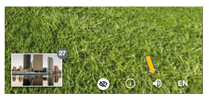
To make the users more aware of this function, the button can be replaced with standard icons: the play icon from the picture below can be displayed before the user clicks the button. The pause icon will then be displayed while the audio is playing. This change will allow for the easier cue recognition and improve usability.


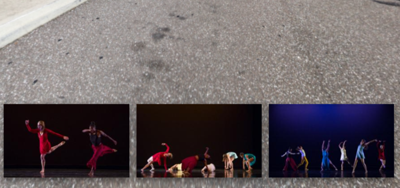
Another feature that may cause certain inconvenience while using the virtual tour guide is the photo section at the bottom of the screen. The screen print below shows that it opens automatically when the cursor moves over it. As a result, the users may see it often as they accidentally move the mouse and unintentionally open the photo section. Instead, users can be required to click on the small picture in order to open the larger section with the rest of the photos.
Innovative Techniques
Several techniques and methods can be used as a part of this research to ensure a more positive user experience for the students. One example is the Gartner UX Value Framework, which allows to prove the business value, the brand value, the customer value, and the employee value of the UX (Stewart). Another technique that allows measuring the efficiency of the UX design and improving it is the Google HEART Metric, developed to help UX designers in the product development process.
Applying the Google HEART Metric
Applying the Google HEART Metric to redesign the USF website can be beneficial as this system allows to analyze the usefulness of the new features introduced. The table below demonstrates how the goals and outcomes of the website’s UX redesign can be measured using specific metrics.
Table 1
It can be concluded that implementing the changes discussed in this research will promote all the aspects of the Google HEART Metric applied to the USF website. For instance, making the video player more convenient to use will increase users’ happiness and engagement. In turn, introducing changes to the virtual tour guide will improve task success, as users will be more aware of the audio guide function.
Works Cited
Buley, Leah. “5 Ways to Get the Most Out of Your Design Team.” Harvard Business Review, Web.
Luenendonk, Martin. “Complete Guide to Google’s HEART Framework for Measuring the Quality of UX.” Cleverism, Web.
Rodden, Kerry, et al. “Measuring the user experience on a large scale.” Proceedings of the 28th international conference on Human factors in computing systems – CHI ’10, 2010.
Stewart, Brent. “How to Prove the Value of User Experience Design.” Gartner, 2019, Web.
The University of South Florida. Welcome to the University of South Florida | Tampa, St. Petersburg, Sarasota-Manatee, FL, Web.