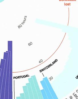
People spend a lot of time in traffic, but not all understand that this process takes a significant part of life. Morris showed many developed countries and tied in his graphic to make the comparison visible and clear. The communicative purpose of the picture is to make people aware of the issue and motivate them to make changes that can benefit societies and the environment. The color attention technique is used in the graph as the author aimed to highlight such countries as USA and Germany with bright colors (“The Cat in the Hat Knows a lot about Data Visualization”). Moreover, he included a huge number of cities making the analyses more accurate for these regions.
The design principle of contrast was included in graph production as the data can be compared. According to Gareth’s thoughts (“‘Contrast’ Design principle of Graphic Design Ep9/45 [Beginners guide to Graphic Design]”), when shapes can be compared, and the difference in color or size exists, the principle of contrast is integrated. Morris used rectangles of different lengths to show a change in data. The shape of the circle indicates that the radial balance was implemented, and information is shown from the center point (“‘Balance’ Design principle of Graphic Design Ep12/45 [Beginners guide to Graphic Design]”). The technique was used to catch the viewer’s attention and ensure that their eyes were aimed at the center.
This visual representation of the traffic problem includes many relevant design principles, and they fit perfectly in the explanation of the graph. The balance principle works well with the proximity theory when all elements should be located in the logical order (“‘Proximity’ Design principle of Graphic Design Ep13/45 [Beginners guide to Graphic Design]”). European countries are located together on the left side of the graph, while countries located in North America stand together on the right side of the visual table. However, the use of the repetition principle may be odd in this example when the designer puts the same colors for different countries. In some cases, repetition can help to formulate a structured thought (“‘Repetition’ Design principle of Graphic Design Ep14/45 [Beginners guide to Graphic Design]”). Nevertheless, this practice is not helpful in the “Hours Spent in Traffic” graph as it may disrupt people.
Simplicity principle is a crucial aspect of successful graphic development. The artists need to cover a wider audience and ensure everyone understands the message (“‘Simplicity’ Design principle of Graphic Design Ep15/45 [Beginners guide to Graphic Design]”). On the one hand, the “Hours Spent in Traffic” graph stays clear and straightforward regarding countries’ explanations. On the other hand, the exact number is not shown, and the data becomes less accurate. Figure 1 shows only four time periods without any deep explanation. The viewer might need to take some extra time to estimate the approximate number of hours spent in traffic in specific countries.
In conclusion, understanding the key design techniques is important to produce clear graphs. Depending on the type of message, different principles can be applied to increase the quality of work. However, the designer should understand that combining all principles may decrease the attention span and make the purpose less effective. Therefore, beginners in this industry should study the key concepts before creating visual objects for existing customers.
Works Cited
“‘Balance’ Design principle of Graphic Design Ep12/45 [Beginners guide to Graphic Design].” YouTube, uploaded by Gareth David Studio, Web.
“‘Contrast’ Design principle of Graphic Design Ep9/45 [Beginners guide to Graphic Design].” YouTube, uploaded by Gareth David Studio, Web.
Morris, Ryan. Average Hours Spent in Traffic. National Geographic, 2014.
“‘Proximity’ Design principle of Graphic Design Ep13/45 [Beginners guide to Graphic Design].” YouTube, uploaded by Gareth David Studio, Web.
“‘Repetition’ Design principle of Graphic Design Ep14/45 [Beginners guide to Graphic Design].” YouTube, uploaded by Gareth David Studio, Web.
“‘Simplicity’ Design principle of Graphic Design Ep15/45 [Beginners guide to Graphic Design].” YouTube, uploaded by Gareth David Studio, Web.
“The Cat in the Hat Knows a lot about Data Visualization.” YouTube, uploaded by Storytelling with data, Web.