
Introduction
In the modern, data-driven world, Excel dashboards are indispensable tools for professionals to analyze and display data. However, creating visually appealing dashboards that effectively communicate information may be challenging (Frost et al., 2021). Many dashboards appear to lack definition, engagement, and the ability to attract attention effectively. Thus, it is important to review the concept of visually persuasive dashboards and outline five key steps to build attractive Excel dashboards that encourage participation and simplify data exploration.
Understanding Visual Persuasion in Excel Dashboards
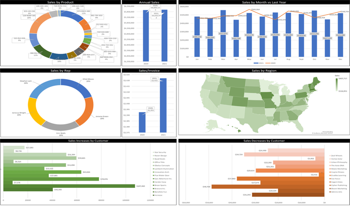
Visual persuasion is crucial in Excel dashboards, where complex data must be transformed into actionable insights. As mentioned in the presentation, “visually persuasive dashboards aren’t just about making beautiful charts and graphs” (Qlik, 2022, slide 4). It is about designing visual features that connect with users, elicit an emotional response, and encourage them to perform desirable actions (Frost et al., 2021). By applying design principles, cognitive psychology, and information processing, professionals can build dashboards that inform, compel, and influence action.
The incorporation of design tenets such as simplicity, continuity, and consistency is important to building visually convincing Excel dashboards. The simplicity ensures the panel is not cluttered with irrelevant information, allowing users to stay focused on the crucial insights. The consistency of design features, such as design color schemes and scripts, provides a holistic visual appeal that enhances insight (Qlik, 2022). Hierarchy focuses users’ attention on the essential data, making dashboards easier to follow and more relevant.
Moreover, realizing how the individual mind processes knowledge is essential to creating successful dashboards. Cognitive psychology concepts, such as the Gestalt principles, explain how individuals absorb and manage visual content. For instance, the principle of similarity holds that objects located close to one another are considered to belong together (Frost et al., 2021). By implementing this principle, connected data points can be organized, making it easier for customers to grasp their connections.
Data visualization methods transform raw information into a significant understanding. The right types of graphics, such as bar charts, line plots, or pie charts, determine the type of content being presented and the message being communicated. For instance, bar charts are useful for comparing separate groups, while line plots are well-suited for depicting trends over time.
The use of courses is another crucial aspect of data visibility (Kha, 2023). Colors can be used to highlight significant data points, create visual contrast, or elicit specific sentiments. However, it is important to choose your color sensibly so that it improves legibility rather than detracts from the viewer’s focus.
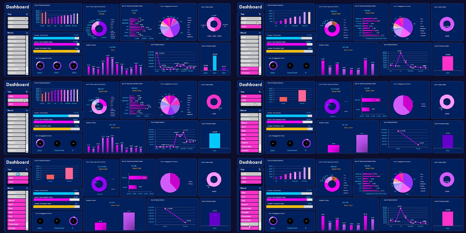
Interactivity is another powerful data visualization tool that lets users interact with data and uncover insights flexibly. Interactive filters, drill-down options, and help prompts allow people to customize their data views and further investigate the data. By allowing users to engage with the dashboard experience, they can gain insights relevant to their specific requirements and goals (Kharakhash, 2023).
In terms of presenting data, visually persuasive dashboards are intended to impact user perception and action. By strategically selecting key metrics, emphasizing trends, and providing useful information, designers can guide users to the outcomes they seek (Frost et al., 2021). Persuasive techniques such as flameworking, social validation, and deficits can be embedded into the design to prompt concrete actions or resolutions.
Key Steps
It is important to identify core metrics, and, in addition to accuracy and relevance, it helps to keep the audience in mind when selecting key measures. Customizing the dashboard to users’ needs and interests ensures that the information displayed relates to them (Qlik, 2022). This concept aligns with the principles of usability design, which emphasize empathy for users’ perspectives and the development of decisions that address their needs. Furthermore, the Pareto approach, also known as the 80/20 rule, can inform the selection of key metrics by focusing on a few vital measures that account for most of the results (Turban et al., 2018). By pinpointing a few mission-critical KPIs that have the greatest impact on an organizational outcome, designers can optimize the dashboard and boost its performance.
It is also required to devise a model that will be a guide for visitors. Besides employing Fitts’ Law, designers can use narrative and stream-of-consciousness methods to lead users across the surface of a dashboard (Turban et al., 2018). By organizing the dashboard in a cohesive, insightful way, developers can establish a narrative that unfolds as users navigate the information. For instance, organizing indicators in a timeline or serial order can create a natural, logical flow of narrative, taking users from broad ideas to specific insights (Qlik, 2022). Furthermore, adding visual cues, such as directional arrows or signs, can help users navigate the dashboard’s sections and stay organized.
Besides simple comparisons, designers can use advanced data analytics techniques, such as trend-following and dispersion analysis, to provide a deeper picture of KPIs. Trend scoring involves analyzing historical data to detect patterns and develop trends through time, allowing developers to anticipate future behavior and make better judgments. Variance intelligence measures actual performance against predetermined targets or benchmarks, revealing areas for improvement or challenges (Turban et al., 2018). By presenting variance insights in a visually appealing format, such as color indicators or springboards, users can quickly identify variances from anticipated outcomes and implement corresponding interventions.
Furthermore, for user-friendly diagram types, designers can use the best data visualization methods, such as narrative, hierarchy, and focus, to enhance insight. Storytelling involves creating a larger narrative surrounding the data, combining different data points into a cohesive narrative that connects with consumers (O’Brien & Stone, 2020). Hierarchy establishes a clear visual structure that focuses users’ attentions on the information that matters most, guaranteeing that critical information is not misplaced.
Emphasis includes the use of implied visual prompts, such as color, size, and contrast, to highlight key insights and draw users’ attention to critical ideas. Engagement can be further enhanced by adding gamification elements to the dashboard, such as performance indicators, progress bars, milestones, and rewards (O’Brien & Stone, 2020). By turning data science into a fun, participatory experience, users can be incentivized to interact with the system regularly and gain more valuable insights from the information it presents.
Conclusion
In summary, visual compelling is a complex concept that includes design guidelines, cognitive psychology, methods of data visibility, and compelling strategies. In the context of Excel workspaces, it entails creating images that not only communicate with users but also encourage and engage them in their decisions. Professionals can use these tools and techniques to create highly effective information, communication, and communication strategies that lead to action and ultimately to organizational performance.
References
Frost, A., Sturt, T., Kynvin, J., & Gallardo, S. F. (2021). Communicating with data visualization: A practical guide. Sage.
Kharakhash, O. (2023). Data visualization: Transforming complex data into actionable insights. Automation of Technological and Business Processes, 15(2), 4-12.
O’Brien, A. D., & Stone, D. N. (2020). Yes, you can import, analyze, and create dashboards and storyboards in Tableau! The GBI case. Journal of Emerging Technologies in Accounting, 17(1), 21-31.
Qlik. (2022). Beyond Excel: 5 Steps to a visually persuasive dashboard (PowerPoint slides).
Turban, E., Pollard, C., & Wood, G. (2018). Information technology for management: On-demand strategies for performance, growth and sustainability (11th ed.). John Wiley & Sons.