Defining CMS-DRGs
The Centers for Medicare and Medicaid Services (CMS) is the federal agency in charge of Medicare and Medicaid programs and is responsible for hospitals’ reimbursement for the services provided to patients. CMS makes decisions relating to medical facilities’ compensations based on Diagnosis Related Groups (DRGs) that categorize patients diagnosed with similar conditions. DRGs under review include respiratory infections, simple pneumonia, interstitial lung infections and other infectious diseases. The DRGs allow healthcare organizations to better control their costs, including costs of patient care and other resources, and establish reimbursement rates. Furthermore, DRGs can be used to track the incidence of various conditions, including incidence by month and age group. Therefore, it is important to ensure that the DRG data is well-presented and, if visualized, the visual elements reflect the important trends.
DRG Incidence
The sum of incidence for different CMS DRGs reflects the total incidence of the patients with similar conditions. In the created chart, the total occurrence rate of four DRGs is presented: respiratory infections, simple pneumonia, interstitial lung infections, and other infectious diseases. The sum of incidence for DRGs includes 74 respiratory infection cases, 39 simple pneumonia cases, 1 interstitial lung infection case and 1 case of other infectious diseases. The data pertaining to the selected DRG’s incidence is given in the form of a simple horizontal bar graph, with the DRGs ranked from greatest incidence to lowest. The chosen alignment from the highest to lowest is visually appealing and allows the viewers to quickly comprehend the frequency rate of each group as well as the differences between each of the selected DRGs. Thus, the graph is easy to understand even without looking at the total number of DRG incidences.
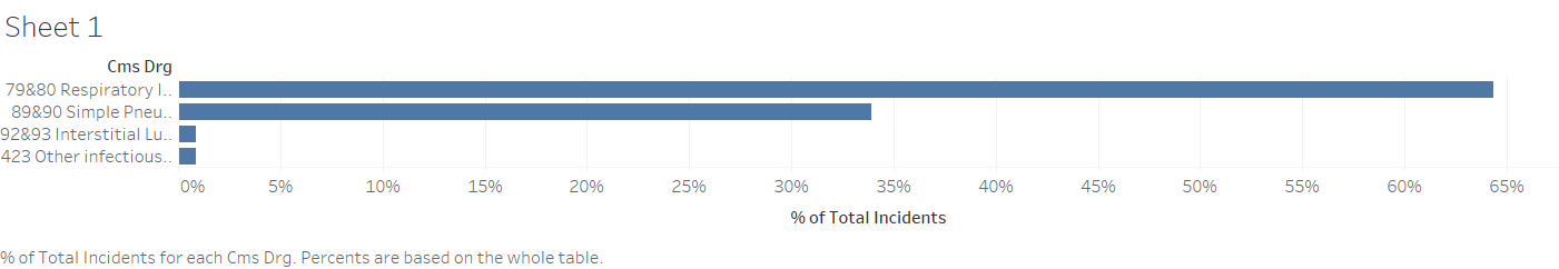
DRG Incidence Percentage
The occurrence rate of different diagnosis groups can be expressed via percentages. Thus, the incidence of the selected DRGs, including respiratory infections, simple pneumonia, interstitial lung infections, and other infectious diseases, is represented with the help of a simple horizontal percentage bar graph. DRG percentages which can be seen in Figure 1 includes respiratory infections (64%), simple pneumonia (34%), interstitial lung infections (1%) and other infectious diseases (1%). The graph expresses the number of cases in each group as a percentage of the total number of cases in all selected groups. Similar to the previous graph communicating the sum of incidence for the discussed DRGs, the groups are ranked on the graph from the highest to the lowest percentage. Thus, the DRG with the highest number of cases is located on the top of the graph, with the rest positioned in a descending succession to ease understanding.
DRG Difference
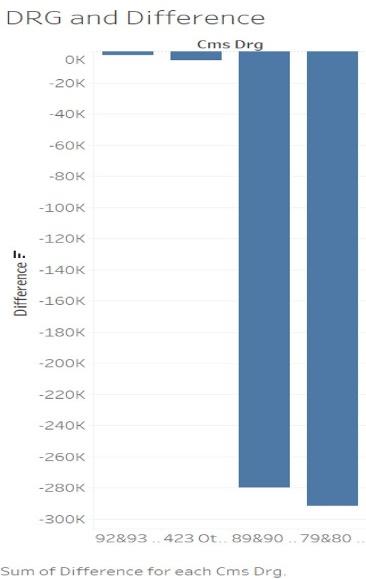
Bar charts can be implemented to illustrate the billed charge to the Medicaid or Medicare programs. The billed charge is expressed through the difference between the amount of reimbursement minus the charges for the patient account. Charges billed to CMS can be seen in Figure 2 and include $290,000 in the respiratory infections DRG, $280,000 in the simple pneumonia DRG, $5,000 in the interstitial lung infections DRG and $2,000 in the other infectious diseases DRG. Thus, the graph shows the DRGs with the highest number of charges being billed to insurance as well as the overall paid amount in the selected time period. The bars in the graph are positioned in descending order for easier understanding and interpretation of the data. The similar positioning and ranking of the bars in the graph allow for connecting the data presented in it with other bar graphs, including those on the sum of incidence and percentage of total incidents.
Average Difference in Reimbursement
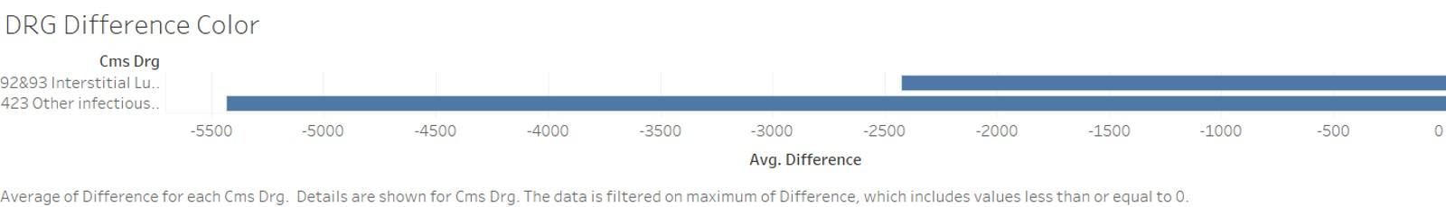
The data collected from the Tableau VLab Activity allows for calculating the average difference for each of the four examined diagnosis groups. The average function of Tableau illustrates the median differences in the billed charges between the diagnosis groups. The function indicated the greatest average difference appeared in the interstitial lung infections and other infectious disease diagnosis groups. As the previous graphs indicate, these groups have the lowest occurrence rates and, therefore, the lowest charges billed to insurance. The greatest difference in reimbursement presented in Figure 3 include interstitial lung infections and other infectious diseases. Therefore, the other infectious diseases DRG illustrates the greatest average difference in the amount of money received by the hospital, while the interstitial lung infections DRG has a nearly twice higher average difference. The visual representation of the average difference was selected due to it being able to clearly present the reviewed trend.
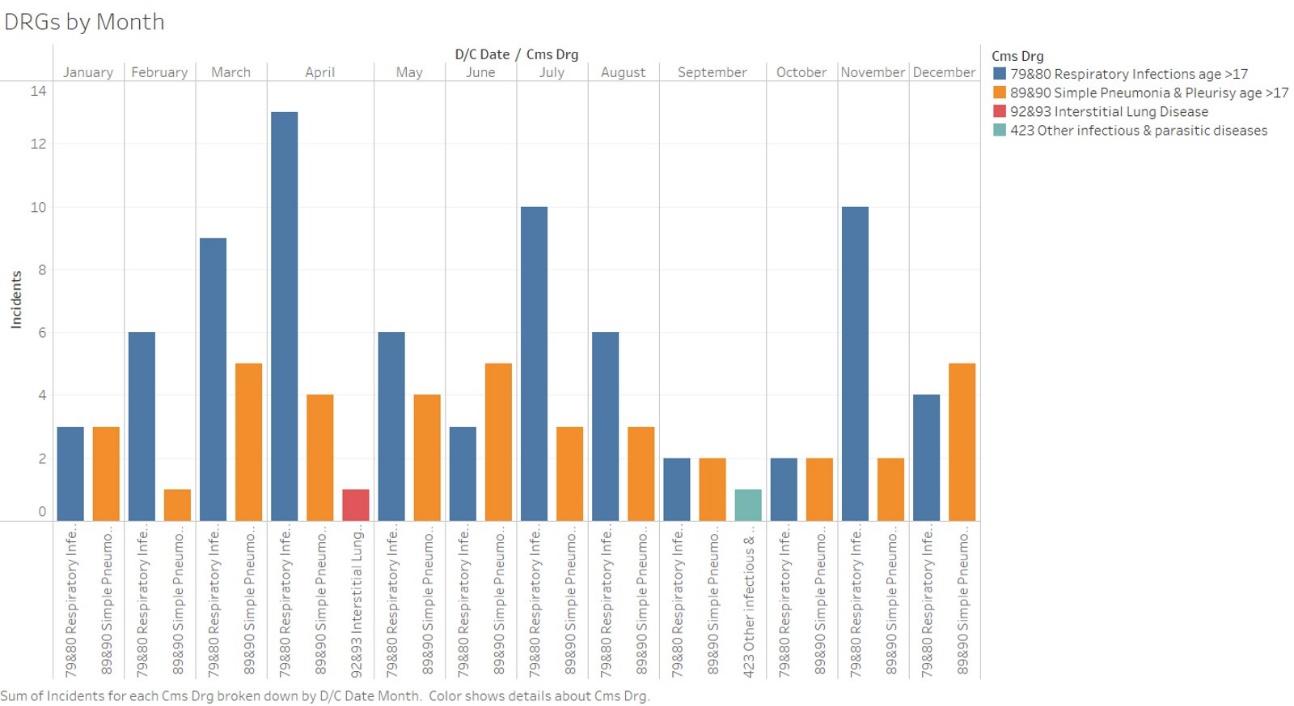
DRG by Month
The final bar graph represents the incidence of the DRGs under consideration in each month in the studied year. It should be noted that the incidence rate in each month is calculated for the persons over the age of 17 admitted to the hospital and diagnosed with a condition in the selected diagnosis groups. The graph in Figure 4 represents DRGs by month. It features respiratory infections and simple pneumonia DRGs prevail in all months, interstitial lung infection presents only in April and other infectious diseases present only in September. The grouped bar graph was utilized to allow the viewers to better understand the trends in DRGs distribution and display the trends of multiple categories. As the data set is quite large, the bar graph is the most logical way of summarizing it. In addition, different colors were used for each of the discussed DRGs to better reflect the case distribution and show the prevalence of respiratory infections and simple pneumonia DRGs.
Bar Graph Use Justification
The selected method of visualization allows for comprehensively presenting the data concerning DRGs incidence and distributions as well as the data concerning the billed charges and the average difference between different diagnosis groups. The choice to visualize each data set with the use of the same method of the bar graph allows for adequate comparison and correlation of the bar graphs and easier interpretation of the datasets. In addition, due to the wide use of bar graphs and the familiarity of viewers with them, they are easy to understand even without extensive medical or economic knowledge. Nevertheless, these graphs may require additional explanation concerning the DRGs and the Medicare and Medicaid programs to understand the significance of the presented data. However, it should be noted that the majority of visualization methods require additional explanation to be completely comprehended.
Overall, bar graphs provide a variety of advantages when employed for the visualization of data pertaining to Medicare and Medicaid Services and their reimbursement of DRGs. All types of bar graphs, including the selected vertical, horizontal, and grouped graphs, accurately represent the frequency distribution in each category and allow for the comparison of multiple categories. Bar graphs allow clarifying the existing trends in DRGs occurrence rates and the related CMS reimbursement. Although the data set presented in the graphs is not large, the chosen method of visualization summarized it concisely.