Graph Description
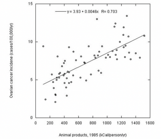
Figure 1 below shows a scatter plot of two variables: the first, the incidence of ovarian cancer, and the second, the amount of animal products. As can be observed from the plotted graph, there is an upward trend between the two variables. This implies that an increase in one variable entails an increase in the other; thus, an increase in the number of animal products may be positively associated with an increase in ovarian cancer incidence.
Graph Analysis
This graph clearly shows that a linear trend can be used to describe this model, and thus, the graph stands alone well. The advantage of the above graph is that it also displays the regression model’s results, namely the regression equation and the correlation coefficient. The data show that as the amount of animal products produced per person per year (kCal) increases, the incidence of ovarian cancer increases by 0.0046 per kCal, as indicated by the slope. The positive slope indicates a positive relationship between the two variables.
The coefficient for the y-intercept indicates the incidence rate of ovarian cancer when no animal products are produced — this is equal to 3.93. This means that when zero animal products were produced, there were 3.93 cases of ovarian cancer per 100,000 population per year. This may make practical sense, but it is unlikely to envision a situation in which animal product production is zero.
Another factor of interest in this graph is the correlation coefficient, which is 0.703. This indicates a strong positive relationship between the variables, meaning that when one increases, the other increases as well, and vice versa. The correlation coefficient can be squared to obtain the coefficient of determination, which equals 0.494. This shows that the regression model cannot reliably describe the data and accounts for only 49.4% of the data’s variance.